I was recently cooking food with my girlfriend, and she goes into the fridge to pull out something. Next thing I knew, BAM and “AAHHH” were the sounds ringing in my ears. She had stood up and smashed her head on the freezer handle of the refrigerator. After a string of unmentionable words from her, I told her I’d blog about this.
How many of us have felt this same, unbearable pain? Why, does this keep happening? WHAT IS THE PROBLEM? Well, the issue here is two things (besides the worst head pain ever): memory and placement. The handle is placed at a point where our short-term memory will completely forget about it.
When we kneel down to reach for something, we have the inclination to look around us to see if we are in a “safe zone”. Once we have identified the area as “safe” we proceed into doing what we initially set out to do.
At this point, our minds are focused on what our goal is now and have pushed out that short term memory that initial “safe zone”. The resulting factor is a head-splitting headache and a string of bad words.
This design does not understand how users think. We as designers need to fully understand the process of which users take use of our products. This includes their thought process. The design of this refrigerator does not take into account how users’ minds function, and it sometimes results in a very frustrated user.
Again, we can avoid this by understanding our users’ needs and goals.
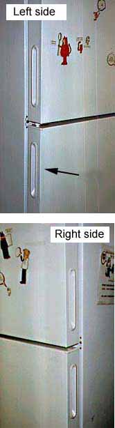
At my new job there is a refrigerator where employees put their lunches. The first time I tried to open the refrigerator I didn't see a handle on the front, but I found one on the left side of the door. (See arrow.) I pulled on the handle, but the door would not open. I thought maybe the refrigerator door had a really strong seal, so I pulled harder. I pulled so hard the whole refrigerator started moving! Someone standing nearby told me, "It opens from the other side. I had the same problem when I first tried to open it."
I looked on the right side of the refrigerator and sure enough, there was a handle there too! When I pulled on that handle, the refrigerator door opened easily.
Apparently, the refrigerator door was designed so it could be hinged on either the left or the right side. Thus, handles were put on both sides. However, people only expect to see one handle on a refrigerator door. When the handle doesn't work, they assume the door is stuck or locked.
Design suggestion
It would be best to put a handle on the front of a refrigerator door so that it can be easily seen. On a reversible door with handles on both sides of the door, there should be a way of removing or concealing the handle on the hinged side. There should not be visible handles on both sides!
Introduction
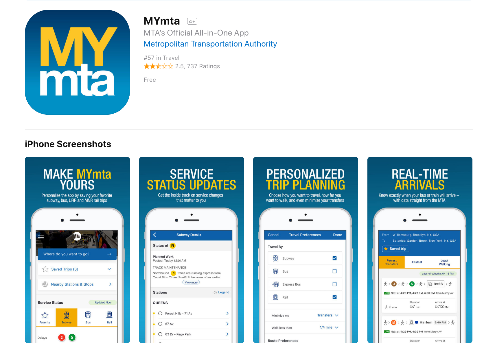
The MYmta iPhone app is a travel app designed to provide relevant information related to New York City’s many public transit options: subways, buses, LIRR and Metro-North rail services, and the Access-A-Ride program. The app allows for real-time scheduling and service changes, as well as personalized settings and trip planning, and station accessibility information.
Netflix is a major streaming service that allows users to watch TV shows, movies, animations and more. It has so much entertainment that you can never say, there is nothing to watch. In order to use Netflix, the new user could start with a one month free trial (which they can cancel anytime) or subscribe by paying monthly. The app itself is free, which is available in mobile, tablet and desktop versions.
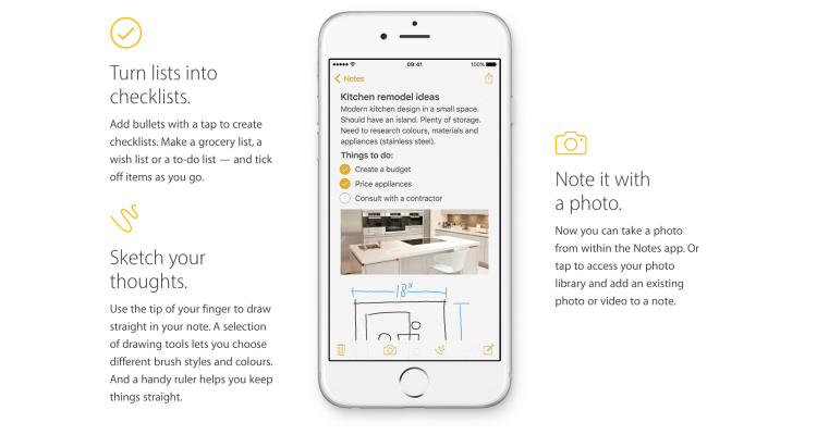
The iOS built-in Notes app empowers users’ note taking capability by providing seamless synchronization feature, supporting multimedia input/insert, and even integrating the sketch feature to simulate the analog note-taking experience. This article would critique the Notes App based on some usability factors mentioned by Don Norman’s book- The Design of Everyday Things.
How designers silently tell you what to do? - Affordances and Signifiers
Sometimes, you just look at a thing and know how it works. That's not an accident - it's good design, called affordance, and it can be applied to video games.
Learn how to design game environments so that the environment tells the player what to do. Affordances are a way we can design something in our game so it communicates the way we are supposed to interact with it via it's form. If you take the example of a cup, people intuitively know how to pick it up because the big round handle looks like it can be grasped. We can apply this logic to objects in game design and level design. By constructing their form in a certain way, the player will intuitively know what to do with the object. This is often considered a form of user experience design.
Signifiers are things we add to objects when an affordance is not 100% clear. These signifiers can be words, symbols or other things, but we put them onto objects to hint at an affordance or to flat out tell a user what to do. We can take advantage of these in a similar way we took advantage of affordances by using them to guide the player with more difficult interactions.
There are many situations in games where we leverage affordance when we play. In this video we cover a number of examples and I explain in depth the definition of these terms we have been discussing. We will cover the classic door design example where we design door handles to fit the way a door opens. We also talk about how affordance isn't just for environment design but is applied all over different disciplines of design including combat design. source: Game Design by Gigity McD
In his article Affordance, Conventions and Design, Norman emphasizes the difference between perceived affordance and affordance.[1] Thus, affordance can not be understood as feedback made by system when we are using screen-based equipment and instead it should be explained as something that “provide strong clues to the operations of things”, according to DOET written by Norman[2]. In general, affordance serves as the role that leads users and consumers to think, learn, analyze and interact.
As a representative form of interactive media, video games never lack materials for us to research design principles such as affordances, constraints and conventions.[3]
1.HUD design in video games
When we talk about interactive media, it is inevitable to talk about user interface and user experience. As for video games, a player can not judge the quality of gameplay when he first starts adventure, but he can decide whether the art style is to his liking or not once he sees the title. Jesse Schell in his book The Art of Game Design explicitly explain the hierarchical mental structure of players’ cognition. Even though for designers, mechanism, story, aesthetics and technology are equally important, the first two things players notice are usually aesthetics and mechanism maybe because these two are most easily to be symbolized.[4] So the combination of aesthetics and mechanism should provide players with enough affordances.
Games, especially the role-playing game, often leave tons of information for players to learn. Obviously, game designers in modern age will not list everything on screen just as their predecessors did. Instead they just place the most important information, such as hit point, mana point and ammunition, on the screen. Actually, the important information presented on screen is called Head Up Display (HUD), which is originally used in military area, describing the parameters shown in cockpit. To keep the HUD interface as concise as possible, one strategy is integrating the information into game contents.
The ammunition design of COD: AW
In Call of Duty: Advanced Warfare, designers cleverly make the ammunition information one part of the guns (the number will move as you move the gun and change view), giving players clear information that it is something related to weapons.
However, this strategy does not make game mechanism clear all the time. Metro 2033 uses the watch to indicate the duration of gas mask. It is really a good idea if players have been familiar with the game mechanism, but the vague and indirect relationship between mask and watch can frustrate new players at first. In contrast, Call of Duty: Black Ops uses the cracks on mask to warn players, which is a more intuitive design.
The watch design of check gas mask is somewhat confusing
2.Map and interactive elements design
It is the responsibility of game designers to tell players what they should and should not do during the gaming process. HUD serves as the instructor of player from beginning to end, but it is not enough for players to do well when they are required to make an immediate response. So designers should leave hints to players.
One thing that designers are good at is using both affordance and constraint to give players instructions. In many action games, players have to manipulate their characters to climb cliffs or trees and jump over chasms. Under such circumstances, designers often mark rocks that can be climbed and restrict characters to access those areas that can not interact with players.
The climbable part in Rise of the Tomb Raider is different from other parts
In Rise of the Tomb Raider, the ice that can be climbed is evidently lighter than the unclimbable part. What’s more, it is a standard design in the whole game, meaning the pattern of climbable part can be understood instinctively by players.
Another common trick used by game designers is setting margin for map with seemingly accessible perspective. I guess every player of Counter-Strike has the experience of fleeing outside the map. A more intricate way is to destroy the environment intentionally in order to force players to move to the next scene, especially in some linear cinematic games. Naughty Dog is the master of using such a strategy. In Uncharted franchise games, players must keep moving to avoid being buried by collapsed houses and cliffs, which in turn destroy the scene and stop characters from going back. This constraint ensures that players can have compact gaming process and have no problem with finding the destination.
3.Thoughts of future game design
Murray in her book Inventing the medium listed four affordances for digital artifacts: encyclopedic, spatial, procedural, and participatory.[5] Intrinsically a computer program, video game itself of course own the four affordances. For example, RTS(Real-Time Strategy) and MOBA(Multiplayer Online Battle Arena) games produce infinite possibilities for players and professional tournaments with bonus of millions of dollars. Compared to legacy media, video game is totally multisequential and interactive.
However, the complexity and flexibility of video game have brought designers a question – how to know what players really like. In traditional media age, users receive information passively, so designers only have to consider the transmission process from one direction and in digital media age, especially during the process of designing HCL system, designers should select the appropriate conventions that human interactors can understand, according to Murray.[5] Modern video game design is based on the mature media like movies and novels and asks designers to consider the balance between mechanism, story, aesthetics and technology. The problem here is that players have different preferences so designers can only accumulate experience by making mistakes to set good conceptual models for most players. A typical example is the failure of No Man’s Sky, whose developers are seduced by new technologies. [5] They create an universe by automatic random algorithm but neglect the importance of level design, thus making the world vapid, sterile and repetitive.
In general, game design is a formidable process and requires developers to correctly construct conceptual model for most players and make clear affordances, constraints and conventions.
References:
[1]Norman, Donald A. “Affordance, conventions, and design.”interactions 6.3 (1999): 38-43.
[2]Norman, Donald A. The design of everyday things: Revised and expanded edition. Basic books, 2013.
[3]Norman,Donald A, “Affordance, Conventions, and Design.” Interactions 6, no. 3 (May 1999): 38-43.
[4]Schell, Jesse. The Art of Game Design: A Book of Lenses. 2nd edition. Natick: A K Peters/CRC Press, 2014. Print
[5]Murray, Janet H. Inventing the medium: principles of interaction design as a cultural practice. Mit Press, 2011.
[6]Stonehouse, Anthony. “User interface design in video games.” Gamasutra. 27 Feb 2014.
[7]Zhang, Jiajie, and Vimla L. Patel. “Distributed cognition, representation, and affordance.” Pragmatics & Cognition 14.2 (2006): 333-341.
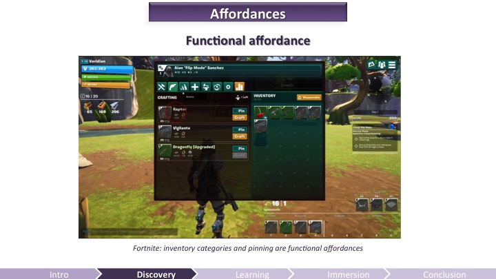
Game Developers Conference - GDC 2016 video presentation
Discovering and mastering a video game is a learning experience for the user. It requires mental efforts. This is why it’s important to understand how the brain learns to craft a compelling onboarding experience – one worth putting effort into, one that will matter to your audience.
Anything the brain processes and learns originates from a perceived input and changes the memory of a subject. The quality of the processing – therefore the quality of the retention – depends highly on the attentional resources applied, which are also dependent on the emotions and motivation felt by the players. In sum, to improve the experience of the players, video game developers must take into account the perception, memory, and attention limitations of the brain, as well as the emotions and motivation felt by the players.
The Gamer's Brain: How Neuroscience and UX can Impact Video Game Design
While information and opinions on ‘good UX’ are increasing in availability, teams, organizations, and individuals still struggling to define, measure, and agree upon principles of UX in a productive manner. That is, a lot of UX discussions end in design arguments. Meanwhile, the developers are waiting for direction, the designers are waiting for a correction, and the end-users are waiting for a satisfying experience.
BASIC UX does not set out to be the ‘end all, be all’ of UX principles. It does set out to help solve or at least reduce the problem stated above — UX design in productive environments is harder than it should be.
A set of common principles that test something’s overall user experience.
First, each letter in the word BASIC stands for a UX principle.
Beauty
Accessibility
Simplicity
Intuitiveness
Consistency
______________
Beautiful
Is it aesthetically pleasant?
The look and feel of a product are important to its overall user experience. The Aesthetic-Usability Effect shows that a visually appealing design is perceived as easier to use than an ugly one. Developers should refer to style guides and design specs for reference here. A few pixels can make a design look ‘off’ and leave the product feeling ‘broken.’
Are high-quality images and graphics used? (balance with size optimization)
Is it properly aligned with the layout?
__________
Accessible
Can ‘everyone’ use it?
A product’s accessibility is measured by how available and usable it is for people, regardless of their ability. Developers must go beyond the ‘average’ user and ensure that those with disabilities are also able to use the product. These disabilities might include: poor or no vision, color blindness, lack of motor skills, lower than average intelligence, etc. In these cases, third-party software such as mouse-dictation and screen readers are often used to navigate and perform actions within the product. Using existing standards such as WCAG, 508 compliant, and W3C will help increase the overall accessibility of the product. Subtle accessibility impacts should also be kept in mind when choosing font size, colors, and animations.
Questions to ask
Does it comply with standards? (WCAG, 508 compliant, W3C)
Is it cross-browser compatible? (IE8–11, CH, FF, SF)
Is it ‘display’ responsive?
Is the language simple enough for most to understand?
__________
Simple
Does it make life easier?
Hick’s Law states that the time it takes to make a decision is proportionally related to the number and complexity of choices. Additionally, Ockham’s Razor states that simplicity should be the deciding factor when choosing between two identical designs. Developers must then create user interfaces that distill the options to only what is needed to perform the user’s task.
Visually, this means balancing the use of white space and alignments to create associations, rather than complex graphics and styling. The Principles of Gestalt informs us that the use of distance, alignments and color similarities can help guide a product in a clean, simple and intuitive manner. For language content, this means reducing redundancy, removing passivity and filler words.
The Gulfs of Evaluation and Execution (Norman 1986) help us understand the usability gaps that users face in any system. Evaluation happens when the user is trying to understand the state of the system. If the state is not clear, the user might unnecessarily repeat an action, or feel a sense of anxiety that their task wasn’t completed. Execution is needed for a user to achieve their goals. If the path of execution is unclear, then the user won’t know how to achieve their goals in the system. If either one of these “gulfs” are too wide, then users will not have a good experience in the system and will dread using it.
Affordance is another key aspect of an intuitive UX. For example, the color of links or the shape of buttons indicates that there is an action available. It’s import to realize that most people spend most of their time with other products and in other systems. Thus, building upon established design patterns is key.
Can the user achieve their goal with little or no initial instructions?
Is the task easily repeated by the user without further instruction?
Can the user predict the outcome/output?
_________
Consistent
Does it match the system?
Consistency is the thread that holds BASIC UX together. A beautiful product is consistent. An accessible product is consistent. A simple product is consistent. An intuitive product is consistent. In UX, consistency is the thing that separates frustrating chaos from cohesive harmony. It is important that design colors, spacing, fonts and alignments are uniform throughout the product. This visual and functional uniformity creates a sense of dependability and trust between the user and the system.
Developers should reuse existing and established elements in the system whenever possible. Forms should have consistent alerts, labels, validation, and action behaviors. If consistency is lacking, then the entire UX will be as well. Performance glitches should be minimized so that pages load as a consistent rate and actions produce predictable responses.
User Experience Design is at the forefront of product management in today’s industries. However, in spite of this vast and growing knowledge-share on the topic, UX Design is still a difficult area to gain team consensus around. It is in these situations that frameworks can provide clear direction. BASIC UX is a user experience design framework made up of five key design principles. It strives to help developers and designers guide their products in the right direction while remaining productive in the development process. I encourage you to introduce BASIC UX to your team and use it to enhance the experiences your products deliver.
This course introduces students to the field of human-computer interaction.
Introduction
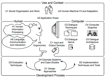
The body of knowledge of Human-Computer Interaction can be perceived as resulting from the following five interrelated aspects, depicted in the diagram bellow:
(N) the nature of human-computer interaction;
(U) the use and context of computers;
(H) human characteristics;
(C) computer system and interface architecture; and
(D) the development process.
This course touches the (N) aspect but mainly targets the (H) aspects illustrated in the diagram above. It comprises seven modules:
After successfully attending this course, students will know how user interfaces have developed over the past decades, and what constants of human performance need to be considered when designing user interfaces.
Textbooks written by 100+ leading designers, bestselling authors, and Ivy League professors. The textbooks are assembled in a gigantic 4000+ page encyclopedia covering the design of interactive products and services such as websites, household objects, smartphones, computer software, aircraft cockpits, you name it.
You can accuse me of living under a rock because I haven't seen one of these before, but this is absolutely brilliant. I just bought a new contact grill and take a look at the plug on the cord set. For all of you designers out there who bemoan the "stupidity" of consumers, how they won't follow directions, bla bla bla, take note of this simple design solution.
The problem is as old as electric products themselves. People grab the cord rather than the plug to unplug an appliance, eventually ruining the cord.
Does the left most knob control the left front or left read burner?
Errol R. Hoffmann & Alan H.S. Chan (2011): Alternative approaches to the design of four-burner stoves,
Ergonomics, 54:9, 777-791
Suggestion
Useful features to consider when buying an induction hob.
The arrangement of knobs controlling your stove burners should match the arrangement of the burners themselves.
What is wrong?
Interface
What can I do? How? Where?
- Too small icons (see the Fitts’s law*)
- Non-intuitive interface
(in an emergency you may waste time in choosing the right icon)
* Fitts's Law states "...the time to acquire a target is a function of the distance to and size of the target". As the distance increases, movement takes longer and as the size decreases selection again takes longer.
Suggestion
A big knob (real or virtual) is better than a small icon on the glass
Perceived affordance: you can increase the selected power
Signifier (the where and the how): twisting the knob
Feedback
LED surface lights shine onto pans to give the visual of gas cooking
Did you know light bulbs can be used as vases, milk jugs turned into shovels, and wine corks transformed into business card holders? Everyday objects can be used in a multitude of ways other than those originally intended.
You can make everything from emergencies supplies or substitutes to creative crafts and gifts with common household items and a little creativity. Upcycle old magazines or bags, transform plastic spoons and t-shirts, or just cobble together a star ship from office supplies.
For dozens of awesome ideas on how to use everyday objects in different ways, read on.
You’ve encountered a door like this. One that looks like you should pull on it, but really you’re supposed to push. Those doors you hate have a name: “Norman doors.”
They’re named after Don Norman, a UC San Diego cognitive scientist, who identified this phenomena in his book “The Design of Everyday Things.”
According to Norman, pushing on a door that says “pull” isn’t necessarily your fault. It is just poorly designed.
University of California: How to design doors to be less confusing
This is a door.
The affordance of a door is that you can open it.
You know it by your conceptual model of how works a door.
But without signifier you don’t know where and how open it.
Affordance: is what a product/object can do. Signifier: perceivable cues are signs indicating what you can do.
Note:
The perceivable part of an affordance is a signifier.
A "signifier" is, a sign that guide people to successfully interact with the design.
Signifiers are signals, communication devices.
These signs tell you about the possible actions; what to do, and where to do it.
What is wrong?
No signifier for these doors
(How can I open this door? Is there an hidden handle or is it an automatic door?)
Suggestion
Design should always disclosure the signifier
(Handles or some colored sign on the frame)
**************
March 2017 UPDATE
The same supermarket decided to add classical handles