Visualizzazione post con etichetta user experience. Mostra tutti i post

lunedì 28 maggio 2018

10 Usability Heuristics with Examples

10 Usability Heuristics with Examples

by SaiChandan Duggirala
Imaginary design by Icons8 to improve the User Experience of a Boarding pass.
User Experience is a qualitative metric subject to many factors. It’s an evolving discipline and it’s evident when the forerunner of great user experiences, Apple, humbly tags their iOS Human Interface Guidelines as Beta. Google termed their material design guidelines as a living document which will be updated regularly. One of the pioneers who tried to objectively evaluate the user experience on digital platforms is Jakob Nielsen with his heuristic evaluation. Though they date back to the 90’s, these general rules of thumb are still valid and are used today.
In this article, I attempt to explain these 10 rules in common language with examples:

1. Visibility of System Status
2. Match between system and the real world
3. User Control and Freedom
4. Consistency and Standards
5. Error Prevention
6. Recognition rather than recall
7. Flexibility and Efficiency of use
8. Aesthetic and minimalist design
9. Help users recognize, diagnose, and recover from errors
10. Help and Documentation

GoDaddy’s Help page

Conclusion:
These guidelines are general rules of thumb and will mostly be applicable to any web & mobile application with some exceptions. Always use your judgment to implement these principles or any other UX practices by keeping yourself in end user’s shoes.
_____ 

Heuristic Evaluations and Expert Reviews

Advantages and Disadvantages of Heuristics

A heuristic evaluation should not replace usability testing. Although the heuristics relate to criteria that affect your site’s usability, the issues identified in a heuristic evaluation are different than those found in a usability test.


         Advantages

  • It can provide some quick and relatively inexpensive feedback to designers.
  • You can obtain feedback early in the design process.
  • Assigning the correct heuristic can help suggest the best corrective measures to designers.
  • You can use it together with other usability testing methodologies.
  • You can conduct usability testing to further examine potential issues.

         Disadvantages

  • It requires knowledge and experience to apply the heuristics effectively.
  • Trained usability experts are sometimes hard to find and can be expensive.
  • You should use multiple experts and aggregate their results.
  • The evaluation may identify more minor issues and fewer major issues.

____

Though many groups have developed heuristics, one of the best-known sources is the set developed by Nielsen’s in 1994.  Nielsen refined the list originally developed in 1990 by himself and Rolf Molich.  Nielsen’s Heuristics include:

  • Visibility of system status: The system should always keep users informed about what is going on, through appropriate feedback within reasonable time.
  • Match between system and the real world: The system should speak the users' language, with words, phrases and concepts familiar to the user, rather than system-oriented terms. Follow real-world conventions, making information appear in a natural and logical order.
  • User control and freedom: Users often choose system functions by mistake and will need a clearly marked "emergency exit" to leave the unwanted state without having to go through an extended dialogue. Support undo and redo.
  • Consistency and standards: Users should not have to wonder whether different words, situations, or actions mean the same thing. Follow platform conventions.
  • Error prevention: Even better than good error messages is a careful design which prevents a problem from occurring in the first place. Either eliminate error-prone conditions or check for them and present users with a confirmation option before they commit to the action.
  • Recognition rather than recall: Minimize the user's memory load by making objects, actions, and options visible. The user should not have to remember information from one part of the dialogue to another. Instructions for use of the system should be visible or easily retrievable whenever appropriate.
  • Flexibility and efficiency of use: Accelerators—unseen by the novice user—may often speed up the interaction for the expert user such that the system can cater to both inexperienced and experienced users. Allow users to tailor frequent actions.
  • Aesthetic and minimalist design: Dialogues should not contain information which is irrelevant or rarely needed. Every extra unit of information in a dialogue competes with the relevant units of information and diminishes their relative visibility.
  • Help users recognize, diagnose, and recover from errors: Error messages should be expressed in plain language (no codes), precisely indicate the problem, and constructively suggest a solution.
  • Help and documentation: Even though it is better if the system can be used without documentation, it may be necessary to provide help and documentation. Any such information should be easy to search, focused on the user's task, list concrete steps to be carried out, and not be too large.

Expert Reviews

In an expert review, the reviewers already know and understand the heuristics. Because of this, reviewers do not use a specific set of heuristics. As a result, the expert review tends to be less formal, and they are not required to assign a specific heuristic to each potential problem.


lunedì 16 aprile 2018

Why is Online Checkout So Difficult?!

Why is Online Checkout So Difficult?!

by Dmitry Kovalenko

Summary: nowadays online checkout processes are too complex and cannot be compared with the real-life cash checkout. But they definitely can be better.


In this article we are going to overview the checkout process on 4 services to understand and “feel” the problem itself. Also, it is the 1st chapter of four that are linked together by one story and goal where I described what I have learned and used to design the completely new checkout process for our SaaS project Fluix.

2nd chapter. You will find out 18 must-do principles of how to design a better experience for your checkout form (or any other form) and dramatically increase the success rate, and decrease the completion time.

Chapters 3 and 4. The complexity behind the new checkout form for Fluix. You’ll learn the relationships and dependencies between fields, their input & visual constraints, and a lot of insights about the way I’ve designed the new checkout form for our SaaS project called Fluix.


Just imagine. Friday night. You’re at one of the coziest restaurants in the city with a panoramic ocean view. Eating your best ever ribeye-steak (or whatever you like the most) mixed with a glass of gorgeous red wine. You feel full, relaxed and peaceful. You ask the waiter for the bill (no, the point is not in the money). And instead of a simple piece of paper with a total price, you get a form with 27 fields that must be filled.
Why is Online Checkout So Difficult?!


“WHAT?!!” — you will probably ask yourself. And will repeat the same question to the waiter, and then to the manager…
SUCKS! Right?

Let’s rewind, how do we bought everything before all these plastic cards and digital transactions? You just take what you want, give the cash to the seller and… that’s it! Done. Minimum time spent. Minimum actions made.


In an online world, it’s not so easy. At all. Tons of fields, questions, buttons, checkboxes, redirections between the bunch of pages, of services, emails with confirmations, passwords, suggestions of other related (most the time they are not) products, tons of additional options, and God knows what else.

Let’s take a look at a few examples ↪

lunedì 31 luglio 2017

The best UX and design conferences in 2017

The best UX and design conferences in 2017
A complete guide for designers who are looking for events and conferences to attend this year, or who are simply planning their next trip around the world.
by Fabricio Teixeira


Photo credit: Knak

A great way of learning more about User Experience and getting in touch with professionals who share the same passion as you is to attend UX Conferences and UX Events happening every year around the globe.

The events listed are the ones our team at uxdesign.cc have been to or would like to attend in the near future. Make sure you charge your smartphone, bring some business cards in your pocket and consider including one of these design events before or after your next trip.

  • Events about creativity and technology

  • Get together with local UX groups

  • Follow events in your area


uxdesign.cc

lunedì 10 luglio 2017

How to Create a UX Design Portfolio: Tips from a UX Recruiter

How to Create a UX Design Portfolio: Tips from a UX Recruiter
by Tom Cotterill


How to Create a UX Design Portfolio: Tips from a UX Recruiter
As a UX recruiter, my role involves not just identifying and developing tech talent, but also following the industry closely; going to events, workshops, and conferences to make sure I’m in a strong position to connect the dots and successfully match companies with perfect-fit employees.

Through the conversations I have day-to-day, I’ve managed to put together a clear picture of the industry as it stands in 2017 and what the expectations are for all levels of UX designer, from absolute beginners to senior UXers and UX directors.

One big aspect of my role is making sure that the candidates I work with are amazing at showcasing their skills, experience, and past achievements. One thing I get asked over and over again is, “Where should I begin with creating my portfolio? What’s the standard? How can I make it better?”

So, I’m going to share the advice that I frequently give out to candidates I work with, be it a beginner, mid-level or senior UX designer. I’ll be explaining why your portfolio is so important, what to include, where to host it, how much to include, and answering lots of other common questions.

lunedì 19 giugno 2017

How Great Icons Can Affect The User Experience

How Great Icons Can Affect The User Experience
by Jake Rocheleau

Interfaces are all about communication and getting things done. A website’s UI is a means to an end, and the designer’s job is to create an interface that helps the user reach that end quickly.

Icons are perfect for interfaces because they convey meaning without words. Users can learn how an interface works just by studying the visuals and interacting with the elements.

In this post I’ll cover a few different ways to use icons to improve the quality of UX on a website. There are no perfect uses but there are commonalities between great icons and an improved user experience.


designmodo.com

lunedì 8 maggio 2017

From Small CSS Tricks To Great Design Mysteries: SmashingConf Barcelona 2017

From Small CSS Tricks To Great Design Mysteries: SmashingConf Barcelona 2017
By Vitaly Friedman
$399 (ca. €365 incl. VAT)

About The Conference
In Barcelona, we’ll explore new front-end challenges, UX strategies and design patterns that you can apply to your work right away. No fluff, no theory: just hands-on, practical and on point — things that worked well in real-life projects, with talks and workshops by practitioners from the industry.
Why This Conference Could Be For You
This event focuses on the practical. You’ll learn many valuable techniques for your workflow, and you’ll meet fantastic, like-minded people from the industry. You’ll learn:
  1. Strategies for building fast responsive websites,
  2. Clever psychological techniques for smarter interfaces,
  3. Techniques and guidelines for better mobile UX,
  4. Guidelines for scalable CSS and JavaScript,
  5. Techniques for better interaction design and typography,
  6. How to optimize for performance and content delivery,
  7. Gotchas and guidelines with SVG, CSS Grid, HTTP/2,
  8. Mistakes and lessons learned from real-life projects,
  9. Responsive design patterns for future-ready websites,
  10. How to move away from generic solutions towards designs that exhibit soul and personality.

lunedì 17 aprile 2017

The UX Design Success Ladder

The UX Design Success Ladder: Achieving Meaningful Product Design
by Ward Andrews


The UX Design Success Ladder: 5 Steps to Creating Meaningful Products.
To take products from good to great, we have to go beyond functional requirements and deliver usable, comfortable experiences that not only delights users, but also affect their lives on a deeper level.

lunedì 3 aprile 2017

37+ Extraordinary Ways To Use Everyday Objects Differently

37+ Extraordinary Ways To Use Everyday Objects Differently
by Stacey Graham
Suitcase Table
Did you know light bulbs can be used as vases, milk jugs turned into shovels, and wine corks transformed into business card holders? Everyday objects can be used in a multitude of ways other than those originally intended.

You can make everything from emergencies supplies or substitutes to creative crafts and gifts with common household items and a little creativity. Upcycle old magazines or bags, transform plastic spoons and t-shirts, or just cobble together a star ship from office supplies.

For dozens of awesome ideas on how to use everyday objects in different ways, read on.

Deyan's Experiences

Deyan's Experiences
Usability and User Experience in everyday life
by Deyan Halachliyski

What do we see here?
  • on/off button (that’s clear)
  • knob with some red and blue markings on the bottom

What do I need to know when washing my hands?
  • how to regulate the water temperature
  • how to regulate the water flow

Difference Between UX and UI Design

Difference Between UX and UI Design


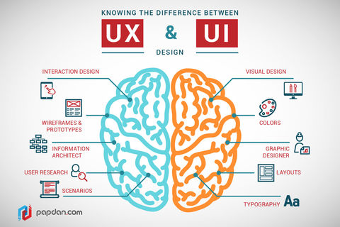
When companies began to establish a presence on the Internet, they hired web designers to create those websites – general practitioners of sorts. Once web design became more complex, however, specialization developed. So, now we have UX and UI designers, each with their specific facets of web design. These terms are often used interchangeagably, however, and there is some disagreement as to what exactly each specialty entails. So here is a basic definition of each.

Article by JohnUnger

lunedì 13 marzo 2017

How to design doors to be less confusing

How to design doors to be less confusing

You’ve encountered a door like this. One that looks like you should pull on it, but really you’re supposed to push. Those doors you hate have a name: “Norman doors.”

They’re named after Don Norman, a UC San Diego cognitive scientist, who identified this phenomena in his book “The Design of Everyday Things.”

According to Norman, pushing on a door that says “pull” isn’t necessarily your fault. It is just poorly designed.
University of California: How to design doors to be less confusing

lunedì 6 febbraio 2017

Uncomfortable Design: Designing for evil

Uncomfortable Design: Designing for evil


How might designers use their powers for evil, rather than good?
We all know that the purpose of User Experience design is to provide the best possible experience to a user. Designers conduct ethnographic research in a given context in order to understand how to create positive solutions for people. But what if we were to design something that deliberately works against the user completing his/her task?
www.trozellidesign.com by Bride Trozelli

lunedì 30 gennaio 2017

Best of the Best 2016! Top 13 UI/UX Design Posts for Reference


This article curated some of the most recommended design posts in 2016, such as the principles, books, and tools helpful on UI/UX design, methods and suggestions on how to make better design, as well as the new design trends.


Grace Jia - 12/15/2016

domenica 22 gennaio 2017

domenica 1 gennaio 2017

martedì 20 dicembre 2016