Visualizzazione post con etichetta perceived affordance. Mostra tutti i post

lunedì 12 marzo 2018

How to escape from a car trunk

How to escape from a car trunk

For the 2002 model year, all cars were required to feature a standard glow-in-the-dark trunk-release lever, which opens the compartment from the inside in the event of an emergency. 

Perceived Affordance and Metaphorical Signifier

A useful handle that glows in the dark and has an easy to understand symbol.
The particular shape of the plastic handle effectively induces to pull it towards us, to open the liftgate.

A good interface should have the appropriate perceived affordances to make the tasks that can be done with it evident for the user.
Emergency trunk release lever
Children – and sometimes adults for work  – trapped in the trunk, can die of suffocation or heat stroke. Once in the trunk, they may not be able to get out.

Perceived Affordance

Metaphorical Signifier

_____ 
____


The emergency trunk release safety problem

sabato 17 febbraio 2018

If It Needs a Sign, It’s Probably Bad Design

If It Needs a Sign, It’s Probably Bad Design


bad design

The EpiPen, the potentially life-saving device that delivers a dose of medicine to people having a severe allergic reaction, has been all over the news for its outrageous price spike. Going up 500 percent in just under a decade is upsetting. But even as the company and regulators are dealing with its price, going unaddressed is the product’s significant design flaw.

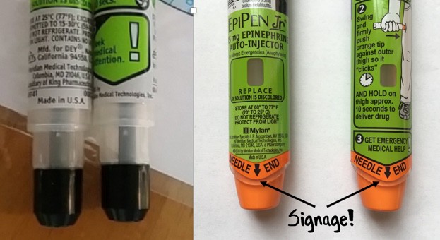
Despite having pen in its name, the EpiPen isn’t really designed like a pen at all. A pen usually has a cap that covers the pen tip. But the cap of the EpiPen is on the opposite end as the needle tip. Joyce Lee, a pediatrician and University of Michigan professor who also studies patient-centered design, points out that this broken metaphor causes confusion over which end is which – and has led to people accidentally pushing their fingers into the needle. Between 1994 and 2007 there were over 15,000 unintentional injections from EpiPens, including many cases of trained healthcare professionals who accidentally gave themselves a dose of epinephrine in the thumb or finger while trying to deliver the life-saving medicine to someone else.

bad design
Unlike a regular pen, the EpiPen has the cap and needle tip on opposite sides  (Kira Stewart-Watkins, Flickr)

The owner of the EpiPen, Mylan, told ProPublica that “Since acquiring the EpiPen Auto-Injector, Mylan has made significant improvements to the design of the medical device portion of the product” and that the design changes were “aimed at making EpiPen Auto-Injectors easier to safely carry, hold, and administer and reduce the risk to users from the device’s needle, which is extremely important to our patients.” The company “encourage[s] all patients and caregivers to receive training on proper administration.” See Mylan’s full response here.

But while in 2009 Mylan redesigned the device, they didn’t change the orientation of the cap and needle. Instead, they colored one end bright orange and gave it the label “Needle End.” No doubt the design tweak helped a little: according to one study, the new EpiPen has a success rate of 67 percent (the old pen had a success rate of 43 percent). But that same study compared the EpiPen to another epinephrine auto-injector, the Auvi-Q, which was recently taken off the market after being recalled for dosage problems. The Auvi-Q is designed with the cap and needle on the same end – and had a success rate of over 90 percent.

It’s not surprising that a new color and a label didn’t stop accidental injections entirely. The EpiPen is just one more example in a long tradition of designers “solving” design problems by adding instructions, rather than fixing the underlying design itself.

Now, it’s true that sometimes instructions are useful and necessary. But in many cases, if it needs a sign, it’s bad design.
_____________________________________ 

The Role of Metaphor in Design

by Joyce Lee, MD, MPH Physician, Designer, Researcher Promoting a Maker Movement for Health     doctorasdesigner.com

bad design

The left-sided photo shows the needle area of the old EpiPen. The right-sided photo shows the needle area of the currently available EpiPen. On both sides of the current EpiPen, there is text on the front and back with the words NEEDLE END in large capital letters accompanied by a large black arrow. A healthcare stakeholder wouldn’t even blink at this detail, but I must quote the great Don Norman, one of the founders of human-centered design:

“Any time you see signs or labels added to a device, it is an indication of bad design.”


lunedì 17 luglio 2017

Ikea mug notch


IKEA Trofe Mug: Dishwasherowned
by Travis Hudson

This isn't so much of a gadget, but an extremely handy device that I wish I would have thought of. This TROFE mug from IKEA has a simple notch on the bottom of the mug that prevents water from pooling up around the base during a dishwasher run.

Some comments from the website:

___________

Gizmometer
These are a perfect example of design without testing. The notch is under the handle. Most dishwashers load cups so that the handle points toward the center of the dishwasher and are tilted upward at the handle so that the spray can reach the inside of the cup. Thus, the notch is at the highest point of the cup when it's loaded in a dishwasher, making the notch useless. A few tests in a few dishwashers would have pointed that out. Now people will buy these thinking they're clever, only to find that they don't work as advertised when they get home.

___________ 

John Laur
I agree with the comments about poor design choice. It would have been easier to make the bottom flat or put two or 3 notches in it.

Plus it's not like Ikea invented this. Look at any cheap plasticware in any restaraunt and you will find drain notches. You can also use them to 'hook' one or two cups onto the rim of another and carry four or six drinks at a time without using a tray.
___________ 

jetstar7
I don't own a dishwasher. I am the dish-washer. I put stuff on a wire rack to drip dry. So this cup works. And the image of the cup is seen in IKEA's latest catalogue. No mention of it's intent to optimise dishwasher cleaning in there.

lunedì 26 giugno 2017

Design With A Purpose: 15 Everyday Things You Never Imagined Had A Purpose

Design With A Purpose: 15 Everyday Things You Never Imagined Had A Purpose
by Suchismita Biswas

Technology has science behind it. Every small design has logic. Do you know the purpose of the small hole in your pen cap? I bet many of us don’t know the actual purpose of the feature. Like this, there are many everyday small things we use but don’t know the exact purpose of the features. This article is written to inform you such little things which you use but don’t know the purpose.


design-purpose-15-everyday-things-never-imagined-purpose

lunedì 29 maggio 2017

plug with a convenient hole to hook a finger into

Plug with a convenient hole to hook a finger into
by Katherine Bennett


You can accuse me of living under a rock because I haven't seen one of these before, but this is absolutely brilliant. I just bought a new contact grill and take a look at the plug on the cord set. For all of you designers out there who bemoan the "stupidity" of consumers, how they won't follow directions, bla bla bla, take note of this simple design solution.

The problem is as old as electric products themselves. People grab the cord rather than the plug to unplug an appliance, eventually ruining the cord.

more.... designinvestigations.com

lunedì 10 aprile 2017

Induction cooktop

Induction cooktop

What is wrong?
Bad mapping

Does the left most knob control the left front or left read burner?


Errol R. Hoffmann & Alan H.S. Chan (2011): Alternative approaches to the design of four-burner stoves,
Ergonomics, 54:9, 777-791


Suggestion
Useful features to consider when buying an induction hob.


The arrangement of knobs controlling your stove burners should match the arrangement of the burners themselves.


What is wrong?
Interface

What can I do? How? Where?


- Too small icons (see the Fitts’s law*)
- Non-intuitive interface 
  (in an emergency you may waste time in choosing the right icon) 

* Fitts's Law states "...the time to acquire a target is a function of the distance to and size of the target". As the distance increases, movement takes longer and as the size decreases selection again takes longer.


Suggestion
A big knob (real or virtual) is better than a small icon on the glass 


Perceived affordance: you can increase the selected power
Signifier (the where and the how): twisting the knob 


Feedback


LED surface lights shine onto pans to give the visual of gas cooking

lunedì 27 marzo 2017

Cool Mist Humidifier _ interaction design

Cool Mist Humidifier

 What is wrong?
 Wrong System Image Unexpected behavior: - For the user the handle means that is possible lift the entire object and transport it. For the designer the handle is only for the tank, where refill the water. - Water spill outside


Suggestion:
Air Humidifier with Topside Water Refill Design

Add water from top, there is no need to remove the water tank like most other cool mist humidifiers. This eliminates chances of getting water on the floor or desk every time you refill the tank.