Visualizzazione post con etichetta mental model. Mostra tutti i post

sabato 17 febbraio 2018

If It Needs a Sign, It’s Probably Bad Design

If It Needs a Sign, It’s Probably Bad Design


bad design

The EpiPen, the potentially life-saving device that delivers a dose of medicine to people having a severe allergic reaction, has been all over the news for its outrageous price spike. Going up 500 percent in just under a decade is upsetting. But even as the company and regulators are dealing with its price, going unaddressed is the product’s significant design flaw.

Despite having pen in its name, the EpiPen isn’t really designed like a pen at all. A pen usually has a cap that covers the pen tip. But the cap of the EpiPen is on the opposite end as the needle tip. Joyce Lee, a pediatrician and University of Michigan professor who also studies patient-centered design, points out that this broken metaphor causes confusion over which end is which – and has led to people accidentally pushing their fingers into the needle. Between 1994 and 2007 there were over 15,000 unintentional injections from EpiPens, including many cases of trained healthcare professionals who accidentally gave themselves a dose of epinephrine in the thumb or finger while trying to deliver the life-saving medicine to someone else.

bad design
Unlike a regular pen, the EpiPen has the cap and needle tip on opposite sides  (Kira Stewart-Watkins, Flickr)

The owner of the EpiPen, Mylan, told ProPublica that “Since acquiring the EpiPen Auto-Injector, Mylan has made significant improvements to the design of the medical device portion of the product” and that the design changes were “aimed at making EpiPen Auto-Injectors easier to safely carry, hold, and administer and reduce the risk to users from the device’s needle, which is extremely important to our patients.” The company “encourage[s] all patients and caregivers to receive training on proper administration.” See Mylan’s full response here.

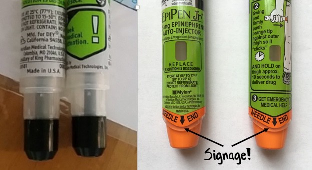
But while in 2009 Mylan redesigned the device, they didn’t change the orientation of the cap and needle. Instead, they colored one end bright orange and gave it the label “Needle End.” No doubt the design tweak helped a little: according to one study, the new EpiPen has a success rate of 67 percent (the old pen had a success rate of 43 percent). But that same study compared the EpiPen to another epinephrine auto-injector, the Auvi-Q, which was recently taken off the market after being recalled for dosage problems. The Auvi-Q is designed with the cap and needle on the same end – and had a success rate of over 90 percent.

It’s not surprising that a new color and a label didn’t stop accidental injections entirely. The EpiPen is just one more example in a long tradition of designers “solving” design problems by adding instructions, rather than fixing the underlying design itself.

Now, it’s true that sometimes instructions are useful and necessary. But in many cases, if it needs a sign, it’s bad design.
_____________________________________ 

The Role of Metaphor in Design

by Joyce Lee, MD, MPH Physician, Designer, Researcher Promoting a Maker Movement for Health     doctorasdesigner.com
bad design

The left-sided photo shows the needle area of the old EpiPen. The right-sided photo shows the needle area of the currently available EpiPen. On both sides of the current EpiPen, there is text on the front and back with the words NEEDLE END in large capital letters accompanied by a large black arrow. A healthcare stakeholder wouldn’t even blink at this detail, but I must quote the great Don Norman, one of the founders of human-centered design:

“Any time you see signs or labels added to a device, it is an indication of bad design.”


lunedì 26 giugno 2017

Design With A Purpose: 15 Everyday Things You Never Imagined Had A Purpose

Design With A Purpose: 15 Everyday Things You Never Imagined Had A Purpose
by Suchismita Biswas

Technology has science behind it. Every small design has logic. Do you know the purpose of the small hole in your pen cap? I bet many of us don’t know the actual purpose of the feature. Like this, there are many everyday small things we use but don’t know the exact purpose of the features. This article is written to inform you such little things which you use but don’t know the purpose.


design-purpose-15-everyday-things-never-imagined-purpose

lunedì 3 aprile 2017

37+ Extraordinary Ways To Use Everyday Objects Differently

37+ Extraordinary Ways To Use Everyday Objects Differently
by Stacey Graham
Suitcase Table
Did you know light bulbs can be used as vases, milk jugs turned into shovels, and wine corks transformed into business card holders? Everyday objects can be used in a multitude of ways other than those originally intended.

You can make everything from emergencies supplies or substitutes to creative crafts and gifts with common household items and a little creativity. Upcycle old magazines or bags, transform plastic spoons and t-shirts, or just cobble together a star ship from office supplies.

For dozens of awesome ideas on how to use everyday objects in different ways, read on.

Deyan's Experiences

Deyan's Experiences
Usability and User Experience in everyday life
by Deyan Halachliyski

What do we see here?
  • on/off button (that’s clear)
  • knob with some red and blue markings on the bottom

What do I need to know when washing my hands?
  • how to regulate the water temperature
  • how to regulate the water flow

lunedì 27 marzo 2017

Cool Mist Humidifier _ interaction design

Cool Mist Humidifier

 What is wrong?
 Wrong System Image Unexpected behavior: - For the user the handle means that is possible lift the entire object and transport it. For the designer the handle is only for the tank, where refill the water. - Water spill outside


Suggestion:
Air Humidifier with Topside Water Refill Design

Add water from top, there is no need to remove the water tank like most other cool mist humidifiers. This eliminates chances of getting water on the floor or desk every time you refill the tank.

martedì 28 febbraio 2017

Frozen food Doors _ interaction design

Frozen food Doors

This is a door.
The affordance of a door is that you can open it.
You know it by your conceptual model of how works a door.
But without signifier you don’t know where and how open it.


Affordance: is what a product/object can do.
Signifier: perceivable cues are signs indicating what you can do.

 Note:
The perceivable part of an affordance is a signifier.
A "signifier" is, a sign that guide people to successfully interact with the design.
Signifiers are signals, communication devices.
These signs tell you about the possible actions; what to do, and where to do it.

What is wrong?
No signifier for these doors
(How can I open this door? Is there an hidden handle or is it an automatic door?)

Suggestion
Design should always disclosure the signifier
(Handles or some colored sign on the frame)

**************
March 2017 UPDATE
The same supermarket decided to add classical handles