Mini prototyping templates (8.5 x 11)
We use the Digital Psychology Wireframe Kit to help our students develop their skills in applying behavioral science strategies to a wide range of interactive media.
After rearchitecting our wireframe kit in 2017, our students and friends started asking for a copy.
To share the love with the wider community of digital media pros, here's a copy of our smaller 8.5 x 11 wireframe kit, under a flexible creative commons license.
About the wireframe kit
Paper is the ultimate wireframing tool for building quick concept mockups and prototypes, with full creative freedom.
We use the oversized version of the wireframe kit in our digital psychology training, where we focus on applying psychology to various interactive design, UX and marketing applications.
Since our focus is on creative concepts, rather than pixel-perfect specifications, the kit provides ballpark dimensions across a wide range of popular devices, for websites, apps, wearables, advertising and more.
This wireframe kit does not include our training system; only device specifications.
Prototype specifications
Our grid system is inspired by the Bootstrap CSS system and uses a format that is convenient for adaptive or responsive breakpoints, at 3, 4, or 6 column divisions.
The grid is 1,200 pixels wide, divided into 12 columns, with dark gridlines every 100 pixels, each with 10 light gridlines, each at 10 pixels. This is a rough approximation of the sizes typically used in grid systems, with some smaller and others larger.
Our prototype wireframe specifications follow the proportions of popular products, such as the iPhone 8, iPad Air, and Apple Watch Series 3.
Our Facebook ad templates are based on 1200x1200 and 1200x628 pixels, which are common image dimensions used across various social media ad platforms.
Our banner ad templates are based on the most common display advertising formats used in Google's adaptive ads and AdRoll’s remarketing banners.
FREE to use, under Creative Commons
This 8.5 x 11 wireframe kit is distributed for free, under Creative Commons License Attribution-Share Alike 4.0 International (CC BY-SA 4.0). If you distribute any variations, please respect our licensing and show your love by crediting us with a link to: https://www.alterspark.com. To view the license, visit: http://creativecommons.org/licenses/by-sa/4.0/.
In “Walking You Through the Audience-Influence Model”, you'll learn the essentials of digital psychology in an intuitive and visual mini-publication. You'll also enjoy templates, worksheets and research questions that you can implement immediately.
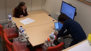
Young children are significantly more likely than adults to have their opinions and decisions influenced by robots, according to new research.
The study, conducted at the University of Plymouth, compared how adults and children respond to an identical task when in the presence of both their peers and humanoid robots.
It showed that while adults regularly have their opinions influenced by peers, something also demonstrated in previous studies, they are largely able to resist being persuaded by robots.
However, children aged between seven and nine were more likely to give the same responses as the robots, even if they were obviously incorrect.
The study used the Asch paradigm, first developed in the 1950s, which asks people to look at a screen showing four lines and say which two matches in length. When alone, people almost never make a mistake but when doing the experiment with others, they tend to follow what others are saying.
When children were alone in the room in this research, they scored 87 per cent on the test, but when the robots join in their score drops to 75 per cent. And of the wrong answers, 74 per cent matched those of the robot.
In their conclusion to the current study, the researchers add:
“A future in which autonomous social robots are used as aids for education professionals or child therapists is not distant. In these applications, the robot is in a position in which the information provided can significantly affect the individuals they interact with. A discussion is required about whether protective measures, such as a regulatory framework, should be in place that minimises the risk to children during social child-robot interaction and what form they might take so as not to adversely affect the promising development of the field.”
Conducted by computer scientist Anna-Lisa Vollmer of the Cluster of Excellence Cognitive Interaction Technology (CITEC) at Bielefeld University as well as her colleagues from Plymouth University (United Kingdom), the Max Planck Institute for Human Development (Berlin) and Ghent University (Belgium), this study appeared on Wednesday (15.08.2018) in the scientific journal "Science Robotics."
The research team used the "conformity experiment" - the experiment psychologist Salomon Asch became known for in the 1950s. The experiment shows just how much a group can influence the opinion of an individual. "The test subjects are tasked with evaluating a visual image, and they hear the incorrect assessment from the others in the group - who are all 'in' on the experiment," explains Anna-Lisa Vollmer, who is a member of Applied Informatics, a research group led by Professor Dr. Britta Wrede that is part of the Faculty of Technology and CITEC.
In this new study, it is not people who are "in" on the experiment, but rather three Nao robots. These humanoid robots are able to speak and gesticulate, and are significantly smaller than adult humans (standing at approximately 60 centimeters). The study was divided into two parts. In the first phase of the experiment, the researchers investigated whether adults adjusted their assessment based on the one put forth by the three robots present. In the second phase, 7-9 year-old children took part in the experiment. The study participants viewed a vertical line on a screen. They had to compare the length of this line with three other lines (A, B, and C), and then say which of these lines was the same length. If the right answer was "B," the robot would, for instance, incorrectly claim that "C" was correct.
The results: "Children give into the social pressure induced by the group of robots," says Anna-Lisa Vollmer. "Adults, on the other hand, withstand this influence, even though they would be influenced by other humans in the same situation."
According to Vollmer, the factors responsible for the Nao robots exerting peer pressure or not have yet to be determined. The size of the Nao robots might be the reason why they were not able to influence the adults in this experiment. "Due to their appearance and size, the Nao robots might be more likely to be perceived as being on the same level by the children." That said, the researchers made effort to compensate for size: in both experiments, the robots' seat level was adjusted to that of the participants.
The current study is pioneering work: "Even though children are considered to be an important user group in the future, it is not really known what influence robots have on children, and how robot behaviour impacts childhood development," says Anna-Lisa Vollmer.
The results of this study are also of practical relevance for the use of humanoid robots. "There are applications in which having influence is advantageous, such as in healthcare or education," says Anna-Lisa Vollmer. "But of course we cannot disregard abuse or erroneous use. For example, how do we deal with a situation in which several robots in a store advertise a product and get a person to buy it even though they would not have done so otherwise? Other risks include cases in which autonomously learning robots draw incorrect conclusions from their sensory data and then go with this to people who trust the robot's assessment," as Vollmer explains.
__________
HUMAN-ROBOT INTERACTION
Children conform, adults resist: A robot group induced peer pressure on normative social conformity
Anna-Lisa Vollmer1, Robin Read, Dries Trippas and Tony Belpaeme
Science Robotics 15 Aug 2018: Vol. 3, Issue 21, eaat7111 DOI: 10.1126/scirobotics.aat7111
Universal Design is the design and composition of an environment so that it can be accessed, understood and used to the greatest extent possible by all people regardless of their age, size, ability or disability. An environment (or any building, product, or service in that environment) should be designed to meet the needs of all people who wish to use it. This is not a special requirement, for the benefit of only a minority of the population. It is a fundamental condition of good design. If an environment is accessible, usable, convenient and a pleasure to use, everyone benefits. By considering the diverse needs and abilities of all throughout the design process, universal design creates products, services and environments that meet peoples' needs. Simply put, universal design is a good design.
The 7 Principles
The 7 Principles of Universal Design were developed in 1997 by a working group of architects, product designers, engineers and environmental design researchers, led by the late Ronald Mace in the North Carolina State University.The purpose of the Principles is to guide the design of environments, products and communications. According to the Center for Universal Design in NCSU, the Principles "may be applied to evaluate existing designs, guide the design process and educate both designers and consumers about the characteristics of more usable products and environments."
The OXO "Good Grips" range of kitchen utensils began with a goal: to produce a vegetable peeler that was easy to hold and use, regardless of strength or manual dexterity. This resulted in OXO applying a universal design approach when designing any of their kitchen products.
The oven is installed on the wall above the counter. When it is opened, the oven floor can be lowered electronically right down to the counter. This makes it very easy to put things into the oven. The floor surface is made of glass ceramics and can also be used as a warming zone.
The 'slide and hide' features of this Constructa-Neff oven enable the door to be tucked away underneath the oven, providing barrier-free access to the oven. The pull-out trays are fully self-supporting, and thus don't require the user to keep a hand on the tray at all times.
The container can be easily opened and closed by simply pressing an extra-large button on the lid. After the container has been opened, the button can also be used as a large simple handle.
Lavabomobile is a washbasin that can be electronically adjusted. Its design makes it convenient for wheelchair users to use as well people of smaller stature, children or anyone wishing to the washbasin while sitting down. It also travels to a higher position to ease access for taller standing users.
The large LCD display makes it easy to read the temperature. The large, flat shape of the probe enables it to be held stably in the armpit. This provides a more usable design for everyone, from small children, who can't sit still, to older people, who may have trouble reading a small display.
The 161x161x32-mm sized m-smart jumbo switch is a highly visible switch for your whole hand or other operation. It is potentially suitable for use in public environments such a seniors' residences, hospitals, kindergartens and rehab centres.
The Emporia TIME mobile phone is designed for people of all ages that works without a standard menu system. Functions, such as texting, are activated by pressing special buttons positioned on the side of the device, which studies show to be most ergonomically suitable.
A perforation on the packaging of this Panasonic battery pack means the batteries are easy to remove. The word "new" is printed on the plastic so that it is easy to tell the old from the new batteries.
Part of the packaging is formed as a flap creating a handle for the small battery. When the flap is broken off, the battery can be removed and easily inserted into the hearing aid. The packages are colour-coded to identify the battery sizes.
The absence of detectable information makes these nontraditional elevator call buttons difficult for first-time users with reduced vision to recognize.
RoDyMan, an acronym for Robotic Dynamic Manipulation, is a five-year research project (2013-2018) funded by the European Research Council to the CREATE Consortium and carried out at PRISMA Lab in the Department of Electrical Engineering and Information Technology of the University of Naples Federico II.
The goal is the development of a service robot able to manipulate elastic and soft objects, which change continuously density and shape, as well as to manipulate objects in a non-prehensile way, i.e. without grasping them.
These robots will be used not only in manufacturing but also as an aid to elderly or disabled people, for medical and surgical use, and in other manual activities.
Preparing a pizza involves an extraordinary level of manual dexterity: for this reason, a pizzaiolo robot has been conceived and a pizza chef has been involved in the project to learn his keen motions directly through a biokinetic sensor suite he wears while stretching the dough, seasoning, tossing and baking on the pizza peel.
It is also a tribute to Naples, at the forefront of technology, robotics and automation, but especially of culture and gastronomy, of which pizza is a symbol and tradition.
Creating a robot able to manipulate objects like humans is one of the most sought and difficult challenges of robotics. It means to replicate skills that are the result of human biological and cultural evolution.
This goal is arduous, mainly for two issues. First, we do not have a total knowledge of human nature, but this is the condition to be able to replicate the human functions in a machine. Second, there are many technical limits to implement a bio-inspired robot, not the least those making it user-friendly, safe and aesthetically appreciated. Source: rodyman.euPrismaLab rodyman
How designers silently tell you what to do? - Affordances and Signifiers
Sometimes, you just look at a thing and know how it works. That's not an accident - it's good design, called affordance, and it can be applied to video games.
Learn how to design game environments so that the environment tells the player what to do. Affordances are a way we can design something in our game so it communicates the way we are supposed to interact with it via it's form. If you take the example of a cup, people intuitively know how to pick it up because the big round handle looks like it can be grasped. We can apply this logic to objects in game design and level design. By constructing their form in a certain way, the player will intuitively know what to do with the object. This is often considered a form of user experience design.
Signifiers are things we add to objects when an affordance is not 100% clear. These signifiers can be words, symbols or other things, but we put them onto objects to hint at an affordance or to flat out tell a user what to do. We can take advantage of these in a similar way we took advantage of affordances by using them to guide the player with more difficult interactions.
There are many situations in games where we leverage affordance when we play. In this video we cover a number of examples and I explain in depth the definition of these terms we have been discussing. We will cover the classic door design example where we design door handles to fit the way a door opens. We also talk about how affordance isn't just for environment design but is applied all over different disciplines of design including combat design. source: Game Design by Gigity McD
In his article Affordance, Conventions and Design, Norman emphasizes the difference between perceived affordance and affordance.[1] Thus, affordance can not be understood as feedback made by system when we are using screen-based equipment and instead it should be explained as something that “provide strong clues to the operations of things”, according to DOET written by Norman[2]. In general, affordance serves as the role that leads users and consumers to think, learn, analyze and interact.
As a representative form of interactive media, video games never lack materials for us to research design principles such as affordances, constraints and conventions.[3]
1.HUD design in video games
When we talk about interactive media, it is inevitable to talk about user interface and user experience. As for video games, a player can not judge the quality of gameplay when he first starts adventure, but he can decide whether the art style is to his liking or not once he sees the title. Jesse Schell in his book The Art of Game Design explicitly explain the hierarchical mental structure of players’ cognition. Even though for designers, mechanism, story, aesthetics and technology are equally important, the first two things players notice are usually aesthetics and mechanism maybe because these two are most easily to be symbolized.[4] So the combination of aesthetics and mechanism should provide players with enough affordances.
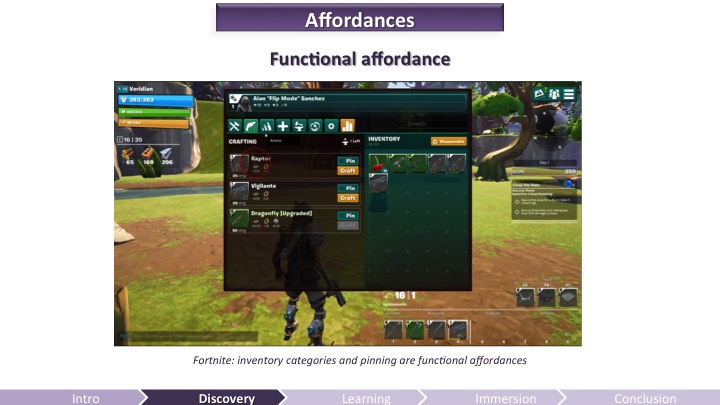
Games, especially the role-playing game, often leave tons of information for players to learn. Obviously, game designers in modern age will not list everything on screen just as their predecessors did. Instead they just place the most important information, such as hit point, mana point and ammunition, on the screen. Actually, the important information presented on screen is called Head Up Display (HUD), which is originally used in military area, describing the parameters shown in cockpit. To keep the HUD interface as concise as possible, one strategy is integrating the information into game contents.
The ammunition design of COD: AW
In Call of Duty: Advanced Warfare, designers cleverly make the ammunition information one part of the guns (the number will move as you move the gun and change view), giving players clear information that it is something related to weapons.
However, this strategy does not make game mechanism clear all the time. Metro 2033 uses the watch to indicate the duration of gas mask. It is really a good idea if players have been familiar with the game mechanism, but the vague and indirect relationship between mask and watch can frustrate new players at first. In contrast, Call of Duty: Black Ops uses the cracks on mask to warn players, which is a more intuitive design.
The watch design of check gas mask is somewhat confusing
2.Map and interactive elements design
It is the responsibility of game designers to tell players what they should and should not do during the gaming process. HUD serves as the instructor of player from beginning to end, but it is not enough for players to do well when they are required to make an immediate response. So designers should leave hints to players.
One thing that designers are good at is using both affordance and constraint to give players instructions. In many action games, players have to manipulate their characters to climb cliffs or trees and jump over chasms. Under such circumstances, designers often mark rocks that can be climbed and restrict characters to access those areas that can not interact with players.
The climbable part in Rise of the Tomb Raider is different from other parts
In Rise of the Tomb Raider, the ice that can be climbed is evidently lighter than the unclimbable part. What’s more, it is a standard design in the whole game, meaning the pattern of climbable part can be understood instinctively by players.
Another common trick used by game designers is setting margin for map with seemingly accessible perspective. I guess every player of Counter-Strike has the experience of fleeing outside the map. A more intricate way is to destroy the environment intentionally in order to force players to move to the next scene, especially in some linear cinematic games. Naughty Dog is the master of using such a strategy. In Uncharted franchise games, players must keep moving to avoid being buried by collapsed houses and cliffs, which in turn destroy the scene and stop characters from going back. This constraint ensures that players can have compact gaming process and have no problem with finding the destination.
3.Thoughts of future game design
Murray in her book Inventing the medium listed four affordances for digital artifacts: encyclopedic, spatial, procedural, and participatory.[5] Intrinsically a computer program, video game itself of course own the four affordances. For example, RTS(Real-Time Strategy) and MOBA(Multiplayer Online Battle Arena) games produce infinite possibilities for players and professional tournaments with bonus of millions of dollars. Compared to legacy media, video game is totally multisequential and interactive.
However, the complexity and flexibility of video game have brought designers a question – how to know what players really like. In traditional media age, users receive information passively, so designers only have to consider the transmission process from one direction and in digital media age, especially during the process of designing HCL system, designers should select the appropriate conventions that human interactors can understand, according to Murray.[5] Modern video game design is based on the mature media like movies and novels and asks designers to consider the balance between mechanism, story, aesthetics and technology. The problem here is that players have different preferences so designers can only accumulate experience by making mistakes to set good conceptual models for most players. A typical example is the failure of No Man’s Sky, whose developers are seduced by new technologies. [5] They create an universe by automatic random algorithm but neglect the importance of level design, thus making the world vapid, sterile and repetitive.
In general, game design is a formidable process and requires developers to correctly construct conceptual model for most players and make clear affordances, constraints and conventions.
References:
[1]Norman, Donald A. “Affordance, conventions, and design.”interactions 6.3 (1999): 38-43.
[2]Norman, Donald A. The design of everyday things: Revised and expanded edition. Basic books, 2013.
[3]Norman,Donald A, “Affordance, Conventions, and Design.” Interactions 6, no. 3 (May 1999): 38-43.
[4]Schell, Jesse. The Art of Game Design: A Book of Lenses. 2nd edition. Natick: A K Peters/CRC Press, 2014. Print
[5]Murray, Janet H. Inventing the medium: principles of interaction design as a cultural practice. Mit Press, 2011.
[6]Stonehouse, Anthony. “User interface design in video games.” Gamasutra. 27 Feb 2014.
[7]Zhang, Jiajie, and Vimla L. Patel. “Distributed cognition, representation, and affordance.” Pragmatics & Cognition 14.2 (2006): 333-341.
Game Developers Conference - GDC 2016 video presentation
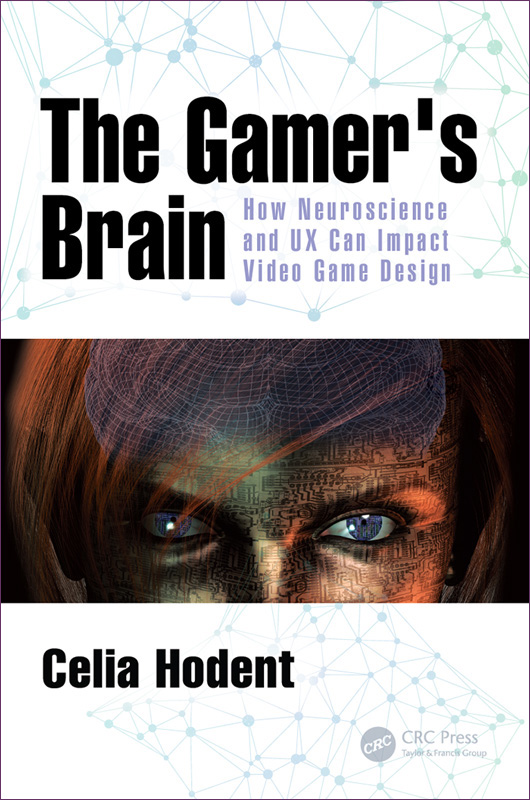
Discovering and mastering a video game is a learning experience for the user. It requires mental efforts. This is why it’s important to understand how the brain learns to craft a compelling onboarding experience – one worth putting effort into, one that will matter to your audience.
Anything the brain processes and learns originates from a perceived input and changes the memory of a subject. The quality of the processing – therefore the quality of the retention – depends highly on the attentional resources applied, which are also dependent on the emotions and motivation felt by the players. In sum, to improve the experience of the players, video game developers must take into account the perception, memory, and attention limitations of the brain, as well as the emotions and motivation felt by the players.
The Gamer's Brain: How Neuroscience and UX can Impact Video Game Design
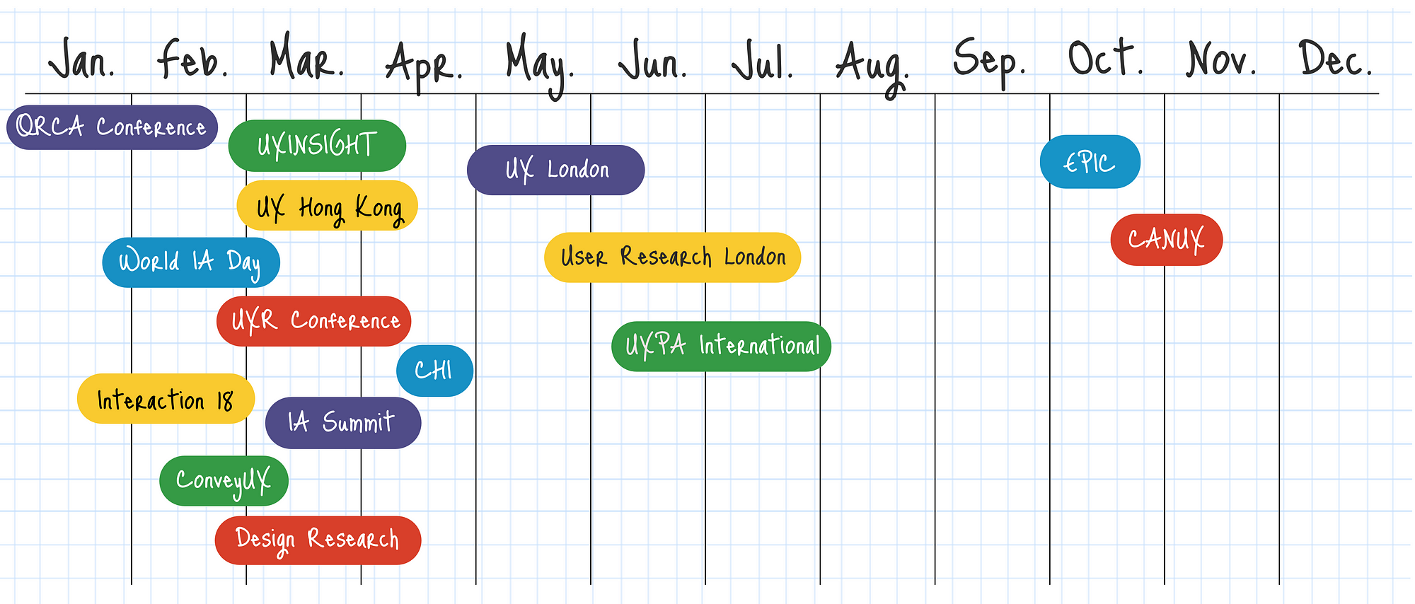
Upcoming UX, Usability, and UI Conferences in 2018
Planning ahead and looking for UX conferences announced for 2018? So far there are 120+ user experience (UX) conferences including design, usability and UI topics announced around the world with many more that we’re tracking waiting to announce their 2018 dates. Find the right conference that meets your needs: focus topics, timing, location or cost.
User Experience is a qualitative metric subject to many factors. It’s an evolving discipline and it’s evident when the forerunner of great user experiences, Apple, humbly tags their iOS Human Interface Guidelines as Beta. Google termed their material design guidelines as a living document which will be updated regularly. One of the pioneers who tried to objectively evaluate the user experience on digital platforms is Jakob Nielsen with his heuristic evaluation. Though they date back to the 90’s, these general rules of thumb are still valid and are used today.
In this article, I attempt to explain these 10 rules in common language with examples:
1. Visibility of System Status 2. Match between system and the real world 3. User Control and Freedom 4. Consistency and Standards 5. Error Prevention 6. Recognition rather than recall 7. Flexibility and Efficiency of use 8. Aesthetic and minimalist design 9. Help users recognize, diagnose, and recover from errors 10. Help and Documentation
GoDaddy’s Help page
Conclusion:
These guidelines are general rules of thumb and will mostly be applicable to any web & mobile application with some exceptions. Always use your judgment to implement these principles or any other UX practices by keeping yourself in end user’s shoes.
A heuristic evaluation should not replace usability testing. Although the heuristics relate to criteria that affect your site’s usability, the issues identified in a heuristic evaluation are different than those found in a usability test.
Advantages
It can provide some quick and relatively inexpensive feedback to designers.
You can obtain feedback early in the design process.
Assigning the correct heuristic can help suggest the best corrective measures to designers.
You can use it together with other usability testing methodologies.
You can conduct usability testing to further examine potential issues.
Disadvantages
It requires knowledge and experience to apply the heuristics effectively.
Trained usability experts are sometimes hard to find and can be expensive.
You should use multiple experts and aggregate their results.
The evaluation may identify more minor issues and fewer major issues.
____
Though many groups have developed heuristics, one of the best-known sources is the set developed by Nielsen’s in 1994. Nielsen refined the list originally developed in 1990 by himself and Rolf Molich. Nielsen’s Heuristics include:
Visibility of system status: The system should always keep users informed about what is going on, through appropriate feedback within reasonable time.
Match between system and the real world: The system should speak the users' language, with words, phrases and concepts familiar to the user, rather than system-oriented terms. Follow real-world conventions, making information appear in a natural and logical order.
User control and freedom: Users often choose system functions by mistake and will need a clearly marked "emergency exit" to leave the unwanted state without having to go through an extended dialogue. Support undo and redo.
Consistency and standards: Users should not have to wonder whether different words, situations, or actions mean the same thing. Follow platform conventions.
Error prevention: Even better than good error messages is a careful design which prevents a problem from occurring in the first place. Either eliminate error-prone conditions or check for them and present users with a confirmation option before they commit to the action.
Recognition rather than recall: Minimize the user's memory load by making objects, actions, and options visible. The user should not have to remember information from one part of the dialogue to another. Instructions for use of the system should be visible or easily retrievable whenever appropriate.
Flexibility and efficiency of use: Accelerators—unseen by the novice user—may often speed up the interaction for the expert user such that the system can cater to both inexperienced and experienced users. Allow users to tailor frequent actions.
Aesthetic and minimalist design: Dialogues should not contain information which is irrelevant or rarely needed. Every extra unit of information in a dialogue competes with the relevant units of information and diminishes their relative visibility.
Help users recognize, diagnose, and recover from errors: Error messages should be expressed in plain language (no codes), precisely indicate the problem, and constructively suggest a solution.
Help and documentation: Even though it is better if the system can be used without documentation, it may be necessary to provide help and documentation. Any such information should be easy to search, focused on the user's task, list concrete steps to be carried out, and not be too large.
Expert Reviews
In an expert review, the reviewers already know and understand the heuristics. Because of this, reviewers do not use a specific set of heuristics. As a result, the expert review tends to be less formal, and they are not required to assign a specific heuristic to each potential problem.
The internet is the modern wild west. With a low barrier to entry and little restrictions, anyone can set up shop and mine for gold — from Zuckerberg to Susan, your neighbour who sells cat-shaped oven mitts on her e-commerce store.
For this reason, the websites, platforms and systems we use online all have a distinctly different look and feel. The freedom of the digital world is what makes the work of a UX designer both exciting and challenging. There is so much room for innovation. Yet, at the same time, the designer must stay focused on maintaining usability for the end-user.
People are creatures of habit. If every website features their scroll bar on the right side of the page, changing it could result in mass confusion — even if the change is objectively “more efficient.” A UX designer must always consider not just what the user wants, but also what they know and expect. There is a fine line between improving the design and confusing the user.
The best designers understand that a balance between standardization and innovation is the key to great user experience.
1. Give Trends Time to Prove Their Worth
Trends come and go. Notice which ones add value and which ones are nothing more than the digital equivalent of shoulder pads.
Using design trends is a way for designers to capitalize on what users already know. However, not all UX trends are created equal. Just because everyone’s doing it, doesn’t mean you should.
Don’t copy bad design just because it has become standard across the web.
2. Remember the Fundamental UX Principles
UX principles are evergreen. Unlike trends, they are the foundation of great user experience design. Empathizing with your user, for example, will never go out of style.
Human psychology is the basis for many of UX’s basic assumptions — after all, we are designing for people. Taking the time to understand and reflect on how the user thinks and acts will help guide powerful design.
3. Emphasize Onboarding and Guidance
The more innovative a product is, the more guidance the user will need. There is a learning curve every time you introduce a new feature or a novel layout. It is the designer’s responsibility to show a user the ropes.
Keep this in mind when you opt for a less familiar format.
4. Apply Insights from Advanced Analytics
Knowing how your users are interacting with your product is essential to understanding and optimizing the success of your product. This is especially true for implementing innovative design patterns.
With so many analytic platforms and even more metrics — ensure you are getting valuable insights by focusing on how rather than who. Heat maps, visual analytics and session recorders give you access to view the user’s actions down to the last click and scroll. Build great UX by paying attention to patterns and intercepting problem areas.
Pinpointing where your user got lost, became frustrated or gave up gives you a huge advantage implementing a solution.
5. Test Usability with Real Users
Usability testing is the best way to get feedback during the design process and ensure your product has great user experience. Conduct sessions in-person, where you can observe body language and ask follow-up questions. Remember, users don’t always understand their own behaviour.
Whether you are improving upon tried and true design standards or creating something entirely new — the way humans interact with your product might surprise you. Come with an open mind, and remember there is always room for growth.
Is it possible for a product to be high-quality and have bad UX? To answer this question about bad user experience, we must first preface it by defining, “a great product.”
Is a great product the same as a successful one? If we measure a product’s greatness by its ubiquity or gross revenue — the answer is yes. There are plenty of everyday items with horrific UX that continue to be in bought and used.
This can occur because there is simply no better substitute, or we have become so accustomed to the concept we no longer notice its inefficiencies.
Consider your keyboard. The symbol placement is far from intuitive — to the point that there is an entire industry of software dedicated to onboarding young users. Yet, it remains the standard.
The vast majority of products with bad UX will not have the far-reaching success of the keyboard, and even then — they will never truly be “great products.”
Truly great products do not have bad UX.
Here is why:
It might serve a purpose, but it doesn’t fulfil its potential
Let’s talk about the standard printer for example — notorious for confusing buttons, erratic behaviours and almost guaranteed user frustration.
It fills a need so people continue to buy it — especially if the alternatives have equally bad UX. However, the gap in usability must be filled with a crutch: heavy customer service, rigorous onboarding or aggressive marketing.
Patching up your product’s UX problem instead of fixing it at the root will quickly run up a tab.
Just ask any company that sells a printer how often their customer service representatives hear about various printing malfunctions.
Simply put, a product with bad UX is a product that could be better. Companies that do not improve UX are missing an opportunity to create a truly great product.
Frustration will turn to user churn
Providing a great user experience is critical for keeping users engaged. A product which causes user frustration will be abandoned — just as soon as something better comes along. Take CDs for example.
Once the go-to means of listening to music, the CD left much to be desired in terms of user experience. They were delicate and easy to break, awkward to store and expensive to collect. This left them vulnerable to user churn as soon as MP3 technology hit the market.
From a business perspective, a product with bad UX is an unstable investment as a competitor could easily improve upon the concept and gain a competitive edge.
UX is constantly evolving
User experience has existed long before the buzzword was coined, and has continued to evolve in many products we use every day. The telephone’s evolution is just one prominent example.
In the age of the customer, growing demands for better user experience has stipulated an influx of more intuitive products and software. This shift marks a turning point where UX is no longer an added bonus, but rather a means for survival.
If you’re wondering why your e-commerce website is not producing the sales you had expected, or why you are not getting the response you had anticipated, there are a whole range of steps you can take to improve your conversion rate.
Making changes that seem small or unnoticeable to you may help potential customers engage better with your site. Often we unknowingly make mistakes that create unnecessary barriers for the potential customers, leaving us bewildered by the lack of sales.
When people are shopping online they are not necessarily looking for you in particular, it’s more likely they are simply searching for a store that best fits their needs. For this reason, it is important for your website to look ‘right’ – it has to look like it will fulfil what the potential customer desires.
According to a research at the Missouri University of Science and Technology, when viewing a website users form first impressions within few milliseconds and their first impressions are highly affected by several design factors like use of colors, typeface and font size, use of images, and easy navigation.
The good news is even if your website has one or more of the below-mentioned problems it’s never too late; in fact, most of these could be rectified within a few hours!
Table Of Content
Buying is Not Easy
Complex Checkout Process
No Competitive Pricing, No Market Research
Lack of Payment Transparency, Hidden Charges
Additional Charges, Additional Dissatisfaction
Overlooking Security Concerns
Lack of Trust Signals Integration
The omission of Established Identity
Not So Social
No Payment Assurance
The absence of Security Certifications and Insignia
Summary: nowadays online checkout processes are too complex and cannot be compared with the real-life cash checkout. But they definitely can be better.
In this article we are going to overview the checkout process on 4 services to understand and “feel” the problem itself. Also, it is the 1st chapter of four that are linked together by one story and goal where I described what I have learned and used to design the completely new checkout process for our SaaS project Fluix.
2nd chapter. You will find out 18 must-do principles of how to design a better experience for your checkout form (or any other form) and dramatically increase the success rate, and decrease the completion time.
Chapters 3 and 4. The complexity behind the new checkout form for Fluix. You’ll learn the relationships and dependencies between fields, their input & visual constraints, and a lot of insights about the way I’ve designed the new checkout form for our SaaS project called Fluix.
Just imagine. Friday night. You’re at one of the coziest restaurants in the city with a panoramic ocean view. Eating your best ever ribeye-steak (or whatever you like the most) mixed with a glass of gorgeous red wine. You feel full, relaxed and peaceful. You ask the waiter for the bill (no, the point is not in the money). And instead of a simple piece of paper with a total price, you get a form with 27 fields that must be filled.
“WHAT?!!” — you will probably ask yourself. And will repeat the same question to the waiter, and then to the manager…
SUCKS! Right?
Let’s rewind, how do we bought everything before all these plastic cards and digital transactions? You just take what you want, give the cash to the seller and… that’s it! Done. Minimum time spent. Minimum actions made.
In an online world, it’s not so easy. At all. Tons of fields, questions, buttons, checkboxes, redirections between the bunch of pages, of services, emails with confirmations, passwords, suggestions of other related (most the time they are not) products, tons of additional options, and God knows what else.
How to become a UX Designer at 40 with no digital or design experience
What is User Experience Design?
User Experience Design is the process of enhancing a persons experience with a product or service and involves an understanding of their behaviour to create a successful design.
Example: A business has an app, they want the sign-up process to have a great User Experience (UX). You have business requirements. You find the engineers (computer programmers) limitations. You research, collaborate with designers and others. You create ideas and prototypes to test. You develop what is the best, test more and iterate on that. That’s UX.
There is a great demand for good UX Designers. If you have no previous digital or design experience don’t panic. I had neither and managed to get into the world of UX. I chose to be a UX Designer because it was creative, in technology and in demand (and I didn’t need to wear a suit to work!). My journey was not easy, I’ve had bumps along the way but I wouldn’t change a thing.
If you are willing to work hard, be patient, and work outside your comfort zone, it’s a really exciting career.
Topics I’ll cover:
Studying UX Design, the tools to learn, your UX portfolio, getting a job, the UX process, how to design, user testing , people you’ll work with and ongoing learning.
1. UX Study On Campus
2. UX Study Online
3. UX Design Tools
4. Prototype Tools
5. The UX Portfolio
6. Getting a UX Job
7. UX Process
8. How to Design
9. User Testing
10. People you’ll work with
11. Ongoing Learning & Staying Inspired
12. Final words
For the 2002 model year, all cars were required to feature a standard glow-in-the-dark trunk-release lever, which opens the compartment from the inside in the event of an emergency.
Perceived Affordance and Metaphorical Signifier
A useful handle that glows in the dark and has an easy to understand symbol.
The particular shape of the plastic handle effectively induces to pull it towards us, to open the liftgate.
A good interface should have the appropriate perceived affordances to make the tasks that can be done with it evident for the user.
Emergency trunk release lever
Children – and sometimes adults for work – trapped in the trunk, can die of suffocation or heat stroke. Once in the trunk, they may not be able to get out.