Visualizzazione post con etichetta usability. Mostra tutti i post

lunedì 29 luglio 2019

Design Critiques

Design Critiques


 design critiques - Pratt Institute


About IXD@Pratt

IXD@Pratt is a collection of articles about User Experience and its related disciplines. The website is maintained by faculty and students at Pratt Institute’s School of Information and all content is written by students, alumni, and faculty associated with the Master of Science in Information Experience Design and User Experience (UX) Advanced Certificate programs.

Pratt Institute, School of Information
144 West 14th Street, 6th Floor
New York, NY 10011-7301

********************
Examples 2019

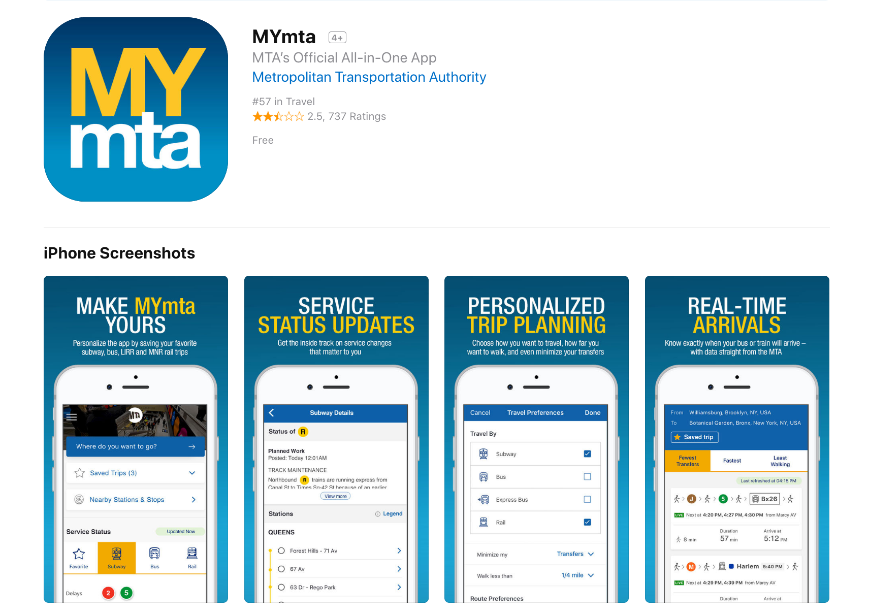
Design Critique: MYmta (iPhone app)

Source: https://itunes.apple.com/us/app/mymta/id1297605670?mt=8

Introduction
The MYmta iPhone app is a travel app designed to provide relevant information related to New York City’s many public transit options: subways, buses, LIRR and Metro-North rail services, and the Access-A-Ride program. The app allows for real-time scheduling and service changes, as well as personalized settings and trip planning, and station accessibility information.


************ 

Design Critique: Netflix (Desktop App)



Fig 1.1 – Before signing into Netflix

Netflix is a major streaming service that allows users to watch TV shows, movies, animations and more. It has so much entertainment that you can never say, there is nothing to watch. In order to use Netflix, the new user could start with a one month free trial (which they can cancel anytime) or subscribe by paying monthly. The app itself is free, which is available in mobile, tablet and desktop versions.


**************** 
Design Critique: Notes (iPhone App)
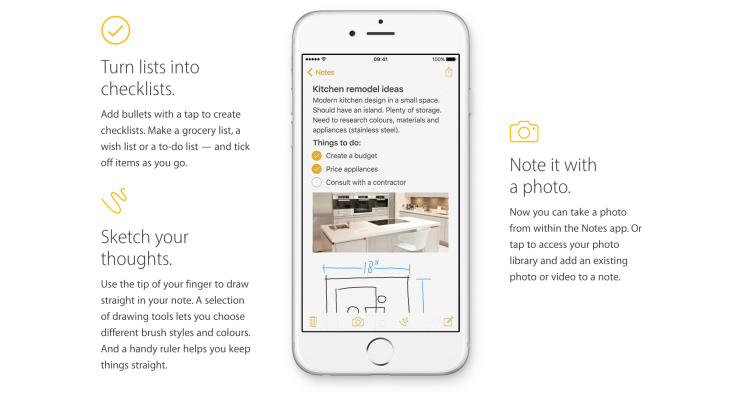


The iOS built-in Notes app empowers users’ note taking capability by providing seamless synchronization feature, supporting multimedia input/insert, and even integrating the sketch feature to simulate the analog note-taking experience. This article would critique the Notes App based on some usability factors mentioned by Don Norman’s book- The Design of Everyday Things.

lunedì 14 maggio 2018

Great UX balancing act: here is why

Great UX balancing act: here is why

by WalkMe Team

The internet is the modern wild west. With a low barrier to entry and little restrictions, anyone can set up shop and mine for gold — from Zuckerberg to Susan, your neighbour who sells cat-shaped oven mitts on her e-commerce store.
For this reason, the websites, platforms and systems we use online all have a distinctly different look and feel. The freedom of the digital world is what makes the work of a UX designer both exciting and challenging. There is so much room for innovation. Yet, at the same time, the designer must stay focused on maintaining usability for the end-user.
People are creatures of habit. If every website features their scroll bar on the right side of the page, changing it could result in mass confusion — even if the change is objectively “more efficient.” A UX designer must always consider not just what the user wants, but also what they know and expect. There is a fine line between improving the design and confusing the user.
The best designers understand that a balance between standardization and innovation is the key to great user experience.


1. Give Trends Time to Prove Their Worth

Trends come and go. Notice which ones add value and which ones are nothing more than the digital equivalent of shoulder pads.
Using design trends is a way for designers to capitalize on what users already know. However, not all UX trends are created equal. Just because everyone’s doing it, doesn’t mean you should.
Don’t copy bad design just because it has become standard across the web.


2. Remember the Fundamental UX Principles

UX principles are evergreen. Unlike trends, they are the foundation of great user experience design. Empathizing with your user, for example, will never go out of style.
Human psychology is the basis for many of UX’s basic assumptions — after all, we are designing for people. Taking the time to understand and reflect on how the user thinks and acts will help guide powerful design.


3. Emphasize Onboarding and Guidance

The more innovative a product is, the more guidance the user will need. There is a learning curve every time you introduce a new feature or a novel layout. It is the designer’s responsibility to show a user the ropes.
Keep this in mind when you opt for a less familiar format.


4. Apply Insights from Advanced Analytics

Knowing how your users are interacting with your product is essential to understanding and optimizing the success of your product. This is especially true for implementing innovative design patterns.
With so many analytic platforms and even more metrics — ensure you are getting valuable insights by focusing on how rather than who. Heat maps, visual analytics and session recorders give you access to view the user’s actions down to the last click and scroll. Build great UX by paying attention to patterns and intercepting problem areas.
Pinpointing where your user got lost, became frustrated or gave up gives you a huge advantage implementing a solution.


5. Test Usability with Real Users

Usability testing is the best way to get feedback during the design process and ensure your product has great user experience. Conduct sessions in-person, where you can observe body language and ask follow-up questions. Remember, users don’t always understand their own behaviour.
Whether you are improving upon tried and true design standards or creating something entirely new — the way humans interact with your product might surprise you. Come with an open mind, and remember there is always room for growth.

by WalkMe Team

lunedì 23 aprile 2018

30 Reasons Why People Don’t Buy From Your Website and How To Fix It

30 Reasons Why People Don’t Buy From Your Website and How To Fix It


If you’re wondering why your e-commerce website is not producing the sales you had expected, or why you are not getting the response you had anticipated, there are a whole range of steps you can take to improve your conversion rate.

Making changes that seem small or unnoticeable to you may help potential customers engage better with your site. Often we unknowingly make mistakes that create unnecessary barriers for the potential customers, leaving us bewildered by the lack of sales.

When people are shopping online they are not necessarily looking for you in particular, it’s more likely they are simply searching for a store that best fits their needs. For this reason, it is important for your website to look ‘right’ – it has to look like it will fulfil what the potential customer desires.

According to a research at the Missouri University of Science and Technology, when viewing a website users form first impressions within few milliseconds and their first impressions are highly affected by several design factors like use of colors, typeface and font size, use of images, and easy navigation.

The good news is even if your website has one or more of the below-mentioned problems it’s never too late; in fact, most of these could be rectified within a few hours!

Table Of Content
  • Buying is Not Easy
  • Complex Checkout Process
  • No Competitive Pricing, No Market Research
  • Lack of Payment Transparency, Hidden Charges
  • Additional Charges, Additional Dissatisfaction
  • Overlooking Security Concerns
  • Lack of Trust Signals Integration
  • The omission of Established Identity
  • Not So Social
  • No Payment Assurance
  • The absence of Security Certifications and Insignia
  • No Purchase Guarantee
  • Excessive Security Measures
  • Insufficient Product Details
  • Poor Discoverability
  • No Persuasive Sales Copy
  • No Incentives to Encourage Revisit
  • Product-Market Misfit
  • Too Much Irrelevant Product Choices
  • Unprofessional Web Design
  • Dated Design Layouts
  • Poor User Experience
  • Website Crashing, Timeout Error
  • Non-responsive Website
  • Time Stands Still
  • Website Needs Pest Control (Bug Fixes)
  • Sudden Pop-ups
  • No Top-notch Search Function
  • Delivery Options and Coverage
  • Logistics Credentials


Let’s take a look at a few examples ↪

sabato 3 marzo 2018

Why don't users read manuals?

Why don't users read manuals?

Why people don't read manuals?

Why don't users read instructions?
Why don’t users read instructions?

User’s Fault
Most people are lazy.
They assume most of it can be figured out by using common sense.
They assume they know how to use things and don’t have time to read complicated instructions.
Some people learn best when given spoken directions rather than reading.
Some people learn best by watching and imitating.


Not The User's Fault
Instructions are often tedious to read and poorly written.
The manual is written in another language.
Often written by the engineers who designed the product and by lawyers for the manufacturer, the manuals are usually not written with the consumer in mind, even when the manuals are easy to understand, they may not be entertaining enough for today's consumer, especially younger ones who have grown up with the fast-paced world.
Learning styles
Learning by doing

The Paradox of Active Users

Usability - Principles of design for users

Principles of design for users:


Affordance
Affordances define what actions are possible between an object/service and a person.

Consistency
Design interfaces to have similar operations and use similar elements for similar tasks.
Enable people to transfer prior knowledge to new contexts and learn new things quickly.

Constraint
A method of limiting the actions with restrictions so that the system can never enter into an invalid state.

Feedback
Clearly and immediate confirmation that an action has been performed successfully.

Mapping
A relationship between controls and their movements or effects. A good mapping between controls and their effects results in greater ease of use.

Signifier
Signifiers are signs, perceptible signals of what can be done. These signs tell you about the possible actions; what to do, and where to do it.

Visibility
The usability of a system is improved when its status and methods of use are clearly visible.

How to write usable manuals


How to write usable manuals
Components of well-designed manuals:    
A separate quick-start booklet.
Table of contents and index required. 
Glossaries for clarifying technical terms. 
Appendices for error messages.
Divide the document into sections.
Match the procedures to tasks. Group similar tasks into the same chapter.
Organize chapters so that frequent tasks come before infrequent tasks.
If you need both task-based instructions and reference material, divide the document into two sections. The first section is a user guide. The second section is a reference manual. 

Pdf document "People don't read manuals"


lunedì 1 gennaio 2018

5 Things Everyone Should Know About UX Work

5 Things Everyone Should Know About UX Work


The howls of frustration that we hear on many UX projects are often to do with how badly misunderstood the UX role is in business. Here are 5 things that everyone should know about UX work:

1. UX Research is Essential

The first barrier to many a UX project is people in the company who think they already know the customer inside out.

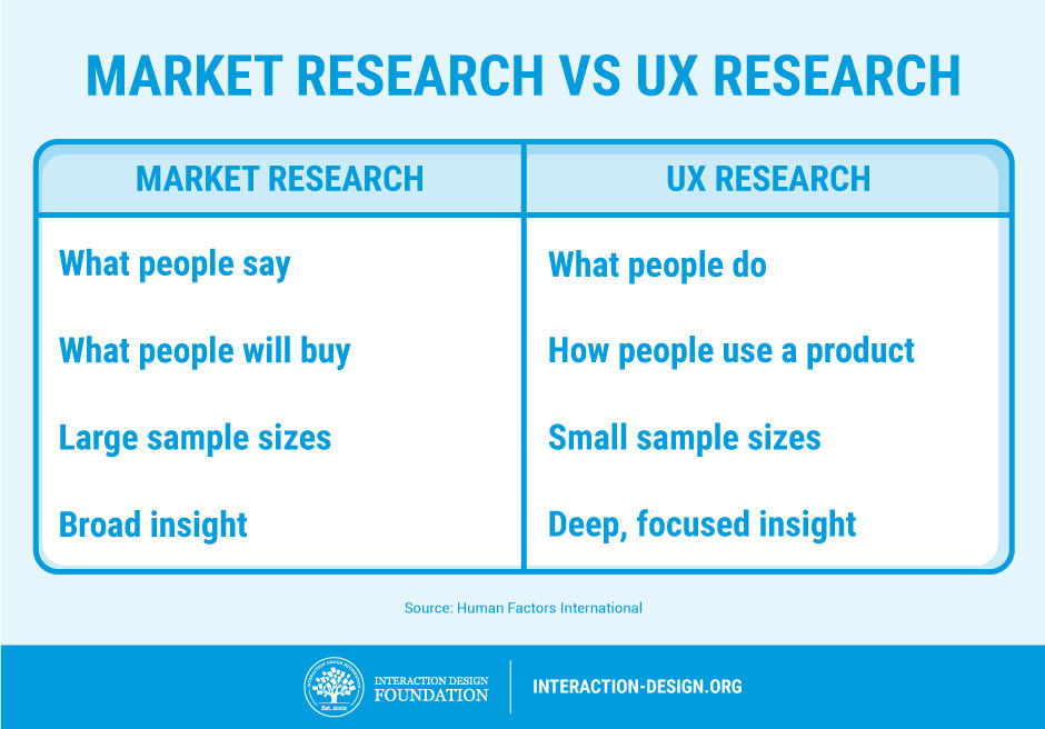
“We’ve done plenty of market research, just tell us what you need to know and we’ll tell you,” comes the offer of many a helpful marketing manager or project manager. In reality, we don’t care about their market research—we need to talk to users to build up a profile in relationship to the use of the product and not how they interact with the company in general. Market research is about broad trends in customers and what they are likely to buy; UX research is about individual behaviours of users when they use a product. These are different things, and without talking to users, we can’t know how they see the product or develop one of those lovely user personas that we need.


2. UX Work Tends to Be Iterative

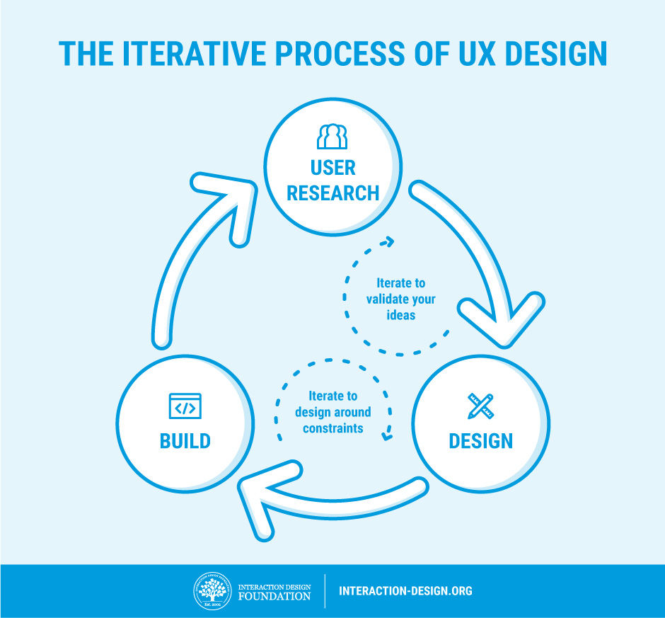
While it doesn’t look like we’ve done all that much since the last time you popped your head round the door, in truth, we’re 5 versions farther along the lines towards a product our customers will like. To make great products, we make lots of changes and test them. Then we bury the changes that don’t make enough of a difference. We keep doing this until we finally have a product that’s substantially better than either our last one or the competitor’s offerings. It takes time, and it’s not exciting to look at from outside our labs, but it’s also very much necessary.


3. We Can’t Show You a “Process”

We warn against treating UX work as a “one size fits all” process. Sadly, this behaviour can alienate some clients, and in some cases, clients might even demand this from the outset.

“Show us your process and we’ll tell you how it fits in with our product,” they might claim.

You need to step back and explain that each process should be somewhat unique, as each product is somewhat unique and as each user base is also somewhat unique. Your clients don’t want a standard process really; they just think they do and you may have to wean them off the idea.


4. Yes, We Have to Test

If you want products that users love, then we have to test them. Sure, we UX folks are experts in our field, but we’re not your users. Our job is to refine ideas to the point that we can hand them over to your users to tell is if we got it right or not. This may be time consuming, but it’s the only assurance you have that we’re really moving in the right direction too.


5. UX is More than Usability

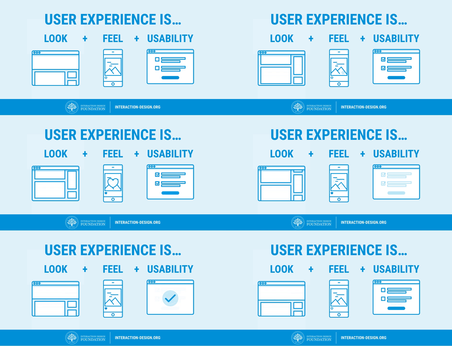
Usability is important, but the user experience is more than usability. We like how Apple has managed to get usability on the strategic radar, but usability alone is not enough. Usability is the bare minimum requirement of a product that is released; UX includes everything else that makes the difference between “it works” and “it wows!”

source: Interaction Design Foundation