Visualizzazione post con etichetta UX. Mostra tutti i post

giovedì 7 gennaio 2021

2021 - UX conferences and workshops

 2021 - UX conferences and workshops 

uxagenda


Search for an event


uiuxtrend


UXLx Masters 2021 (Online)
February 10 - February 12
Online
€295

World Class Designers Conference 2021 (Online)
February 18 - February 19
Online
USD200

UXRConf Anywhere 2021 (Online)
February 24 - February 26
Online
USD99

The UX Conference 2021 (Online)
March 1 - March 2
Online
£29

UXDX APAC Conference 2021 (Online)
March 4 - March 5
Online

Canvas Conference 2021 (Online)
March 15 - March 18
Online
£149

UX Copenhagen 2021 (Online)
March 25 - March 26
Online
USD815

UX Days Tokyo 2020 (Tokyo, Japan)
March 26 - March 28
Tosho Grand Hall, Marunouchi Nijubashi Building, 3 Chome-2-2 Marunouchi, Chiyoda-ku 
Tokyo, 100-0005 Japan + Google Map
JPY53784

UX Istanbul 2021 (Online)
April 6 - April 9
Online
850Turkish lira 

Information Architecture Conference 2021 (Online)
April 28 - April 30
Online

UX London 2020 (London, UK)
May 1 - May 3
Trinity Laban, Laban Theatre 30 Creekside 
London, SE8 3DW United Kingdom + Google Map
£1350

From Business to Buttons 2021 (Stockholm, Sweden)
May 5 - May 7
Cirkus Arena & Restaurang, Djurgårdsslätten 43-45 
Stockholm, 115 21 Sweden + Google Map
€799

Confab 2021 (Online)
May 5 - May 7
Online
USD995

CHI 2021 (Yokohama, Japan / Online)
May 8 - May 13
Yokoma 
Online

Graphics Interface 2021 (Online)
May 27 - May 28
Online

Interact London 2021 (London, United Kingdom)
October 14
The Natural History Museum, Cromwell Road 
London, SW7 5BD United Kingdom + Google Map
£229.36

domenica 19 gennaio 2020

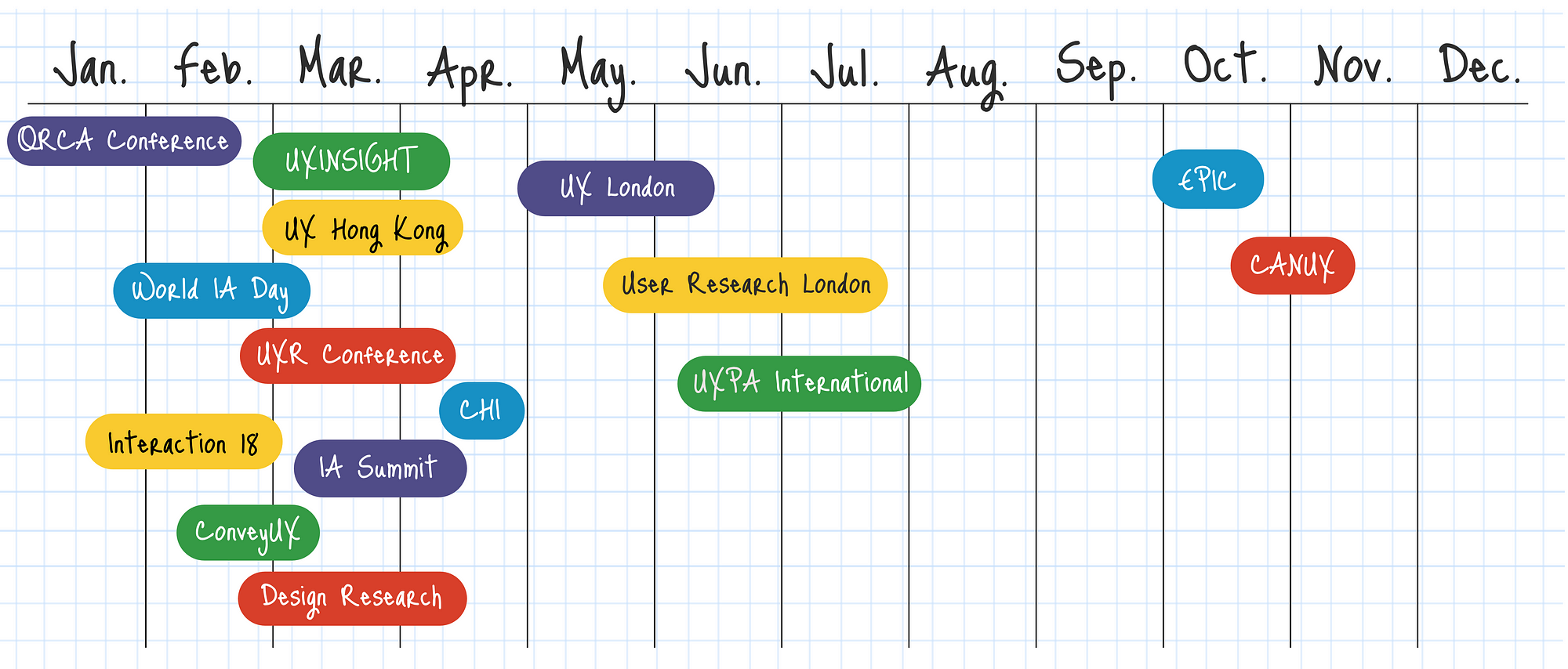
The best UX and design events in 2020

The best UX and design events in 2020

A comprehensive list for designers who are looking for design events, meetups, and conferences to attend this year.

Alert: due to the COVID-19 pandemic, most events have been canceled or shifted to remote. Check the organizer's website to get the latest updates.

January

Group
January 6-8, 2020 ✈ Sanibel Island, Florida, United States

In/Visible Talks
January 16, 2020 ✈ San Francisco, California, United States

DesignTO
January 17-26, 2020 ✈ Toronto, Canada

UXCamp DC
January 18, 2020 ✈ Washington DC, United States

Awwwards Conference Tokyo
January 23-24, 2020 ✈ Tokyo, Chiyoda, Japan

New Adventures
January 23, 2020 ✈ Nottingham, United Kingdom

International Conference on MSIVISM
January 29-31, 2020 ✈ Las Palmas de Gran Canaria, Spain

February

Chief Customer Officers
February 5-6, 2020 ✈ Atlanta, Georgia, United States

Pause Fest
February 5-7, 2020 ✈ Melbourne, Australia

Interaction 20
February 7-20, 2020 ✈ Milan, Italy

Outcome
February 8, 2020 ✈ Chandigarh, India

TEI: International Conference on Tangible, Embedded, and Embodied Interaction
February 9-13, 2020 ✈ Sydney, Australia

Australian Accessibility Conference
February 11-13, 2020 ✈ Victoria Park, Australia

UXistanbul Conference
February 18, 2020 ✈ Istanbul, Turkey

Awwwards Conference
February 20-21, 2020 ✈ Amsterdam, Netherlands

User Experience Hong Kong
“With recent disruptive events in Hong Kong this conference is on hold but we hope to announce some supporting events in 2020" ✈ Hong Kong, China

UXI Live
February 23-24, 2020 ✈ Rishon Lezion, Israel

ProfsoUX
February 28, 2020 ✈ St. Petersburg, Russia

Interaction Design Education Summit
February 29-March 1, 2020 ✈ Milan, Italy


March

The UX Conference
March 2-3, 2020 ✈ London, England

ConveyUX
March 3-5, 2020 ✈ Seattle, Washington, United States

Service Design in Government
March 4-6, 2020 ✈ Edinburgh, Scotland

Leading Design
March 4-6, 2020 ✈ San Francisco, California, United States

International Conference on SETECEC
March 10-13, 2020 ✈ Venice, Italy

NO/BS Conference
March 11-12, 2020 ✈ Melbourne, Australia

Deliver Conference
March 12, 2020 ✈ Manchester, United Kingdom

SXSW
March 13-22, 2020 ✈ Austin, Texas, United States

CHIIR
March 14-18, 2020 ✈ Vancouver, Canada

Booster Conference
March 18-20, 2020 ✈ Bergen, Norway

Design Research
March 18-20, 2020 ✈ Melbourne, Australia

Perth UX Camp
March 19-20, 2020 ✈ Perth, Australia

Ignite UX
March 24, 2020 ✈ Ann Arbor, Michigan, United States

Advancing Research
March 30-April 1, 2020 ✈ New York City, New York, United States

UX Copenhagen
March 30-31, 2020 ✈ Copenhagen, Denmark

AIGA Design Conference
March 30-April 1, 2020 ✈ Pittsburgh, Pennsylvania, United States

April

UIArchConf
April 1-3, 2020 ✈ New Orleans, Louisiana, United States

Creative South
April 2-4, 2020 ✈ Columbus, Georgia, United States

Offset
April 3-5, 2020 ✈ Dublin, Ireland

UX Insight
April 6-8, 2020 ✈ Breda, The Netherlands

University of Illinois Web Conference
April 8-9, 2020 ✈ Champaign-Urbana, Illinois, United States

UX Days Tokyo
April 10, 2020 ✈ Tokyo, Japan

An Event Apart
April 13-15, 2020 ✈ Washington DC, United States

Digital Thinking
April 14–17, 2020 ✈ Austin, Texas, United States

Health Experience Design Conference
April 14-15, 2020 ✈ Boston, Massachusetts, United States

IAC Information Architecture Conference
April 14-18, 2020 ✈ New Orleans, Louisiana, United States

Customer Experience Strategies Summit
April 16-17, 2020 ✈ Toronto, Canada

UX STRAT
April 20-21, 2020 ✈ Singapore

SmashingConf
April 21-22, 2020 ✈ San Francisco, California, United States

UX Healthcare
April 22-24, 2020 ✈ London, United Kingdom

OFFF
April 23-25, 2020 ✈ Barcelona, Spain

CHI
April 25-30, 2020 ✈ Honolulu, Hawaii, United States

Beyond Tellerrand
April 27-29, 2020 ✈ Düsseldorf, Germany

Ergonomics & Human Factors
April 27-29, 2020 ✈ Stratford, United Kingdom

May

Pixel Up
May 4-6, 2020 ✈ Cape Town, South Africa

From Business to Buttons
May 6-8, 2020 ✈ Stockholm, Sweden

An Event Apart
May 11-13, 2020 ✈ Seattle, Washington, United States

Camp Digital
May 13, 2020 ✈ Manchester, United Kingdom

GamesUR
May 14, 2020 ✈ Montreal, Canada

UXConf BR
May 15-16, 2020 ✈ Porto Alegre, Brazil

UX Salon
May 17-18, 2020 ✈ Tel Aviv, Israel

Confab
May 17-20, 2020 ✈ Minneapolis, Minnesota, United States

UXLx User Experience Lisbon
May 19-22, 2020 ✈ Lisbon, Portugal

ACE!
May 20-22, 2020 ✈ Kraków, Poland

Digital Health and Care Congress
May 20-21, 2020 ✈ London, United Kingdom

Ecommerce Design Summit
May 20-21, 2020 ✈ London, United Kingdom

UX London
May 27-29, 2020 ✈ London, United Kingdom

DesignOps Global Conference
May 28-29, 2020 ✈ Manchester, United Kingdom

Front UX & Product Management
May 28-29, 2020 ✈ Salt Lake City, Utah, United States

UX Camp Europe
May 30-31, 2020 ✈ Berlin, Germany


June

POLISHOPA Design Thinking Conference
June 1-4, 2020 ✈ Bydgoszcz, Poland

Fluxible
June 1-7, 2020 ✈ Ontario, Canada

UX Research Conference
June 3-5, 2020 ✈ Toronto, Canada

99U
June 3-5, 2020 ✈ New York City, New York, United States

By Design
June 6, 2020 ✈ Bratislava, Slovakia

SmashingConf
June 9-10, 2020 ✈ Austin, Texas, United States

Enterprise Experience
June 10-12, 2020 ✈ San Francisco, California, United States

UX Scotland
June 10-12, 2020 ✈ Edinburgh, Scotland

Experience Fighters
June 10-11, 2020 ✈ Madrid, Spain

Pixel Pioneers Bristol
June 12, 2020 ✈ Bristol, United Kingdom

IMX Interactive Media Experiences
June 17-19, 2020 ✈ Barcelona, Spain

The Next Web
June 18-19, 2020 ✈ Amsterdam, Netherlands

UXPA
June 23-25, 2020 ✈ Baltimore, Maryland, United States

UX Healthcare
June 24-26, 2020 ✈ Amsterdam, Netherlands

User Research London
June 26, 2020 ✈ London, United Kingdom

An Event Apart
June 29-July 1, 2020 ✈ Boston, Massachusetts, United States

UX STRAT
June 29-July 1, 2020 ✈ Amsterdam, Netherlands

July

HCI International
July 19-24, 2020 ✈ Copenhagen, Denmark

UX Research & Insights Summit
July 21-23, 2020 ✈ Boston, Massachusetts, United States

August

An Event Apart
August 17-19, 2020 ✈ Minneapolis, Minnesota, United States

Beyond Tellerrand
August 24-27, 2020 ✈ Berlin, Germany

UX Australia
August 25-28, 2020 ✈ Melbourne, Australia

September

SmashingConf
September 7-8, 2020 ✈ Freiburg, Germany

UX Healthcare
September 17-18, 2020 ✈ Frankfurt, Germany

Design Matters
September 23-24, 2020 ✈ Copenhagen, Denmark

October

An Event Apart
October 5-7, 2020 ✈ Orlando, Florida, United States

MobileHCI
October 5-8, 2020 ✈ Oldenburg, Germany

Canvas Conference
October 8, 2020 ✈ Birmingham, United Kingdom

UXDX Conference
October 8-9, 2020 ✈ Dublin, Ireland

UX-DAY
October 14-16, 2020 ✈ Mannheim, Germany

Amuse UX Conference
October 16, 2020 ✈ Budapest, Hungary

Smashing Conference
October 20-21, 2020 ✈ New York City, New York, United States

World Usability Congress
October 20-21, 2020 ✈ Graz, Austria

Interaction Latin America
To be confirmed, 2020 ✈ San Jose, Costa Rica

November

Beyond Tellerrand
November 2-4, 2020 ✈ Munich, Germany

Web Summit
November 2-5, 2020 ✈ Lisbon, Portugal

December

An Event Apart
December 14-16, 2020 ✈ San Francisco, California, United States

lunedì 29 luglio 2019

Design Critiques

Design Critiques


 design critiques - Pratt Institute


About IXD@Pratt

IXD@Pratt is a collection of articles about User Experience and its related disciplines. The website is maintained by faculty and students at Pratt Institute’s School of Information and all content is written by students, alumni, and faculty associated with the Master of Science in Information Experience Design and User Experience (UX) Advanced Certificate programs.

Pratt Institute, School of Information
144 West 14th Street, 6th Floor
New York, NY 10011-7301

********************
Examples 2019

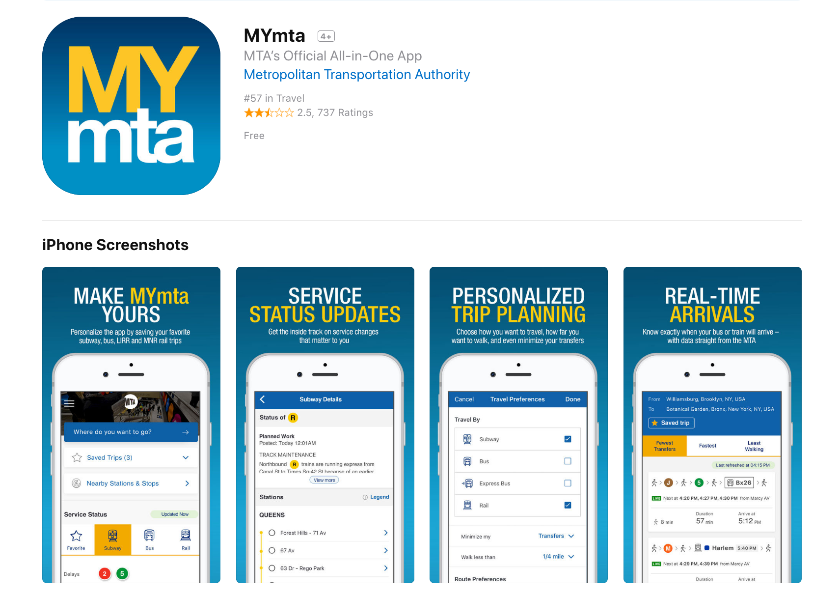
Design Critique: MYmta (iPhone app)

Source: https://itunes.apple.com/us/app/mymta/id1297605670?mt=8

Introduction
The MYmta iPhone app is a travel app designed to provide relevant information related to New York City’s many public transit options: subways, buses, LIRR and Metro-North rail services, and the Access-A-Ride program. The app allows for real-time scheduling and service changes, as well as personalized settings and trip planning, and station accessibility information.


************ 

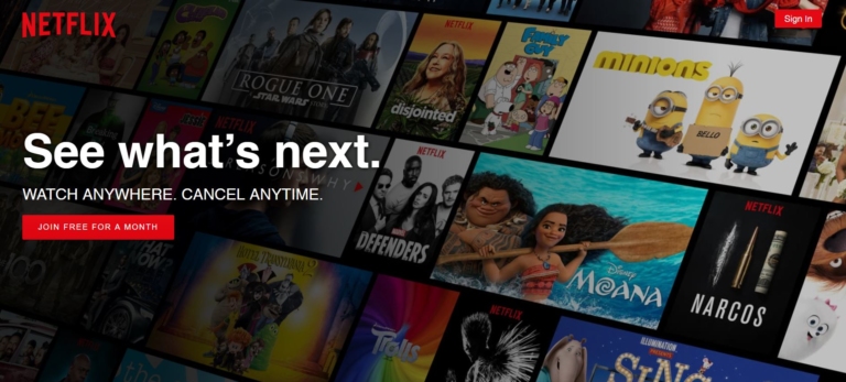
Design Critique: Netflix (Desktop App)


Fig 1.1 – Before signing into Netflix

Netflix is a major streaming service that allows users to watch TV shows, movies, animations and more. It has so much entertainment that you can never say, there is nothing to watch. In order to use Netflix, the new user could start with a one month free trial (which they can cancel anytime) or subscribe by paying monthly. The app itself is free, which is available in mobile, tablet and desktop versions.


**************** 
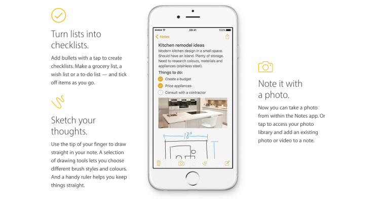
Design Critique: Notes (iPhone App)


The iOS built-in Notes app empowers users’ note taking capability by providing seamless synchronization feature, supporting multimedia input/insert, and even integrating the sketch feature to simulate the analog note-taking experience. This article would critique the Notes App based on some usability factors mentioned by Don Norman’s book- The Design of Everyday Things.

lunedì 27 maggio 2019

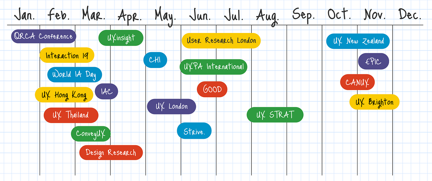
Best Conferences for UX Researchers 2019

Best Conferences for UX Researchers 2019

by Ania Mastalerz

Conferences for UX Researchers 2019

Upcoming UX, Usability, and UI Conferences in 2019

Looking to update your knowledge and connect with other professionals at UX Conferences in 2019? Here’s the list so far for UX Conferences including user experience, design, usability and UI topics announced around the world with many more that we’re tracking waiting to announce their 2019 dates. Find the right conference that meets your needs: focus topics, timing, location or cost. 

lunedì 24 dicembre 2018

FREE WIREFRAME KIT

Free Wireframe Kit

by AlterSpark Corp.


Download PDF (need Email)

Mini prototyping templates (8.5 x 11)
We use the Digital Psychology Wireframe Kit to help our students develop their skills in applying behavioral science strategies to a wide range of interactive media.
After rearchitecting our wireframe kit in 2017, our students and friends started asking for a copy.
To share the love with the wider community of digital media pros, here's a copy of our smaller 8.5 x 11 wireframe kit, under a flexible creative commons license.

About the wireframe kit
Paper is the ultimate wireframing tool for building quick concept mockups and prototypes, with full creative freedom.
We use the oversized version of the wireframe kit in our digital psychology training, where we focus on applying psychology to various interactive design, UX and marketing applications.
Since our focus is on creative concepts, rather than pixel-perfect specifications, the kit provides ballpark dimensions across a wide range of popular devices, for websites, apps, wearables, advertising and more.
This wireframe kit does not include our training system; only device specifications.


Prototype specifications
Our grid system is inspired by the Bootstrap CSS system and uses a format that is convenient for adaptive or responsive breakpoints, at 3, 4, or 6 column divisions.
The grid is 1,200 pixels wide, divided into 12 columns, with dark gridlines every 100 pixels, each with 10 light gridlines, each at 10 pixels. This is a rough approximation of the sizes typically used in grid systems, with some smaller and others larger.
Our prototype wireframe specifications follow the proportions of popular products, such as the iPhone 8, iPad Air, and Apple Watch Series 3.
Our Facebook ad templates are based on 1200x1200 and 1200x628 pixels, which are common image dimensions used across various social media ad platforms.
Our banner ad templates are based on the most common display advertising formats used in Google's adaptive ads and AdRoll’s remarketing banners.


FREE to use, under Creative Commons
This 8.5 x 11 wireframe kit is distributed for free, under Creative Commons License Attribution-Share Alike 4.0 International (CC BY-SA 4.0). If you distribute any variations, please respect our licensing and show your love by crediting us with a link to: https://www.alterspark.com. To view the license, visit: http://creativecommons.org/licenses/by-sa/4.0/.


Stay in touch
If you have any suggestions on how we can make it better, get in touch by email team@alterspark.com or visit us online at: https://www.alterspark.com.

Gallery of wireframe prototypes


_____________ 

Walking You Through The Audience-Influence Model

Download PDF (need Email)

In “Walking You Through the Audience-Influence Model”, you'll learn the essentials of digital psychology in an intuitive and visual mini-publication. You'll also enjoy templates, worksheets and research questions that you can implement immediately.

lunedì 11 giugno 2018

Best Conferences for UX Researchers 2018

Best Conferences for UX Researchers 2018

by Ania Mastalerz

Conferences for UX Researchers 2018
_______________


120+ Upcoming UX, Usability, and UI Conferences in 2018
Upcoming UX, Usability, and UI Conferences in 2018

Planning ahead and looking for UX conferences announced for 2018? So far there are 120+ user experience (UX) conferences including design, usability and UI topics announced around the world with many more that we’re tracking waiting to announce their 2018 dates. Find the right conference that meets your needs: focus topics, timing, location or cost.

lunedì 28 maggio 2018

10 Usability Heuristics with Examples

10 Usability Heuristics with Examples

by SaiChandan Duggirala
Imaginary design by Icons8 to improve the User Experience of a Boarding pass.
User Experience is a qualitative metric subject to many factors. It’s an evolving discipline and it’s evident when the forerunner of great user experiences, Apple, humbly tags their iOS Human Interface Guidelines as Beta. Google termed their material design guidelines as a living document which will be updated regularly. One of the pioneers who tried to objectively evaluate the user experience on digital platforms is Jakob Nielsen with his heuristic evaluation. Though they date back to the 90’s, these general rules of thumb are still valid and are used today.
In this article, I attempt to explain these 10 rules in common language with examples:

1. Visibility of System Status
2. Match between system and the real world
3. User Control and Freedom
4. Consistency and Standards
5. Error Prevention
6. Recognition rather than recall
7. Flexibility and Efficiency of use
8. Aesthetic and minimalist design
9. Help users recognize, diagnose, and recover from errors
10. Help and Documentation

GoDaddy’s Help page

Conclusion:
These guidelines are general rules of thumb and will mostly be applicable to any web & mobile application with some exceptions. Always use your judgment to implement these principles or any other UX practices by keeping yourself in end user’s shoes.
_____ 

Heuristic Evaluations and Expert Reviews

Advantages and Disadvantages of Heuristics

A heuristic evaluation should not replace usability testing. Although the heuristics relate to criteria that affect your site’s usability, the issues identified in a heuristic evaluation are different than those found in a usability test.


         Advantages

  • It can provide some quick and relatively inexpensive feedback to designers.
  • You can obtain feedback early in the design process.
  • Assigning the correct heuristic can help suggest the best corrective measures to designers.
  • You can use it together with other usability testing methodologies.
  • You can conduct usability testing to further examine potential issues.

         Disadvantages

  • It requires knowledge and experience to apply the heuristics effectively.
  • Trained usability experts are sometimes hard to find and can be expensive.
  • You should use multiple experts and aggregate their results.
  • The evaluation may identify more minor issues and fewer major issues.

____

Though many groups have developed heuristics, one of the best-known sources is the set developed by Nielsen’s in 1994.  Nielsen refined the list originally developed in 1990 by himself and Rolf Molich.  Nielsen’s Heuristics include:

  • Visibility of system status: The system should always keep users informed about what is going on, through appropriate feedback within reasonable time.
  • Match between system and the real world: The system should speak the users' language, with words, phrases and concepts familiar to the user, rather than system-oriented terms. Follow real-world conventions, making information appear in a natural and logical order.
  • User control and freedom: Users often choose system functions by mistake and will need a clearly marked "emergency exit" to leave the unwanted state without having to go through an extended dialogue. Support undo and redo.
  • Consistency and standards: Users should not have to wonder whether different words, situations, or actions mean the same thing. Follow platform conventions.
  • Error prevention: Even better than good error messages is a careful design which prevents a problem from occurring in the first place. Either eliminate error-prone conditions or check for them and present users with a confirmation option before they commit to the action.
  • Recognition rather than recall: Minimize the user's memory load by making objects, actions, and options visible. The user should not have to remember information from one part of the dialogue to another. Instructions for use of the system should be visible or easily retrievable whenever appropriate.
  • Flexibility and efficiency of use: Accelerators—unseen by the novice user—may often speed up the interaction for the expert user such that the system can cater to both inexperienced and experienced users. Allow users to tailor frequent actions.
  • Aesthetic and minimalist design: Dialogues should not contain information which is irrelevant or rarely needed. Every extra unit of information in a dialogue competes with the relevant units of information and diminishes their relative visibility.
  • Help users recognize, diagnose, and recover from errors: Error messages should be expressed in plain language (no codes), precisely indicate the problem, and constructively suggest a solution.
  • Help and documentation: Even though it is better if the system can be used without documentation, it may be necessary to provide help and documentation. Any such information should be easy to search, focused on the user's task, list concrete steps to be carried out, and not be too large.

Expert Reviews

In an expert review, the reviewers already know and understand the heuristics. Because of this, reviewers do not use a specific set of heuristics. As a result, the expert review tends to be less formal, and they are not required to assign a specific heuristic to each potential problem.

lunedì 14 maggio 2018

Great UX balancing act: here is why

Great UX balancing act: here is why

by WalkMe Team

The internet is the modern wild west. With a low barrier to entry and little restrictions, anyone can set up shop and mine for gold — from Zuckerberg to Susan, your neighbour who sells cat-shaped oven mitts on her e-commerce store.
For this reason, the websites, platforms and systems we use online all have a distinctly different look and feel. The freedom of the digital world is what makes the work of a UX designer both exciting and challenging. There is so much room for innovation. Yet, at the same time, the designer must stay focused on maintaining usability for the end-user.
People are creatures of habit. If every website features their scroll bar on the right side of the page, changing it could result in mass confusion — even if the change is objectively “more efficient.” A UX designer must always consider not just what the user wants, but also what they know and expect. There is a fine line between improving the design and confusing the user.
The best designers understand that a balance between standardization and innovation is the key to great user experience.


1. Give Trends Time to Prove Their Worth

Trends come and go. Notice which ones add value and which ones are nothing more than the digital equivalent of shoulder pads.
Using design trends is a way for designers to capitalize on what users already know. However, not all UX trends are created equal. Just because everyone’s doing it, doesn’t mean you should.
Don’t copy bad design just because it has become standard across the web.


2. Remember the Fundamental UX Principles

UX principles are evergreen. Unlike trends, they are the foundation of great user experience design. Empathizing with your user, for example, will never go out of style.
Human psychology is the basis for many of UX’s basic assumptions — after all, we are designing for people. Taking the time to understand and reflect on how the user thinks and acts will help guide powerful design.


3. Emphasize Onboarding and Guidance

The more innovative a product is, the more guidance the user will need. There is a learning curve every time you introduce a new feature or a novel layout. It is the designer’s responsibility to show a user the ropes.
Keep this in mind when you opt for a less familiar format.


4. Apply Insights from Advanced Analytics

Knowing how your users are interacting with your product is essential to understanding and optimizing the success of your product. This is especially true for implementing innovative design patterns.
With so many analytic platforms and even more metrics — ensure you are getting valuable insights by focusing on how rather than who. Heat maps, visual analytics and session recorders give you access to view the user’s actions down to the last click and scroll. Build great UX by paying attention to patterns and intercepting problem areas.
Pinpointing where your user got lost, became frustrated or gave up gives you a huge advantage implementing a solution.


5. Test Usability with Real Users

Usability testing is the best way to get feedback during the design process and ensure your product has great user experience. Conduct sessions in-person, where you can observe body language and ask follow-up questions. Remember, users don’t always understand their own behaviour.
Whether you are improving upon tried and true design standards or creating something entirely new — the way humans interact with your product might surprise you. Come with an open mind, and remember there is always room for growth.

by WalkMe Team

lunedì 30 aprile 2018

Can you have a great product with bad UX?

Can you have a great product with bad UX?


Is it possible for a product to be high-quality and have bad UX? To answer this question about bad user experience, we must first preface it by defining, “a great product.”
Is a great product the same as a successful one? If we measure a product’s greatness by its ubiquity or gross revenue — the answer is yes. There are plenty of everyday items with horrific UX that continue to be in bought and used.
This can occur because there is simply no better substitute, or we have become so accustomed to the concept we no longer notice its inefficiencies.
Consider your keyboard. The symbol placement is far from intuitive — to the point that there is an entire industry of software dedicated to onboarding young users. Yet, it remains the standard.
The vast majority of products with bad UX will not have the far-reaching success of the keyboard, and even then — they will never truly be “great products.”
Truly great products do not have bad UX. 
Here is why:


It might serve a purpose, but it doesn’t fulfil its potential
Let’s talk about the standard printer for example — notorious for confusing buttons, erratic behaviours and almost guaranteed user frustration.
It fills a need so people continue to buy it — especially if the alternatives have equally bad UX. However, the gap in usability must be filled with a crutch: heavy customer service, rigorous onboarding or aggressive marketing.
Patching up your product’s UX problem instead of fixing it at the root will quickly run up a tab.

Just ask any company that sells a printer how often their customer service representatives hear about various printing malfunctions.
Simply put, a product with bad UX is a product that could be better. Companies that do not improve UX are missing an opportunity to create a truly great product.


Frustration will turn to user churn
Providing a great user experience is critical for keeping users engaged. A product which causes user frustration will be abandoned — just as soon as something better comes along. Take CDs for example.
Once the go-to means of listening to music, the CD left much to be desired in terms of user experience. They were delicate and easy to break, awkward to store and expensive to collect. This left them vulnerable to user churn as soon as MP3 technology hit the market.
From a business perspective, a product with bad UX is an unstable investment as a competitor could easily improve upon the concept and gain a competitive edge.


UX is constantly evolving
User experience has existed long before the buzzword was coined, and has continued to evolve in many products we use every day. The telephone’s evolution is just one prominent example.
In the age of the customer, growing demands for better user experience has stipulated an influx of more intuitive products and software. This shift marks a turning point where UX is no longer an added bonus, but rather a means for survival.

lunedì 16 aprile 2018

Why is Online Checkout So Difficult?!

Why is Online Checkout So Difficult?!

by Dmitry Kovalenko

Summary: nowadays online checkout processes are too complex and cannot be compared with the real-life cash checkout. But they definitely can be better.


In this article we are going to overview the checkout process on 4 services to understand and “feel” the problem itself. Also, it is the 1st chapter of four that are linked together by one story and goal where I described what I have learned and used to design the completely new checkout process for our SaaS project Fluix.

2nd chapter. You will find out 18 must-do principles of how to design a better experience for your checkout form (or any other form) and dramatically increase the success rate, and decrease the completion time.

Chapters 3 and 4. The complexity behind the new checkout form for Fluix. You’ll learn the relationships and dependencies between fields, their input & visual constraints, and a lot of insights about the way I’ve designed the new checkout form for our SaaS project called Fluix.


Just imagine. Friday night. You’re at one of the coziest restaurants in the city with a panoramic ocean view. Eating your best ever ribeye-steak (or whatever you like the most) mixed with a glass of gorgeous red wine. You feel full, relaxed and peaceful. You ask the waiter for the bill (no, the point is not in the money). And instead of a simple piece of paper with a total price, you get a form with 27 fields that must be filled.
Why is Online Checkout So Difficult?!


“WHAT?!!” — you will probably ask yourself. And will repeat the same question to the waiter, and then to the manager…
SUCKS! Right?

Let’s rewind, how do we bought everything before all these plastic cards and digital transactions? You just take what you want, give the cash to the seller and… that’s it! Done. Minimum time spent. Minimum actions made.


In an online world, it’s not so easy. At all. Tons of fields, questions, buttons, checkboxes, redirections between the bunch of pages, of services, emails with confirmations, passwords, suggestions of other related (most the time they are not) products, tons of additional options, and God knows what else.

Let’s take a look at a few examples ↪

lunedì 9 aprile 2018

How to become a UX Designer at 40 with no digital or design experience

How to become a UX Designer at 40 with no digital or design experience

by Guy Ligertwood

How to become a UX Designer at 40 with no digital or design experience

What is User Experience Design?
User Experience Design is the process of enhancing a persons experience with a product or service and involves an understanding of their behaviour to create a successful design.
Example: A business has an app, they want the sign-up process to have a great User Experience (UX). You have business requirements. You find the engineers (computer programmers) limitations. You research, collaborate with designers and others. You create ideas and prototypes to test. You develop what is the best, test more and iterate on that. That’s UX.
There is a great demand for good UX Designers. If you have no previous digital or design experience don’t panic. I had neither and managed to get into the world of UX. I chose to be a UX Designer because it was creative, in technology and in demand (and I didn’t need to wear a suit to work!). My journey was not easy, I’ve had bumps along the way but I wouldn’t change a thing.
If you are willing to work hard, be patient, and work outside your comfort zone, it’s a really exciting career.

Topics I’ll cover:
Studying UX Design, the tools to learn, your UX portfolio, getting a job, the UX process, how to design, user testing , people you’ll work with and ongoing learning.

1. UX Study On Campus
2. UX Study Online
3. UX Design Tools
4. Prototype Tools
5. The UX Portfolio
6. Getting a UX Job
7. UX Process
8. How to Design
9. User Testing
10. People you’ll work with
11. Ongoing Learning & Staying Inspired
12. Final words

Your journey into UX Design ↪

sabato 24 febbraio 2018

Usable Products

Usable Products


BASIC UX — A Framework for Usable Products


The problem is this…
While information and opinions on ‘good UX’ are increasing in availability, teams, organizations, and individuals still struggling to define, measure, and agree upon principles of UX in a productive manner. That is, a lot of UX discussions end in design arguments. Meanwhile, the developers are waiting for direction, the designers are waiting for a correction, and the end-users are waiting for a satisfying experience.

BASIC UX does not set out to be the ‘end all, be all’ of UX principles. It does set out to help solve or at least reduce the problem stated above — UX design in productive environments is harder than it should be.

A set of common principles that test something’s overall user experience.

First, each letter in the word BASIC stands for a UX principle.

  • Beauty
  • Accessibility
  • Simplicity
  • Intuitiveness
  • Consistency

______________

Beautiful

Is it aesthetically pleasant?

The look and feel of a product are important to its overall user experience. The Aesthetic-Usability Effect shows that a visually appealing design is perceived as easier to use than an ugly one. Developers should refer to style guides and design specs for reference here. A few pixels can make a design look ‘off’ and leave the product feeling ‘broken.’

Questions to ask

Is it aesthetically pleasant?
Does it follows the style guide? (Attractive things work better)
Are high-quality images and graphics used? (balance with size optimization)
Is it properly aligned with the layout?

__________

Accessible

Can ‘everyone’ use it?

A product’s accessibility is measured by how available and usable it is for people, regardless of their ability. Developers must go beyond the ‘average’ user and ensure that those with disabilities are also able to use the product. These disabilities might include: poor or no vision, color blindness, lack of motor skills, lower than average intelligence, etc. In these cases, third-party software such as mouse-dictation and screen readers are often used to navigate and perform actions within the product. Using existing standards such as WCAG, 508 compliant, and W3C will help increase the overall accessibility of the product. Subtle accessibility impacts should also be kept in mind when choosing font size, colors, and animations.

Questions to ask

Does it comply with standards? (WCAG, 508 compliant, W3C)
Is it cross-browser compatible? (IE8–11, CH, FF, SF)
Is it ‘display’ responsive?
Is the language simple enough for most to understand?

__________ 

Simple

Does it make life easier?

Hick’s Law states that the time it takes to make a decision is proportionally related to the number and complexity of choices. Additionally, Ockham’s Razor states that simplicity should be the deciding factor when choosing between two identical designs. Developers must then create user interfaces that distill the options to only what is needed to perform the user’s task.

Visually, this means balancing the use of white space and alignments to create associations, rather than complex graphics and styling. The Principles of Gestalt informs us that the use of distance, alignments and color similarities can help guide a product in a clean, simple and intuitive manner. For language content, this means reducing redundancy, removing passivity and filler words.

Questions to ask

Does it reduce the user’s workload? (automate where possible, reduce user’s workload)
Is it free of clutter and repetitive text? (Cognitive load, DRY text, KISS)
Is its functionality necessary? (YAGNI)

________ 

Intuitive

Is it easy to use?

The Gulfs of Evaluation and Execution (Norman 1986) help us understand the usability gaps that users face in any system. Evaluation happens when the user is trying to understand the state of the system. If the state is not clear, the user might unnecessarily repeat an action, or feel a sense of anxiety that their task wasn’t completed. Execution is needed for a user to achieve their goals. If the path of execution is unclear, then the user won’t know how to achieve their goals in the system. If either one of these “gulfs” are too wide, then users will not have a good experience in the system and will dread using it.

Affordance is another key aspect of an intuitive UX. For example, the color of links or the shape of buttons indicates that there is an action available. It’s import to realize that most people spend most of their time with other products and in other systems. Thus, building upon established design patterns is key.

Questions to ask

Is the functionality clear (Affordance and Gulfs of Evaluation/Execution)
Can the user achieve their goal with little or no initial instructions?
Is the task easily repeated by the user without further instruction?
Can the user predict the outcome/output?

_________ 

Consistent

Does it match the system?

Consistency is the thread that holds BASIC UX together. A beautiful product is consistent. An accessible product is consistent. A simple product is consistent. An intuitive product is consistent. In UX, consistency is the thing that separates frustrating chaos from cohesive harmony. It is important that design colors, spacing, fonts and alignments are uniform throughout the product. This visual and functional uniformity creates a sense of dependability and trust between the user and the system.

Developers should reuse existing and established elements in the system whenever possible. Forms should have consistent alerts, labels, validation, and action behaviors. If consistency is lacking, then the entire UX will be as well. Performance glitches should be minimized so that pages load as a consistent rate and actions produce predictable responses.

Questions to ask

Does it reuse existing Interfaces/Interaction?
Is its language, images, and branding consistent with the system?
Does it appear in the right place at the right time? (workflow, navigation, visual hierarchy and information architecture)
Does it perform consistently every time?

__________ 

Conclusion

User Experience Design is at the forefront of product management in today’s industries. However, in spite of this vast and growing knowledge-share on the topic, UX Design is still a difficult area to gain team consensus around. It is in these situations that frameworks can provide clear direction. BASIC UX is a user experience design framework made up of five key design principles. It strives to help developers and designers guide their products in the right direction while remaining productive in the development process. I encourage you to introduce BASIC UX to your team and use it to enhance the experiences your products deliver.

lunedì 5 febbraio 2018

People don't read instructions


Entitled People Don't Like to Follow Instructions   

They see rules as an unfair imposition.

by Jesse Hicks

Entitlement, as they say, is a hell of a drug. A new study examines its effects, finding that people with a greater sense of entitlement are less likely to follow instructions—because they see rules as an unfair imposition. Even when disregarding the rules means receiving punishment, the more-entitled people would rather lose out than submit to a system they perceive as less than fair to them.

The study, which appears in Social Psychological and Personality Science, follows up on earlier work which showing that more entitled people are less concerned about what’s socially acceptable or serves a greater good. They believe themselves deserving of preferences and resources not given to others—that’s nearly the definition of entitlement—but researchers were less clear on why people felt that way.

********************************

Psychological Entitlement Predicts Failure to Follow Instructions 

Abstract
Six studies examined the relationship between psychological entitlement and not following instructions. In Study 1, more entitled individuals were more likely to ignore instructions about how to format their responses. Studies 2–4 investigated possible boundaries on the association between entitlement and ignoring instructions; however, entitled people were more likely to ignore instructions even when following instructions was low cost for the self, instructions were given in a less controlling way, or punishment was highly likely to result from a failure to follow instructions. To explore another possible explanation for the relationship between entitlement and ignoring instructions, Study 5 examined whether entitled people were more sensitive to situations potentially unfair to them; indeed, they were more likely to reject offers in an ultimatum game. Building on this finding, in Study 6, more entitled individuals’ greater likelihood of ignoring instructions was predicted by their viewing instructions as an unfair demand on them.

******************************** 
********************************

Real Users Don't Read Manuals  

by Moritz - Enterprise Project-manager

Good products help users attain their goals
This is the case for machines, electronics and other physical products, but also holds true for software. A great deal of good UX design is creating something that people can easily understand and handle intuitively. People use products not for the sheer pleasure of using it but to reach a certain goal. This means that one of the main criteria of how people rate their experience depends on how effectively and efficiently people can reach those goals.

So, in general, your product should strive to teach its users 3 different things:

  • To know where different functions can be found
  • To understand the purpose of the different functions 
  • To understand how different functions work

Why don’t users read manuals?

There are a few obvious explanations and not so obvious explanations for this. For one, most people are lazy. They’d rather not do something that takes effort, like read complicated instructions. Even if forced to work with a new tool most novice users will skip over the instructions and assume most of it can be figured out by using common sense. Advanced users skip over the instructions. They assume they know how to use things and don’t have time to read complicated instructions. This doesn’t just lead to errors, but also to users who maintain ineffective usage patterns, keeping themselves from learning and limiting their ability to achieve the goals they have set out for themselves with their new tool.

This isn’t always the user’s fault. Instructions are often tedious to read and poorly written. Users who try to read the instructions tend to get confused by the sheer number of words and concepts. Designers often overdo it with their instructions and tend to over-complicate things. This holds especially true for helper texts within a system. In an attempt to cover all bases and make sure the user gets what he has to do, long text scares off the user and creates the opposite effect.


The theory of the Active User Paradox

Back in the 1980’s John M. Carroll and Mary Beth Rosson at IBM discovered that people don’t read manuals but dive right into tasks until they get stuck or manage to finish through trial and error. They formulated the theory of the Active User Paradox.  In this theory they deal with two common problems faced by users:

  • The Product Paradox
  • The Assimilation Paradox 

These behavioural patterns explain how users try to avoid spending more time than necessary with a product. By skipping proper learning they try to save time, but on the long run this usually costs more time than it saves.

The Product Paradox is the focus of the user on the final product. As they use a product for a specific goal they want to achieve this as soon as possible. They take the first best solution they can find,  skipping instructions and focusing only on the task at hand.

Resulting from this the Assimilation Paradox describes the fact that if people don’t know something they compare it to things they know. Even if those comparisons are not appropriate.

In their paper they give some great guidelines on how to deal with these issues:


How to improve learning behaviour for users

Thankfully, with the above in mind, there are things you can do to improve the learning behaviour of users. One important thing is to accept that long-winded written text-based manuals are often not an ideal solution. Diversification of methods, giving users different avenues for learning, will help bring your point across. In addition, even if a point against manuals has been made here, they should always be supported, as users will need it in worst case scenarios it has to be there.

Different onboarding strategies incorporate the principles Carroll and Rosson established in their papers and try to design for or mitigate the impact of the two paradoxes.


Paradox of the Active User - pdf online

*********************************


Onboarding strategies

What is user onboarding?

User onboarding is the practice of making your product or service as easy as possible for new customers to get value from. It’s a way to build retention directly into your business, ensuring that customers understand how the product works and why it’s worth paying for.


*******************************************
*******************************************


Designing for People Who Have Better Things To Do With Their Lives 

by JOEL SPOLSKY

When you design user interfaces, it’s a good idea to keep two principles in mind:


  1. Users don’t have the manual, and if they did, they wouldn’t read it.
  2. In fact, users can’t read anything, and if they could, they wouldn’t want to.

These are not, strictly speaking, facts, but you should act as if they are facts, for it will make your program easier and friendlier. Designing with these ideas in mind is called respecting the user, which means, not having much respect for the user. Confused? Let me explain.

What does it mean to make something easy to use? One way to measure this is to see what percentage of real-world users are able to complete tasks in a given amount of time. For example, suppose the goal of your program is to allow people to convert digital camera photos into a web photo album. If you sit down a group of average users with your program and ask them all to complete this task, then the more usable your program is, the higher the percentage of users that will be able to successfully create a web photo album.

Now, even without going through with this experiment, I can state with some confidence that some of the users will simply fail to complete the task, or will take an extraordinary amount of time doing it. I don’t mean to say that these users are stupid. Quite the contrary, they are probably highly intelligent, or maybe they are accomplished athletes, but vis-à-vis your program, they are just not applying all of their motor skills and brain cells to the usage of your program.

Users Don’t Read the Manual.

First of all, they actually don’t have the manual. There may not be a manual. If there is one, the user might not have it, for all kinds of logical reasons: they’re on the plane; they are using a downloaded demo version from your website; they are at home and the manual is at work; their IS department never gave them the manual. Even if they have the manual, frankly, they are simply not going to read it unless they absolutely have no other choice. With very few exceptions, users will not cuddle up with your manual and read it through before they begin to use your software. In general, your users are trying to get something done, and they see reading the manual as a waste of time, or at the very least, as a distraction that keeps them from getting their task done.

In fact, users don’t read anything. 

This may sound a little harsh, but you’ll see, when you do usability tests, that there are quite a few users who simply do not read words that you put on the screen. If you pop up an error box of any sort, they simply will not read it.

The fact that users do not read the manual leads many software designers to assume that they are going to have to educate users by describing things as they go along. You see this all over the place in programs.

In reality, when you run a usability test on this kind of thing, you’ll find that advanced users skip over the instructions. They assume they know how to use things and don’t have time to read complicated instructions most novice users skip over the instructions. They don’t like reading too much and hope that the defaults will be OK the remaining novice users who do, earnestly, try to read the instructions (some of whom are only reading them because it’s a usability test and they feel obliged) are often confused by the sheer number of words and concepts. So even if they were pretty confident that they would be able to use the dialogue when it first came up, the instructions actually confused them even more.

******************************************** 

Why Users Don’t Read Your Help Manuals

Study says 64% of men don’t even read the manual before calling tech support

The Disappearance Of The Instruction Manual

95 percent of all returned gadgets still work

Why Don’t People Read the Manual? 

5 Reasons Why Users Don’t Read Your Help Manuals

  1. Your help manual is published in the wrong format
  2. Your help manual is absolutely boring
  3. Your manual does not match user's operating system
  4. Product users underestimate the value of your help manual
  5. Differing technical abilities


Further reading
Why don't people read the manual? in Proceedings of the 24th annual ACM international conference on design and communication (pp. 11-18) Novick, D. G., & Ward, K.

Resolving the paradox of the active user: Stable suboptimal performance in interactive tasks. In Cognitive science, 28 (6), 901-935 Fu, W. T., & Gray, W. D.

Principles and heuristics for designing minimalist instruction. Technical Communications, 42(2), 243-261. van der Meij, H. & Carroll, J.M.

Paradox of the active user. Carroll, J. M., & Rosson, M. B.

The Nurnberg Funnel. Carroll, J.M.

lunedì 1 gennaio 2018

5 Things Everyone Should Know About UX Work

5 Things Everyone Should Know About UX Work


The howls of frustration that we hear on many UX projects are often to do with how badly misunderstood the UX role is in business. Here are 5 things that everyone should know about UX work:

1. UX Research is Essential

The first barrier to many a UX project is people in the company who think they already know the customer inside out.

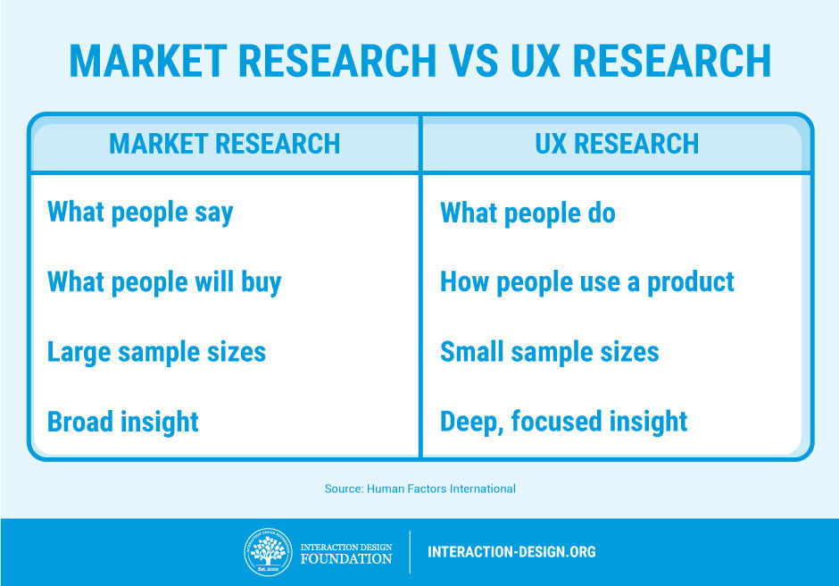
“We’ve done plenty of market research, just tell us what you need to know and we’ll tell you,” comes the offer of many a helpful marketing manager or project manager. In reality, we don’t care about their market research—we need to talk to users to build up a profile in relationship to the use of the product and not how they interact with the company in general. Market research is about broad trends in customers and what they are likely to buy; UX research is about individual behaviours of users when they use a product. These are different things, and without talking to users, we can’t know how they see the product or develop one of those lovely user personas that we need.


2. UX Work Tends to Be Iterative

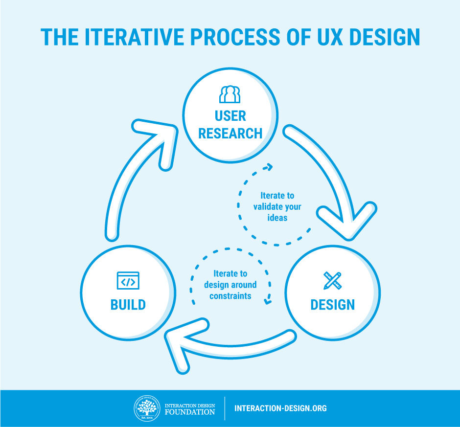
While it doesn’t look like we’ve done all that much since the last time you popped your head round the door, in truth, we’re 5 versions farther along the lines towards a product our customers will like. To make great products, we make lots of changes and test them. Then we bury the changes that don’t make enough of a difference. We keep doing this until we finally have a product that’s substantially better than either our last one or the competitor’s offerings. It takes time, and it’s not exciting to look at from outside our labs, but it’s also very much necessary.


3. We Can’t Show You a “Process”

We warn against treating UX work as a “one size fits all” process. Sadly, this behaviour can alienate some clients, and in some cases, clients might even demand this from the outset.

“Show us your process and we’ll tell you how it fits in with our product,” they might claim.

You need to step back and explain that each process should be somewhat unique, as each product is somewhat unique and as each user base is also somewhat unique. Your clients don’t want a standard process really; they just think they do and you may have to wean them off the idea.


4. Yes, We Have to Test

If you want products that users love, then we have to test them. Sure, we UX folks are experts in our field, but we’re not your users. Our job is to refine ideas to the point that we can hand them over to your users to tell is if we got it right or not. This may be time consuming, but it’s the only assurance you have that we’re really moving in the right direction too.


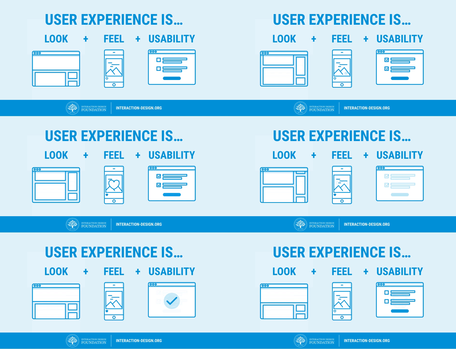
5. UX is More than Usability

Usability is important, but the user experience is more than usability. We like how Apple has managed to get usability on the strategic radar, but usability alone is not enough. Usability is the bare minimum requirement of a product that is released; UX includes everything else that makes the difference between “it works” and “it wows!”

source: Interaction Design Foundation

lunedì 4 dicembre 2017

Bad Icons: How to Identify and Improve Them

Bad Icons: How to Identify and Improve Them

by KARA PERNICE  (Nielsen Norman Group)

Summary: Related links are often chunked as a set, each with an icon. One bad icon hurts user interaction. A set of bad icons is worse because it amplifies confusion, adds clutter, and wastes screen real estate.

Sets of bad icons are very common on intranets. In fact, unhelpful sets of icons appear on most intranets I have seen. As an example, I just looked at this year’s Intranet Design Annual submissions. I excluded the ten winners and opened 20 other homepages at random. In almost every case I saw set of bad icons right away. In three cases there were none on the homepage, but I didn’t have to look far to find one. Only one out of the 20 intranets didn’t have any bad sets of icons. (That site didn’t have any icons at all.)

What Makes an Icon “Bad”

  • The visual already has a different, established meaning. A star icon, for example is for rating and bookmarking, not to view “presentation templates.” The Internet Explorer icon means “launch Internet Explorer,” not “open a list of web links.”
  • The reference is too esoteric and requires too many inferences. An image of a rocket may lead the occasional user to make the leap from “rocket” to “launch” to “app”, as in launch applications. Just as a bull’s eye with an arrow jabbed in its center may conjure “target” then “hit the target” then “financial targets” to finally, savings and retirement. But most users don’t want to solve a puzzle to understand an icon.
  • Blurry. Assumedly because some intranet teams don’t have graphic designers on staff or proper software, some icons are produced with subpar tools, and are thus grainy-looking, fuzzy, and hard to make out.
  • The icon is repeated for every item in a list. Why add a silhouette icon next to every user in a list of names, when the list contains only names and nothing else? Why add a small chain icon by each link in a list of links? Why add a paper icon next to each document in a list of documents?
  • The icons only work as a set. Users should not have to study all icons in a set to determine the meaning of an individual icon.


Examples of intranet icons: without their labels, can you tell what each one is for? The solution is shown further down in this article.

These following types of icon clusters frequently appear on the intranet homepage and other main section pages, probably because these pages act as a portal to more content and applications:


  • Quicklinks (we don’t recommend this name) — links to the areas that are most commonly used, most important to the organization, personalized based on the user’s role, or customized by the user
  • Processes
  • Areas on the intranet


Why There Are So Many Bad Icons on Intranets
Intranets consolidate like commands and links in clusters. Clustering related items helps employees scan and digest pages more quickly. This good design principle, combined with good intentions and a chain of damaging events leads to bad icon design. A common scenario is this: A set of related links are placed together in a list, or as a set of buttons. One or two of the words — such as calendar or comment — in the set create an obvious opportunity to add an icon. The remaining words in the group don’t offer a straightforward iconic representation, but designers are now sold on the idea of using icons, so they conjure poor visuals to accompany or to replace each of the text links.

Another scenario is when a page is text-heavy, and the easiest solution is to break up the text with photos, illustrations, and icons.


Cost of a Bad Icon
If the plan is to always have a label with every icon, then why is a bad icon harmful? After all, the label will be there to disambiguate its meaning, right?

Wrong. Icons are not free, and not every link on your intranet deserves an icon. Each of the following resources used for icons have financial costs, interaction costs, and opportunity costs associated with them:

  • Design and research: Icons don’t just materialize out of thin air. Unlike adding a text link, someone with graphic-design skill needs to create them. They are conjured, drawn, usability tested, and iterated.
  • Development and support: Once created, they still need to be coded, quality-tested (usability-tested again), supported, and sometimes documented. This may be more work than implementing a text link.
  • Screen real estate: Icons take up more space on the screen than text links alone. The space used means another UI component may be forced below the fold, onto another page, or must be omitted altogether.
  • Information processing: Icons may add to visual noise. While good icons can be helpful, poor icons add clutter, and some are hard to understand.


The benefit the icon offers should be greater than the costs of having it.

Examples of intranet icons that are not helpful (from left to right): the ubiquitous wireless symbol used here to represent support, a hard-to decipher image of a person with a magnifying glass over his face to represent personalization, a briefcase standing for job listings, books to represent internal audit, and a chair with a speech bubble to represent departments. (To maintain anonymity of the organization who created these icons, we recreated them in different colors and slightly different styles, but the concepts are the same as the originals.)


Benefits of Good Icons
There are many ways in which icons on intranets can help employees. Some of these include the following:

  • Fast recognition: A familiar or memorable icon may quickly convey meaning — sometimes more so than a text link.
  • Findability:  When people learn what action is associated with a given icon, the icon’s presence can provide an opportunity for some users to locate the command quickly and to become thus more efficient with repetitive tasks. Still, we recommend including a text label on all icons, mainly to ensure that all commands are understandable even if the image isn’t identifiable to every user. With the text label always present, will the icon provide any additional benefit? Answer that question before deciding to include an icon.
  • Brand and style reinforcement: Icons that adhere to brand guidelines reinforce the intranet’s aesthetics style. (Links and buttons without icons can also do so, with color, style, shape, typeface, and color.)

Remember that good icons should be identifiable, quick to locate, and memorable.


Opportunities for Good Icons
Do you think you have a place where you can add some helpful icons? Before proceeding, make sure that:

  • The concept or command that you want to enhance with an icon can be naturally represented by an icon. Don’t forget that some concepts are very complicated, and too difficult to represent with an icon.
  • Your candidate visual for the icon will fit well in the available (usually small) space. Sometimes designers think of a great visual, but it’s impossible to minimize, shrink, crop, or take a portion of to make it work as an icon.
  • The candidate icon is simple and easy to decipher, devoid of a lot of detail. People should not need to lean in or squint to decrypt the icon.
  • The reference is obvious and easy to interpret at a glance, and does not require decoding, studying, or thinking. A web icon is not a painting in a museum ­— users shouldn’t have to stare at it for a long time. One fixation should be enough to understand it. (On an intranet, every second employees waste on poor design is one more second you pay their salary without getting any work done.)


Conclusion
Icons can help users recognize and recall commands. But, a set of links with icons of inconsistent quality will confuse employees and waste their time. Better to either brainstorm, research, and design a set of usable icons; or just use clear text links and no icons at all.