Visualizzazione post con etichetta bad design. Mostra tutti i post

venerdì 4 ottobre 2019

The refrigerator top freezer handle

The refrigerator top freezer handle


I was recently cooking food with my girlfriend, and she goes into the fridge to pull out something.  Next thing I knew, BAM and “AAHHH” were the sounds ringing in my ears.  She had stood up and smashed her head on the freezer handle of the refrigerator.  After a string of unmentionable words from her, I told her I’d blog about this.

How many of us have felt this same, unbearable pain?  Why, does this keep happening?  WHAT IS THE PROBLEM?  Well, the issue here is two things (besides the worst head pain ever):  memory and placement.  The handle is placed at a point where our short-term memory will completely forget about it.

When we kneel down to reach for something, we have the inclination to look around us to see if we are in a “safe zone”.  Once we have identified the area as “safe” we proceed into doing what we initially set out to do.

At this point, our minds are focused on what our goal is now and have pushed out that short term memory that initial “safe zone”.  The resulting factor is a head-splitting headache and a string of bad words.

This design does not understand how users think.  We as designers need to fully understand the process of which users take use of our products.  This includes their thought process.  The design of this refrigerator does not take into account how users’ minds function, and it sometimes results in a very frustrated user.

Again, we can avoid this by understanding our users’ needs and goals.


_____ 

How do you open the refrigerator?


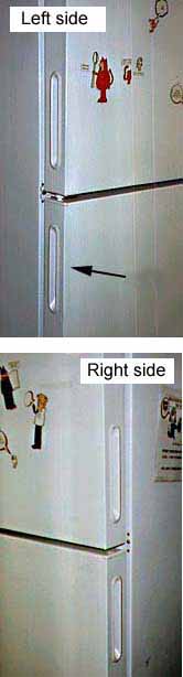
At my new job there is a refrigerator where employees put their lunches. The first time I tried to open the refrigerator I didn't see a handle on the front, but I found one on the left side of the door. (See arrow.) I pulled on the handle, but the door would not open. I thought maybe the refrigerator door had a really strong seal, so I pulled harder. I pulled so hard the whole refrigerator started moving! Someone standing nearby told me, "It opens from the other side. I had the same problem when I first tried to open it."
I looked on the right side of the refrigerator and sure enough, there was a handle there too! When I pulled on that handle, the refrigerator door opened easily.

Apparently, the refrigerator door was designed so it could be hinged on either the left or the right side. Thus, handles were put on both sides. However, people only expect to see one handle on a refrigerator door. When the handle doesn't work, they assume the door is stuck or locked.

Design suggestion

It would be best to put a handle on the front of a refrigerator door so that it can be easily seen. On a reversible door with handles on both sides of the door, there should be a way of removing or concealing the handle on the hinged side. There should not be visible handles on both sides!

domenica 11 agosto 2019

Why Is Bad User Experience Design Still A Thing?

Why Is Bad User Experience Design Still A Thing?


The other day I decided to set up two relatively common household products: (1) a wireless router and (2) a portable steamer. The instruction manuals and the resulting experiences of each setup couldn’t have been more different. Can you guess which required more energy, brain power and patience?


Ding ding ding ding ding! It was the steamer!

Why did setting up an appliance with mechanical engineering akin to a kitchen kettle feel like preparing a space shuttle launch…while a device manufactured by a cable company took five minutes with zero aggravation or ambiguity? The answer: User Experience design.

Good UX: The Router Setup


Setting up routers used to involve sitting on the phone with the cable company and wishing it was somebody else’s job. Now it’s as simple as flipping open a glossy, single-page pamphlet and following clear, colorful diagrams placed alongside highly legible text.


There was even some witty Easter Egg copy as if a real human being wrote it and not just a systems engineer:


Relax? No problem! In fact, when the blinking lights stopped flashing after just two minutes, I felt like a technical genius.

Bad UX: The Steamer


The steamer was another story. A list of 14 steps with essentially no visual hierarchy made it nearly impossible to skim for the most important information: how to avoid burning yourself. In fact, this nugget is all the way at the bottom of list item 13, below a mountainous, monotonous section of text. “The water in the reservoir can severely burn skin.”
Seriously?!

The visual aid stresses the importance of moving the steamer up and down. This doesn’t seem like the most important and/or complicated piece of information for a user to grasp.


___________ 

Here’s how I would have written this information: 

Before You Begin:
1. DO NOT fill with water past the max line.
2. DO NOT tilt the steamer back and forth or water will drip out.
Use an up-down motion, not too long in the same spot. 
3. When you’re done OR need a refill, unplug.
Wait 5 minutes after unplugging for unit to cool before handling.

STEP 1: Fill steamer with water.
- Twist reservoir cap clockwise to open.
- Add tap water up to the maximum line. Do not overfill.
- Replace reservoir cap and twist counter-clockwise to close.

STEP 2: Turn on device.
- Plug device into power outlet and press ON.
- When on, the switch will light up.
- Wait 2-3 minutes for unit to heat up.

STEP 3: Steam clothing.
- Always keep unit in an upright position.
- Point steam holes at wrinkled fabric. Move steamer in an up-down direction.
- For best results, pull fabric firmly in place while steaming.

STEP 4: Unplug and allow to cool before handling.
- Even after turned off, any water inside the unit will remain boiling hot.
- Wait 5 minutes before handling.
- Once cool, empty excess water and replace cap.
- Store in a cool, dry place.

_____________ 

People who buy portable steamers value convenience. It should be easier to assemble. My revision lists key safety concerns at the top followed by a logical order of steps, told in fewer words.

source: emsok

lunedì 29 luglio 2019

Design Critiques

Design Critiques


 design critiques - Pratt Institute


About IXD@Pratt

IXD@Pratt is a collection of articles about User Experience and its related disciplines. The website is maintained by faculty and students at Pratt Institute’s School of Information and all content is written by students, alumni, and faculty associated with the Master of Science in Information Experience Design and User Experience (UX) Advanced Certificate programs.

Pratt Institute, School of Information
144 West 14th Street, 6th Floor
New York, NY 10011-7301

********************
Examples 2019

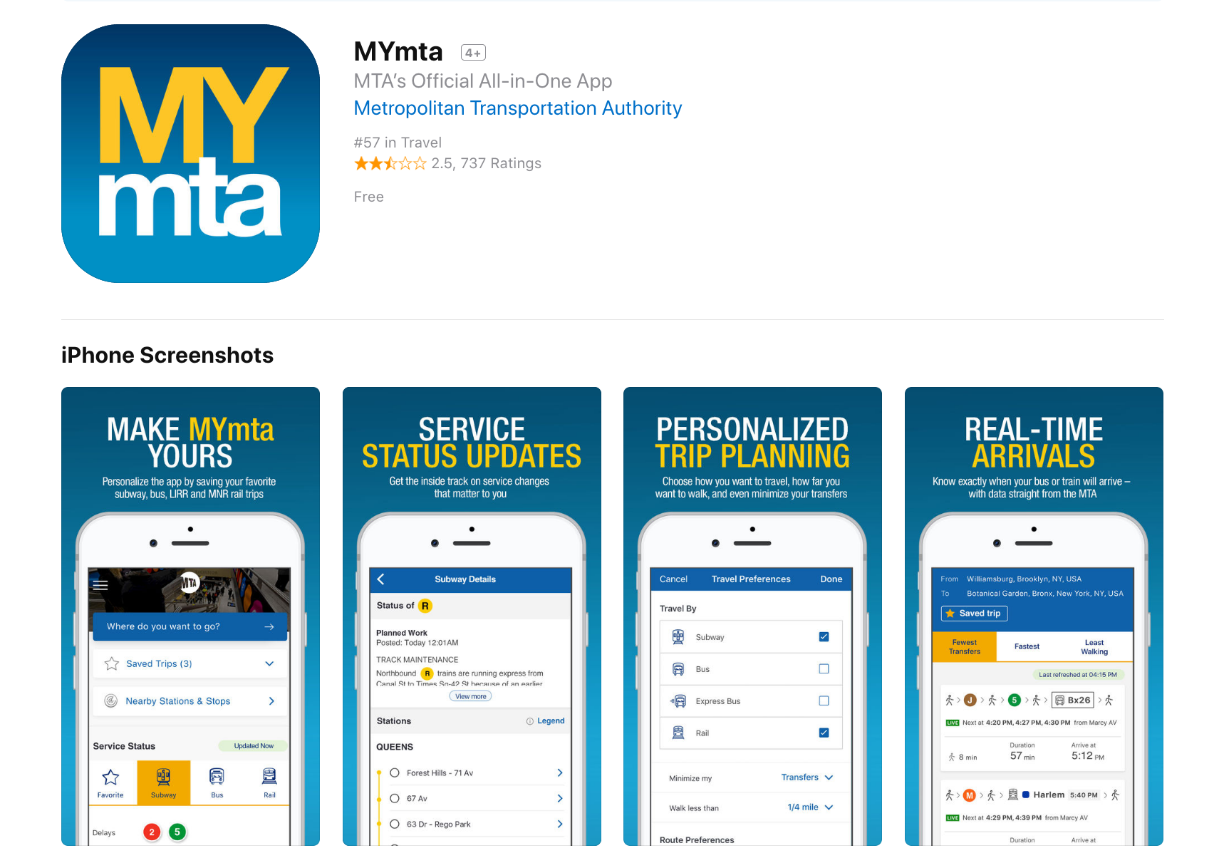
Design Critique: MYmta (iPhone app)

Source: https://itunes.apple.com/us/app/mymta/id1297605670?mt=8

Introduction
The MYmta iPhone app is a travel app designed to provide relevant information related to New York City’s many public transit options: subways, buses, LIRR and Metro-North rail services, and the Access-A-Ride program. The app allows for real-time scheduling and service changes, as well as personalized settings and trip planning, and station accessibility information.


************ 

Design Critique: Netflix (Desktop App)


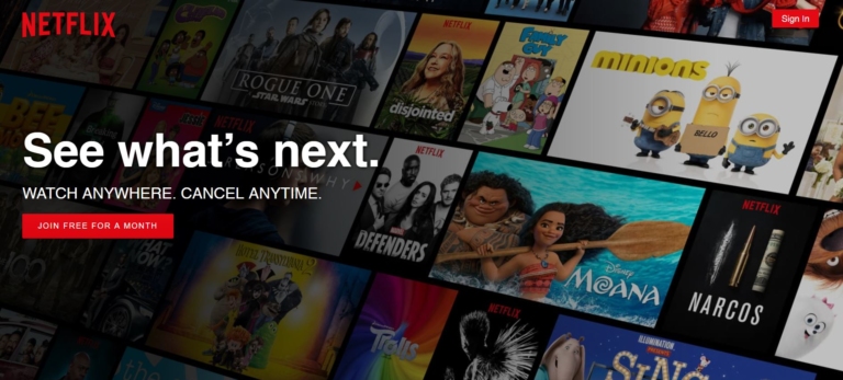
Fig 1.1 – Before signing into Netflix

Netflix is a major streaming service that allows users to watch TV shows, movies, animations and more. It has so much entertainment that you can never say, there is nothing to watch. In order to use Netflix, the new user could start with a one month free trial (which they can cancel anytime) or subscribe by paying monthly. The app itself is free, which is available in mobile, tablet and desktop versions.


**************** 
Design Critique: Notes (iPhone App)


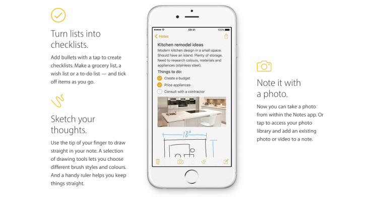
The iOS built-in Notes app empowers users’ note taking capability by providing seamless synchronization feature, supporting multimedia input/insert, and even integrating the sketch feature to simulate the analog note-taking experience. This article would critique the Notes App based on some usability factors mentioned by Don Norman’s book- The Design of Everyday Things.

sabato 8 giugno 2019

25+ Epic Design Fails

25+ Epic Design Fails That Are So Bad We Can’t Believe They Actually Happened


I Don’t Even Have Words For This
bad design


This Gray-Scale Pie Chart
worst design products


I Felt Quite Lost In China, But Fortunately, I Found This Sign
bad user experience


Human Traffic Jams

and many more examples

photofunonline.com

domenica 2 giugno 2019

Epic Design Fails That Are So Bad, We Can’t Believe They Actually Happened

Epic Design Fails That Are So Bad, We Can’t Believe They Actually Happened 


 Nothing Like The Smell Of Coffee And A Good Eye-Stab In The Morning


worst design products


I Was Looking For A Soap Dispenser Labeled “Ketchup” With A Picture Of Grapes

epic fails


That’s Gonna Be An Easy Ride

bad design

and many more examples

photofunonline.com

lunedì 30 aprile 2018

Can you have a great product with bad UX?

Can you have a great product with bad UX?


Is it possible for a product to be high-quality and have bad UX? To answer this question about bad user experience, we must first preface it by defining, “a great product.”
Is a great product the same as a successful one? If we measure a product’s greatness by its ubiquity or gross revenue — the answer is yes. There are plenty of everyday items with horrific UX that continue to be in bought and used.
This can occur because there is simply no better substitute, or we have become so accustomed to the concept we no longer notice its inefficiencies.
Consider your keyboard. The symbol placement is far from intuitive — to the point that there is an entire industry of software dedicated to onboarding young users. Yet, it remains the standard.
The vast majority of products with bad UX will not have the far-reaching success of the keyboard, and even then — they will never truly be “great products.”
Truly great products do not have bad UX. 
Here is why:


It might serve a purpose, but it doesn’t fulfil its potential
Let’s talk about the standard printer for example — notorious for confusing buttons, erratic behaviours and almost guaranteed user frustration.
It fills a need so people continue to buy it — especially if the alternatives have equally bad UX. However, the gap in usability must be filled with a crutch: heavy customer service, rigorous onboarding or aggressive marketing.
Patching up your product’s UX problem instead of fixing it at the root will quickly run up a tab.

Just ask any company that sells a printer how often their customer service representatives hear about various printing malfunctions.
Simply put, a product with bad UX is a product that could be better. Companies that do not improve UX are missing an opportunity to create a truly great product.


Frustration will turn to user churn
Providing a great user experience is critical for keeping users engaged. A product which causes user frustration will be abandoned — just as soon as something better comes along. Take CDs for example.
Once the go-to means of listening to music, the CD left much to be desired in terms of user experience. They were delicate and easy to break, awkward to store and expensive to collect. This left them vulnerable to user churn as soon as MP3 technology hit the market.
From a business perspective, a product with bad UX is an unstable investment as a competitor could easily improve upon the concept and gain a competitive edge.


UX is constantly evolving
User experience has existed long before the buzzword was coined, and has continued to evolve in many products we use every day. The telephone’s evolution is just one prominent example.
In the age of the customer, growing demands for better user experience has stipulated an influx of more intuitive products and software. This shift marks a turning point where UX is no longer an added bonus, but rather a means for survival.

lunedì 23 aprile 2018

30 Reasons Why People Don’t Buy From Your Website and How To Fix It

30 Reasons Why People Don’t Buy From Your Website and How To Fix It


If you’re wondering why your e-commerce website is not producing the sales you had expected, or why you are not getting the response you had anticipated, there are a whole range of steps you can take to improve your conversion rate.

Making changes that seem small or unnoticeable to you may help potential customers engage better with your site. Often we unknowingly make mistakes that create unnecessary barriers for the potential customers, leaving us bewildered by the lack of sales.

When people are shopping online they are not necessarily looking for you in particular, it’s more likely they are simply searching for a store that best fits their needs. For this reason, it is important for your website to look ‘right’ – it has to look like it will fulfil what the potential customer desires.

According to a research at the Missouri University of Science and Technology, when viewing a website users form first impressions within few milliseconds and their first impressions are highly affected by several design factors like use of colors, typeface and font size, use of images, and easy navigation.

The good news is even if your website has one or more of the below-mentioned problems it’s never too late; in fact, most of these could be rectified within a few hours!

Table Of Content
  • Buying is Not Easy
  • Complex Checkout Process
  • No Competitive Pricing, No Market Research
  • Lack of Payment Transparency, Hidden Charges
  • Additional Charges, Additional Dissatisfaction
  • Overlooking Security Concerns
  • Lack of Trust Signals Integration
  • The omission of Established Identity
  • Not So Social
  • No Payment Assurance
  • The absence of Security Certifications and Insignia
  • No Purchase Guarantee
  • Excessive Security Measures
  • Insufficient Product Details
  • Poor Discoverability
  • No Persuasive Sales Copy
  • No Incentives to Encourage Revisit
  • Product-Market Misfit
  • Too Much Irrelevant Product Choices
  • Unprofessional Web Design
  • Dated Design Layouts
  • Poor User Experience
  • Website Crashing, Timeout Error
  • Non-responsive Website
  • Time Stands Still
  • Website Needs Pest Control (Bug Fixes)
  • Sudden Pop-ups
  • No Top-notch Search Function
  • Delivery Options and Coverage
  • Logistics Credentials


Let’s take a look at a few examples ↪

sabato 17 febbraio 2018

If It Needs a Sign, It’s Probably Bad Design

If It Needs a Sign, It’s Probably Bad Design


bad design

The EpiPen, the potentially life-saving device that delivers a dose of medicine to people having a severe allergic reaction, has been all over the news for its outrageous price spike. Going up 500 percent in just under a decade is upsetting. But even as the company and regulators are dealing with its price, going unaddressed is the product’s significant design flaw.

Despite having pen in its name, the EpiPen isn’t really designed like a pen at all. A pen usually has a cap that covers the pen tip. But the cap of the EpiPen is on the opposite end as the needle tip. Joyce Lee, a pediatrician and University of Michigan professor who also studies patient-centered design, points out that this broken metaphor causes confusion over which end is which – and has led to people accidentally pushing their fingers into the needle. Between 1994 and 2007 there were over 15,000 unintentional injections from EpiPens, including many cases of trained healthcare professionals who accidentally gave themselves a dose of epinephrine in the thumb or finger while trying to deliver the life-saving medicine to someone else.

bad design
Unlike a regular pen, the EpiPen has the cap and needle tip on opposite sides  (Kira Stewart-Watkins, Flickr)

The owner of the EpiPen, Mylan, told ProPublica that “Since acquiring the EpiPen Auto-Injector, Mylan has made significant improvements to the design of the medical device portion of the product” and that the design changes were “aimed at making EpiPen Auto-Injectors easier to safely carry, hold, and administer and reduce the risk to users from the device’s needle, which is extremely important to our patients.” The company “encourage[s] all patients and caregivers to receive training on proper administration.” See Mylan’s full response here.

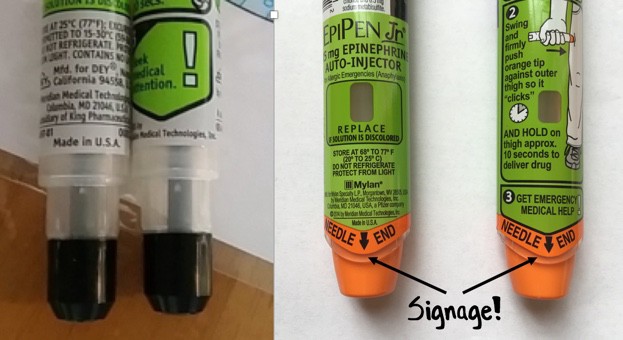
But while in 2009 Mylan redesigned the device, they didn’t change the orientation of the cap and needle. Instead, they colored one end bright orange and gave it the label “Needle End.” No doubt the design tweak helped a little: according to one study, the new EpiPen has a success rate of 67 percent (the old pen had a success rate of 43 percent). But that same study compared the EpiPen to another epinephrine auto-injector, the Auvi-Q, which was recently taken off the market after being recalled for dosage problems. The Auvi-Q is designed with the cap and needle on the same end – and had a success rate of over 90 percent.

It’s not surprising that a new color and a label didn’t stop accidental injections entirely. The EpiPen is just one more example in a long tradition of designers “solving” design problems by adding instructions, rather than fixing the underlying design itself.

Now, it’s true that sometimes instructions are useful and necessary. But in many cases, if it needs a sign, it’s bad design.
_____________________________________ 

The Role of Metaphor in Design

by Joyce Lee, MD, MPH Physician, Designer, Researcher Promoting a Maker Movement for Health     doctorasdesigner.com

bad design

The left-sided photo shows the needle area of the old EpiPen. The right-sided photo shows the needle area of the currently available EpiPen. On both sides of the current EpiPen, there is text on the front and back with the words NEEDLE END in large capital letters accompanied by a large black arrow. A healthcare stakeholder wouldn’t even blink at this detail, but I must quote the great Don Norman, one of the founders of human-centered design:

“Any time you see signs or labels added to a device, it is an indication of bad design.”


lunedì 18 dicembre 2017

What are bad technological flaws no one is addressing?

What are bad technological flaws no one is addressing?


  • Mobility.You cant use your phone while charging.
  • Wastage of electricity as it is less efficient.
  • It's not wireless. Charging Dock is connected to the outlet through a wire.

lunedì 4 dicembre 2017

Bad Icons: How to Identify and Improve Them

Bad Icons: How to Identify and Improve Them

by KARA PERNICE  (Nielsen Norman Group)

Summary: Related links are often chunked as a set, each with an icon. One bad icon hurts user interaction. A set of bad icons is worse because it amplifies confusion, adds clutter, and wastes screen real estate.

Sets of bad icons are very common on intranets. In fact, unhelpful sets of icons appear on most intranets I have seen. As an example, I just looked at this year’s Intranet Design Annual submissions. I excluded the ten winners and opened 20 other homepages at random. In almost every case I saw set of bad icons right away. In three cases there were none on the homepage, but I didn’t have to look far to find one. Only one out of the 20 intranets didn’t have any bad sets of icons. (That site didn’t have any icons at all.)

What Makes an Icon “Bad”

  • The visual already has a different, established meaning. A star icon, for example is for rating and bookmarking, not to view “presentation templates.” The Internet Explorer icon means “launch Internet Explorer,” not “open a list of web links.”
  • The reference is too esoteric and requires too many inferences. An image of a rocket may lead the occasional user to make the leap from “rocket” to “launch” to “app”, as in launch applications. Just as a bull’s eye with an arrow jabbed in its center may conjure “target” then “hit the target” then “financial targets” to finally, savings and retirement. But most users don’t want to solve a puzzle to understand an icon.
  • Blurry. Assumedly because some intranet teams don’t have graphic designers on staff or proper software, some icons are produced with subpar tools, and are thus grainy-looking, fuzzy, and hard to make out.
  • The icon is repeated for every item in a list. Why add a silhouette icon next to every user in a list of names, when the list contains only names and nothing else? Why add a small chain icon by each link in a list of links? Why add a paper icon next to each document in a list of documents?
  • The icons only work as a set. Users should not have to study all icons in a set to determine the meaning of an individual icon.


Examples of intranet icons: without their labels, can you tell what each one is for? The solution is shown further down in this article.

These following types of icon clusters frequently appear on the intranet homepage and other main section pages, probably because these pages act as a portal to more content and applications:


  • Quicklinks (we don’t recommend this name) — links to the areas that are most commonly used, most important to the organization, personalized based on the user’s role, or customized by the user
  • Processes
  • Areas on the intranet


Why There Are So Many Bad Icons on Intranets
Intranets consolidate like commands and links in clusters. Clustering related items helps employees scan and digest pages more quickly. This good design principle, combined with good intentions and a chain of damaging events leads to bad icon design. A common scenario is this: A set of related links are placed together in a list, or as a set of buttons. One or two of the words — such as calendar or comment — in the set create an obvious opportunity to add an icon. The remaining words in the group don’t offer a straightforward iconic representation, but designers are now sold on the idea of using icons, so they conjure poor visuals to accompany or to replace each of the text links.

Another scenario is when a page is text-heavy, and the easiest solution is to break up the text with photos, illustrations, and icons.


Cost of a Bad Icon
If the plan is to always have a label with every icon, then why is a bad icon harmful? After all, the label will be there to disambiguate its meaning, right?

Wrong. Icons are not free, and not every link on your intranet deserves an icon. Each of the following resources used for icons have financial costs, interaction costs, and opportunity costs associated with them:

  • Design and research: Icons don’t just materialize out of thin air. Unlike adding a text link, someone with graphic-design skill needs to create them. They are conjured, drawn, usability tested, and iterated.
  • Development and support: Once created, they still need to be coded, quality-tested (usability-tested again), supported, and sometimes documented. This may be more work than implementing a text link.
  • Screen real estate: Icons take up more space on the screen than text links alone. The space used means another UI component may be forced below the fold, onto another page, or must be omitted altogether.
  • Information processing: Icons may add to visual noise. While good icons can be helpful, poor icons add clutter, and some are hard to understand.


The benefit the icon offers should be greater than the costs of having it.

Examples of intranet icons that are not helpful (from left to right): the ubiquitous wireless symbol used here to represent support, a hard-to decipher image of a person with a magnifying glass over his face to represent personalization, a briefcase standing for job listings, books to represent internal audit, and a chair with a speech bubble to represent departments. (To maintain anonymity of the organization who created these icons, we recreated them in different colors and slightly different styles, but the concepts are the same as the originals.)


Benefits of Good Icons
There are many ways in which icons on intranets can help employees. Some of these include the following:

  • Fast recognition: A familiar or memorable icon may quickly convey meaning — sometimes more so than a text link.
  • Findability:  When people learn what action is associated with a given icon, the icon’s presence can provide an opportunity for some users to locate the command quickly and to become thus more efficient with repetitive tasks. Still, we recommend including a text label on all icons, mainly to ensure that all commands are understandable even if the image isn’t identifiable to every user. With the text label always present, will the icon provide any additional benefit? Answer that question before deciding to include an icon.
  • Brand and style reinforcement: Icons that adhere to brand guidelines reinforce the intranet’s aesthetics style. (Links and buttons without icons can also do so, with color, style, shape, typeface, and color.)

Remember that good icons should be identifiable, quick to locate, and memorable.


Opportunities for Good Icons
Do you think you have a place where you can add some helpful icons? Before proceeding, make sure that:

  • The concept or command that you want to enhance with an icon can be naturally represented by an icon. Don’t forget that some concepts are very complicated, and too difficult to represent with an icon.
  • Your candidate visual for the icon will fit well in the available (usually small) space. Sometimes designers think of a great visual, but it’s impossible to minimize, shrink, crop, or take a portion of to make it work as an icon.
  • The candidate icon is simple and easy to decipher, devoid of a lot of detail. People should not need to lean in or squint to decrypt the icon.
  • The reference is obvious and easy to interpret at a glance, and does not require decoding, studying, or thinking. A web icon is not a painting in a museum ­— users shouldn’t have to stare at it for a long time. One fixation should be enough to understand it. (On an intranet, every second employees waste on poor design is one more second you pay their salary without getting any work done.)


Conclusion
Icons can help users recognize and recall commands. But, a set of links with icons of inconsistent quality will confuse employees and waste their time. Better to either brainstorm, research, and design a set of usable icons; or just use clear text links and no icons at all.

lunedì 23 ottobre 2017

Even the world’s top Apple blogger is losing it over a new MacBook Pro problem

Even the world’s top Apple blogger is losing it over a new MacBook Pro problem

by Chris Smith  @chris_writes

Apple’s newest MacBooks apparently suffer from an unexpected problem, a keyboard issue that’s not easy to fix. Affected models include 2015 or later MacBook and 2016 or later MacBook Pro models. These laptops are thinner than ever, and Apple redesigned the mechanism under each key so that it could manufacture butterfly keyboards with an even slimmer profile.

Incredibly, it turns out that simple particles of dust can render individual keys on these machines useless, and dislodging them to fix them isn’t as easy as it was on older MacBook models.

Reports recently published in The Outline and 512pixels indicate that some users are experiencing serious issues with their keyboards.

The Outline explains that replacing a faulty keyboard isn’t possible. Apple has to replace the top case, which has a $700 price tag if the MacBook Pro is out of warranty. Apparently, plenty of buyers are affected:

It’s unclear how big of a problem butterfly switch keyboards are. Apple forums are overflowing with reports of Geniuses who have told customers that Apple is “collecting data” on the issue. One corporate issuer of the MacBook Pros in question reported to me that its business has encountered a significant number of keyboard issues, but “less than 5% for sure.” Another Genius explained to me that he had seen an overwhelming number of the computers with keyboard issues, the spacebar in particular — while some keys can be very delicately removed, the spacebar breaks every single time anyone, including a professional, tries to remove it. This is a big problem, since, according to the Genius I spoke to, it’s the key most susceptible to acting up from the aforementioned piece of dust. “I would say it’s THE issue on this computer,” he told me. (Apple declined to comment.)

What further proves the new butterfly keyboards have a dust issue is this Apple support document that’s basically insane. If you need to have this guide on your site, it means a significant number of MacBook buyers experience keyboard issues, and it’s not a problem that is going to go away:
apple, bad design, Baffling Design Flaws, 悪いデザイン  良いデザイン,


You need a particular set of skills to clean the keyboard by yourself and not drop the MacBook in the process. The best thing about it is holding the Mac at a 75-degree angle “so it’s not quite vertical,” before using compressed air to eliminate the dust.

Even John Gruber, a diehard Apple fan and respected blogger, is upset about it. “I find these keyboards — specifically, the tales of woe about keys getting stuck or ceasing to work properly — a deeply worrisome sign about Apple’s priorities today,” he said, in a response to The Outline’s story.

What’s worse about it is that we have a song for this issue created by Jonathan Mann, the same guy who mocked Apple’s “Antennagate” issue.

lunedì 16 ottobre 2017

What would be the worst possible design for a sink?

What would be the worst possible design for a sink?
Answers from Quora.com:
____________

Carlo Sirna

This one:
Stunning Wooden Sink

Looks great right?
OK, now wash your teeth, spit the toothpaste into it and try to clean it.

Why this homemade wooden sink is so much shared in woodworkers forums is a total mystery to me.


___________ 


Take a glance at this sink:
Clear Blue Tempered Glass Sink

Looks like a normal sink right? Take a closer look at it? Where do you put the soap? Or anything? You finish brushing your teeth right? You put the toothbrush down on th- Oh wait, there's nothing around the sink, the vanity. You can put a towel on the bottom to dry off your hands, but there's really no point because your hands won't be clean…(no soap).

____________ 

Bad Design: Faceted Crystal Sink
photo via unicornhornsandlgitter
___________

Copyright © Michael J. Darnell 1996-2010

We recently moved into a newly-constructed building at work. The picture on the left shows one of the bathroom sinks in the new building. 


After the sink is used a few times, the top of the counter becomes covered with water. (See the arrow.) The problem is that as one adjusts the faucets with wet hands, water drops down onto the counter and accumulates there. 


Design Suggestion

A larger sink could be used, designed so that the faucets are a part of the sink instead of a separate installation on the counter. When the faucets are adjusted, a larger sink would allow the water that drops down to drain back into the sink, rather than to run over the top of the counter.
Another solution is to install faucets that automatically adjust the water flow without having to move one's hands away from the sink.
____________ 

Hansgrohe ComfortZone
Hansgrohe ComfortZone test
Irritating water splashes due to mismatched combinations of mixer and washbasin – perhaps that’s something you’ve already experienced. As of now, your customers‘ associated annoyance is a thing of the past.

lunedì 15 maggio 2017

lunedì 10 aprile 2017

Induction cooktop

Induction cooktop

What is wrong?
Bad mapping

Does the left most knob control the left front or left read burner?


Errol R. Hoffmann & Alan H.S. Chan (2011): Alternative approaches to the design of four-burner stoves,
Ergonomics, 54:9, 777-791


Suggestion
Useful features to consider when buying an induction hob.


The arrangement of knobs controlling your stove burners should match the arrangement of the burners themselves.


What is wrong?
Interface

What can I do? How? Where?


- Too small icons (see the Fitts’s law*)
- Non-intuitive interface 
  (in an emergency you may waste time in choosing the right icon) 

* Fitts's Law states "...the time to acquire a target is a function of the distance to and size of the target". As the distance increases, movement takes longer and as the size decreases selection again takes longer.


Suggestion
A big knob (real or virtual) is better than a small icon on the glass 


Perceived affordance: you can increase the selected power
Signifier (the where and the how): twisting the knob 


Feedback


LED surface lights shine onto pans to give the visual of gas cooking

lunedì 3 aprile 2017

Deyan's Experiences

Deyan's Experiences
Usability and User Experience in everyday life
by Deyan Halachliyski

What do we see here?
  • on/off button (that’s clear)
  • knob with some red and blue markings on the bottom

What do I need to know when washing my hands?
  • how to regulate the water temperature
  • how to regulate the water flow

lunedì 20 marzo 2017

Dieter Rams: ten principles for good design

Dieter Rams: ten principles for good design


Back in the late 1970s, Dieter Rams was becoming increasingly concerned by the state of the world around him – “an impenetrable confusion of forms, colours and noises.” Aware that he was a significant contributor to that world, he asked himself an important question: is my design good design?
As good design cannot be measured in a finite way he set about expressing the ten most important principles for what he considered was good design.

lunedì 13 marzo 2017

How to design doors to be less confusing

How to design doors to be less confusing

You’ve encountered a door like this. One that looks like you should pull on it, but really you’re supposed to push. Those doors you hate have a name: “Norman doors.”

They’re named after Don Norman, a UC San Diego cognitive scientist, who identified this phenomena in his book “The Design of Everyday Things.”

According to Norman, pushing on a door that says “pull” isn’t necessarily your fault. It is just poorly designed.
University of California: How to design doors to be less confusing

lunedì 6 marzo 2017

Bad Design vs. Good Design: 5 Examples We can Learn From

Bad Design vs. Good Design: 5 Examples We can Learn From
by Teo Yu Siang


Looking at examples of bad design alongside counter-examples of good design is not only fun but also draws important lessons for designers. They highlight pitfalls for designers to avoid and let us understand how to translate design theories into solutions that work in the real world. Jared Spool, the American writer, researcher and usability expert, once said: “Good design, when it’s done well, becomes invisible. It’s only when it’s done poorly that we notice it.” So, let’s look at five examples of obviously bad designs, shine the light on how good design makes it work, and distil some lessons so we can all create great and invisible experiences for our users.


lunedì 27 febbraio 2017

Washing machine _ interaction design

Washing machine:
What is wrong?

Bad communication between user and system.

bad design vs good design

 Bad communication between user and system.

Gulf of Execution: 

How do I know what I can do?
What actions are allowed by the system?
How do I do it?

Gulf of Evaluation:

How do I know what happened?
What does it mean?
Have I accomplished my goal?
bad design vs good design

 The position of the controls on the keyboard is not logical; the hand have to move from one extreme to another of the surface. Changing the cycle the washing machine automatically resets the spin.
bad design vs good design

 Examples of control panel that work better

bad design vs good design