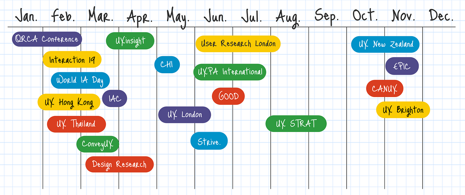
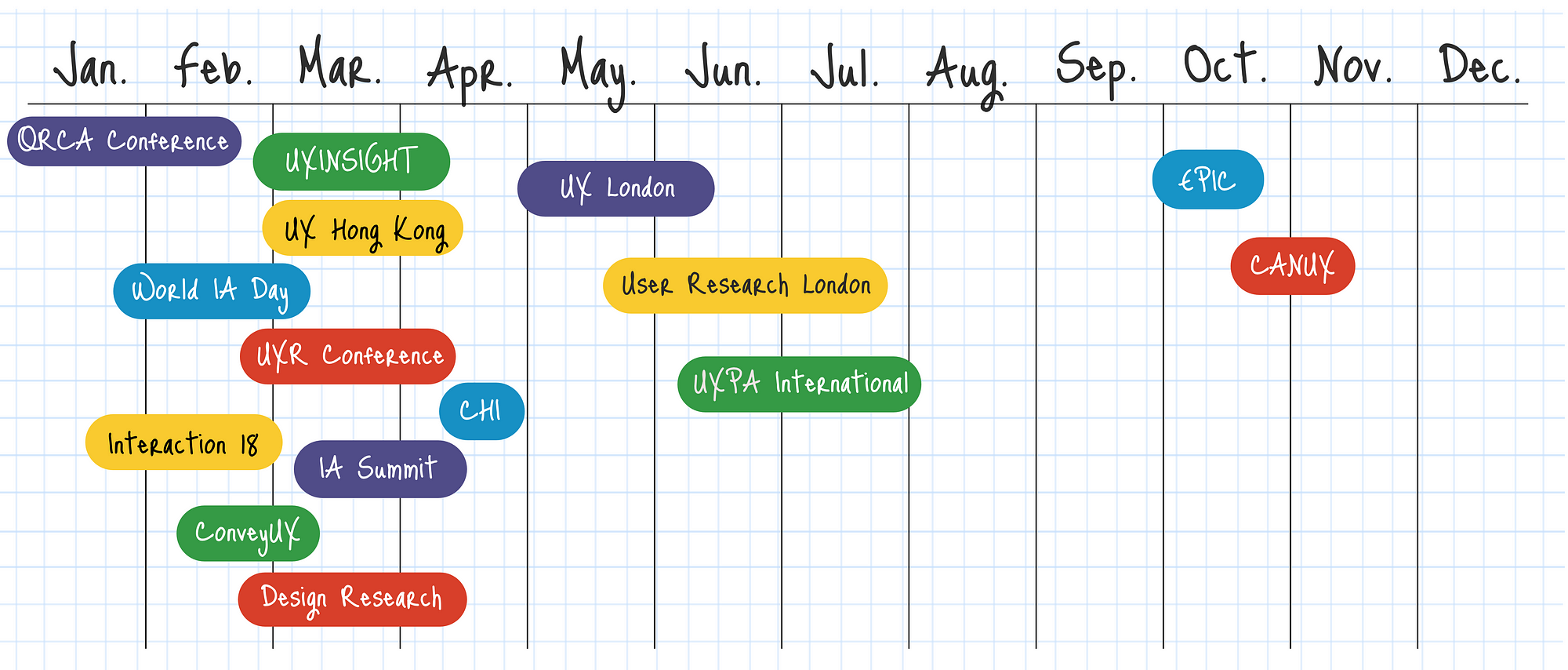
Upcoming UX, Usability, and UI Conferences in 2019
Looking to update your knowledge and connect with other professionals at UX Conferences in 2019? Here’s the list so far for UX Conferences including user experience, design, usability and UI topics announced around the world with many more that we’re tracking waiting to announce their 2019 dates. Find the right conference that meets your needs: focus topics, timing, location or cost.
Mini prototyping templates (8.5 x 11)
We use the Digital Psychology Wireframe Kit to help our students develop their skills in applying behavioral science strategies to a wide range of interactive media.
After rearchitecting our wireframe kit in 2017, our students and friends started asking for a copy.
To share the love with the wider community of digital media pros, here's a copy of our smaller 8.5 x 11 wireframe kit, under a flexible creative commons license.
About the wireframe kit
Paper is the ultimate wireframing tool for building quick concept mockups and prototypes, with full creative freedom.
We use the oversized version of the wireframe kit in our digital psychology training, where we focus on applying psychology to various interactive design, UX and marketing applications.
Since our focus is on creative concepts, rather than pixel-perfect specifications, the kit provides ballpark dimensions across a wide range of popular devices, for websites, apps, wearables, advertising and more.
This wireframe kit does not include our training system; only device specifications.
Prototype specifications
Our grid system is inspired by the Bootstrap CSS system and uses a format that is convenient for adaptive or responsive breakpoints, at 3, 4, or 6 column divisions.
The grid is 1,200 pixels wide, divided into 12 columns, with dark gridlines every 100 pixels, each with 10 light gridlines, each at 10 pixels. This is a rough approximation of the sizes typically used in grid systems, with some smaller and others larger.
Our prototype wireframe specifications follow the proportions of popular products, such as the iPhone 8, iPad Air, and Apple Watch Series 3.
Our Facebook ad templates are based on 1200x1200 and 1200x628 pixels, which are common image dimensions used across various social media ad platforms.
Our banner ad templates are based on the most common display advertising formats used in Google's adaptive ads and AdRoll’s remarketing banners.
FREE to use, under Creative Commons
This 8.5 x 11 wireframe kit is distributed for free, under Creative Commons License Attribution-Share Alike 4.0 International (CC BY-SA 4.0). If you distribute any variations, please respect our licensing and show your love by crediting us with a link to: https://www.alterspark.com. To view the license, visit: http://creativecommons.org/licenses/by-sa/4.0/.
In “Walking You Through the Audience-Influence Model”, you'll learn the essentials of digital psychology in an intuitive and visual mini-publication. You'll also enjoy templates, worksheets and research questions that you can implement immediately.
How designers silently tell you what to do? - Affordances and Signifiers
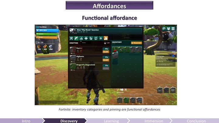
Sometimes, you just look at a thing and know how it works. That's not an accident - it's good design, called affordance, and it can be applied to video games.
Learn how to design game environments so that the environment tells the player what to do. Affordances are a way we can design something in our game so it communicates the way we are supposed to interact with it via it's form. If you take the example of a cup, people intuitively know how to pick it up because the big round handle looks like it can be grasped. We can apply this logic to objects in game design and level design. By constructing their form in a certain way, the player will intuitively know what to do with the object. This is often considered a form of user experience design.
Signifiers are things we add to objects when an affordance is not 100% clear. These signifiers can be words, symbols or other things, but we put them onto objects to hint at an affordance or to flat out tell a user what to do. We can take advantage of these in a similar way we took advantage of affordances by using them to guide the player with more difficult interactions.
There are many situations in games where we leverage affordance when we play. In this video we cover a number of examples and I explain in depth the definition of these terms we have been discussing. We will cover the classic door design example where we design door handles to fit the way a door opens. We also talk about how affordance isn't just for environment design but is applied all over different disciplines of design including combat design. source: Game Design by Gigity McD
In his article Affordance, Conventions and Design, Norman emphasizes the difference between perceived affordance and affordance.[1] Thus, affordance can not be understood as feedback made by system when we are using screen-based equipment and instead it should be explained as something that “provide strong clues to the operations of things”, according to DOET written by Norman[2]. In general, affordance serves as the role that leads users and consumers to think, learn, analyze and interact.
As a representative form of interactive media, video games never lack materials for us to research design principles such as affordances, constraints and conventions.[3]
1.HUD design in video games
When we talk about interactive media, it is inevitable to talk about user interface and user experience. As for video games, a player can not judge the quality of gameplay when he first starts adventure, but he can decide whether the art style is to his liking or not once he sees the title. Jesse Schell in his book The Art of Game Design explicitly explain the hierarchical mental structure of players’ cognition. Even though for designers, mechanism, story, aesthetics and technology are equally important, the first two things players notice are usually aesthetics and mechanism maybe because these two are most easily to be symbolized.[4] So the combination of aesthetics and mechanism should provide players with enough affordances.
Games, especially the role-playing game, often leave tons of information for players to learn. Obviously, game designers in modern age will not list everything on screen just as their predecessors did. Instead they just place the most important information, such as hit point, mana point and ammunition, on the screen. Actually, the important information presented on screen is called Head Up Display (HUD), which is originally used in military area, describing the parameters shown in cockpit. To keep the HUD interface as concise as possible, one strategy is integrating the information into game contents.
The ammunition design of COD: AW
In Call of Duty: Advanced Warfare, designers cleverly make the ammunition information one part of the guns (the number will move as you move the gun and change view), giving players clear information that it is something related to weapons.
However, this strategy does not make game mechanism clear all the time. Metro 2033 uses the watch to indicate the duration of gas mask. It is really a good idea if players have been familiar with the game mechanism, but the vague and indirect relationship between mask and watch can frustrate new players at first. In contrast, Call of Duty: Black Ops uses the cracks on mask to warn players, which is a more intuitive design.
The watch design of check gas mask is somewhat confusing
2.Map and interactive elements design
It is the responsibility of game designers to tell players what they should and should not do during the gaming process. HUD serves as the instructor of player from beginning to end, but it is not enough for players to do well when they are required to make an immediate response. So designers should leave hints to players.
One thing that designers are good at is using both affordance and constraint to give players instructions. In many action games, players have to manipulate their characters to climb cliffs or trees and jump over chasms. Under such circumstances, designers often mark rocks that can be climbed and restrict characters to access those areas that can not interact with players.
The climbable part in Rise of the Tomb Raider is different from other parts
In Rise of the Tomb Raider, the ice that can be climbed is evidently lighter than the unclimbable part. What’s more, it is a standard design in the whole game, meaning the pattern of climbable part can be understood instinctively by players.
Another common trick used by game designers is setting margin for map with seemingly accessible perspective. I guess every player of Counter-Strike has the experience of fleeing outside the map. A more intricate way is to destroy the environment intentionally in order to force players to move to the next scene, especially in some linear cinematic games. Naughty Dog is the master of using such a strategy. In Uncharted franchise games, players must keep moving to avoid being buried by collapsed houses and cliffs, which in turn destroy the scene and stop characters from going back. This constraint ensures that players can have compact gaming process and have no problem with finding the destination.
3.Thoughts of future game design
Murray in her book Inventing the medium listed four affordances for digital artifacts: encyclopedic, spatial, procedural, and participatory.[5] Intrinsically a computer program, video game itself of course own the four affordances. For example, RTS(Real-Time Strategy) and MOBA(Multiplayer Online Battle Arena) games produce infinite possibilities for players and professional tournaments with bonus of millions of dollars. Compared to legacy media, video game is totally multisequential and interactive.
However, the complexity and flexibility of video game have brought designers a question – how to know what players really like. In traditional media age, users receive information passively, so designers only have to consider the transmission process from one direction and in digital media age, especially during the process of designing HCL system, designers should select the appropriate conventions that human interactors can understand, according to Murray.[5] Modern video game design is based on the mature media like movies and novels and asks designers to consider the balance between mechanism, story, aesthetics and technology. The problem here is that players have different preferences so designers can only accumulate experience by making mistakes to set good conceptual models for most players. A typical example is the failure of No Man’s Sky, whose developers are seduced by new technologies. [5] They create an universe by automatic random algorithm but neglect the importance of level design, thus making the world vapid, sterile and repetitive.
In general, game design is a formidable process and requires developers to correctly construct conceptual model for most players and make clear affordances, constraints and conventions.
References:
[1]Norman, Donald A. “Affordance, conventions, and design.”interactions 6.3 (1999): 38-43.
[2]Norman, Donald A. The design of everyday things: Revised and expanded edition. Basic books, 2013.
[3]Norman,Donald A, “Affordance, Conventions, and Design.” Interactions 6, no. 3 (May 1999): 38-43.
[4]Schell, Jesse. The Art of Game Design: A Book of Lenses. 2nd edition. Natick: A K Peters/CRC Press, 2014. Print
[5]Murray, Janet H. Inventing the medium: principles of interaction design as a cultural practice. Mit Press, 2011.
[6]Stonehouse, Anthony. “User interface design in video games.” Gamasutra. 27 Feb 2014.
[7]Zhang, Jiajie, and Vimla L. Patel. “Distributed cognition, representation, and affordance.” Pragmatics & Cognition 14.2 (2006): 333-341.
Game Developers Conference - GDC 2016 video presentation
Discovering and mastering a video game is a learning experience for the user. It requires mental efforts. This is why it’s important to understand how the brain learns to craft a compelling onboarding experience – one worth putting effort into, one that will matter to your audience.
Anything the brain processes and learns originates from a perceived input and changes the memory of a subject. The quality of the processing – therefore the quality of the retention – depends highly on the attentional resources applied, which are also dependent on the emotions and motivation felt by the players. In sum, to improve the experience of the players, video game developers must take into account the perception, memory, and attention limitations of the brain, as well as the emotions and motivation felt by the players.
The Gamer's Brain: How Neuroscience and UX can Impact Video Game Design
Upcoming UX, Usability, and UI Conferences in 2018
Planning ahead and looking for UX conferences announced for 2018? So far there are 120+ user experience (UX) conferences including design, usability and UI topics announced around the world with many more that we’re tracking waiting to announce their 2018 dates. Find the right conference that meets your needs: focus topics, timing, location or cost.
Is it possible for a product to be high-quality and have bad UX? To answer this question about bad user experience, we must first preface it by defining, “a great product.”
Is a great product the same as a successful one? If we measure a product’s greatness by its ubiquity or gross revenue — the answer is yes. There are plenty of everyday items with horrific UX that continue to be in bought and used.
This can occur because there is simply no better substitute, or we have become so accustomed to the concept we no longer notice its inefficiencies.
Consider your keyboard. The symbol placement is far from intuitive — to the point that there is an entire industry of software dedicated to onboarding young users. Yet, it remains the standard.
The vast majority of products with bad UX will not have the far-reaching success of the keyboard, and even then — they will never truly be “great products.”
Truly great products do not have bad UX.
Here is why:
It might serve a purpose, but it doesn’t fulfil its potential
Let’s talk about the standard printer for example — notorious for confusing buttons, erratic behaviours and almost guaranteed user frustration.
It fills a need so people continue to buy it — especially if the alternatives have equally bad UX. However, the gap in usability must be filled with a crutch: heavy customer service, rigorous onboarding or aggressive marketing.
Patching up your product’s UX problem instead of fixing it at the root will quickly run up a tab.
Just ask any company that sells a printer how often their customer service representatives hear about various printing malfunctions.
Simply put, a product with bad UX is a product that could be better. Companies that do not improve UX are missing an opportunity to create a truly great product.
Frustration will turn to user churn
Providing a great user experience is critical for keeping users engaged. A product which causes user frustration will be abandoned — just as soon as something better comes along. Take CDs for example.
Once the go-to means of listening to music, the CD left much to be desired in terms of user experience. They were delicate and easy to break, awkward to store and expensive to collect. This left them vulnerable to user churn as soon as MP3 technology hit the market.
From a business perspective, a product with bad UX is an unstable investment as a competitor could easily improve upon the concept and gain a competitive edge.
UX is constantly evolving
User experience has existed long before the buzzword was coined, and has continued to evolve in many products we use every day. The telephone’s evolution is just one prominent example.
In the age of the customer, growing demands for better user experience has stipulated an influx of more intuitive products and software. This shift marks a turning point where UX is no longer an added bonus, but rather a means for survival.
How to become a UX Designer at 40 with no digital or design experience
What is User Experience Design?
User Experience Design is the process of enhancing a persons experience with a product or service and involves an understanding of their behaviour to create a successful design.
Example: A business has an app, they want the sign-up process to have a great User Experience (UX). You have business requirements. You find the engineers (computer programmers) limitations. You research, collaborate with designers and others. You create ideas and prototypes to test. You develop what is the best, test more and iterate on that. That’s UX.
There is a great demand for good UX Designers. If you have no previous digital or design experience don’t panic. I had neither and managed to get into the world of UX. I chose to be a UX Designer because it was creative, in technology and in demand (and I didn’t need to wear a suit to work!). My journey was not easy, I’ve had bumps along the way but I wouldn’t change a thing.
If you are willing to work hard, be patient, and work outside your comfort zone, it’s a really exciting career.
Topics I’ll cover:
Studying UX Design, the tools to learn, your UX portfolio, getting a job, the UX process, how to design, user testing , people you’ll work with and ongoing learning.
1. UX Study On Campus
2. UX Study Online
3. UX Design Tools
4. Prototype Tools
5. The UX Portfolio
6. Getting a UX Job
7. UX Process
8. How to Design
9. User Testing
10. People you’ll work with
11. Ongoing Learning & Staying Inspired
12. Final words
While information and opinions on ‘good UX’ are increasing in availability, teams, organizations, and individuals still struggling to define, measure, and agree upon principles of UX in a productive manner. That is, a lot of UX discussions end in design arguments. Meanwhile, the developers are waiting for direction, the designers are waiting for a correction, and the end-users are waiting for a satisfying experience.
BASIC UX does not set out to be the ‘end all, be all’ of UX principles. It does set out to help solve or at least reduce the problem stated above — UX design in productive environments is harder than it should be.
A set of common principles that test something’s overall user experience.
First, each letter in the word BASIC stands for a UX principle.
Beauty
Accessibility
Simplicity
Intuitiveness
Consistency
______________
Beautiful
Is it aesthetically pleasant?
The look and feel of a product are important to its overall user experience. The Aesthetic-Usability Effect shows that a visually appealing design is perceived as easier to use than an ugly one. Developers should refer to style guides and design specs for reference here. A few pixels can make a design look ‘off’ and leave the product feeling ‘broken.’
Are high-quality images and graphics used? (balance with size optimization)
Is it properly aligned with the layout?
__________
Accessible
Can ‘everyone’ use it?
A product’s accessibility is measured by how available and usable it is for people, regardless of their ability. Developers must go beyond the ‘average’ user and ensure that those with disabilities are also able to use the product. These disabilities might include: poor or no vision, color blindness, lack of motor skills, lower than average intelligence, etc. In these cases, third-party software such as mouse-dictation and screen readers are often used to navigate and perform actions within the product. Using existing standards such as WCAG, 508 compliant, and W3C will help increase the overall accessibility of the product. Subtle accessibility impacts should also be kept in mind when choosing font size, colors, and animations.
Questions to ask
Does it comply with standards? (WCAG, 508 compliant, W3C)
Is it cross-browser compatible? (IE8–11, CH, FF, SF)
Is it ‘display’ responsive?
Is the language simple enough for most to understand?
__________
Simple
Does it make life easier?
Hick’s Law states that the time it takes to make a decision is proportionally related to the number and complexity of choices. Additionally, Ockham’s Razor states that simplicity should be the deciding factor when choosing between two identical designs. Developers must then create user interfaces that distill the options to only what is needed to perform the user’s task.
Visually, this means balancing the use of white space and alignments to create associations, rather than complex graphics and styling. The Principles of Gestalt informs us that the use of distance, alignments and color similarities can help guide a product in a clean, simple and intuitive manner. For language content, this means reducing redundancy, removing passivity and filler words.
The Gulfs of Evaluation and Execution (Norman 1986) help us understand the usability gaps that users face in any system. Evaluation happens when the user is trying to understand the state of the system. If the state is not clear, the user might unnecessarily repeat an action, or feel a sense of anxiety that their task wasn’t completed. Execution is needed for a user to achieve their goals. If the path of execution is unclear, then the user won’t know how to achieve their goals in the system. If either one of these “gulfs” are too wide, then users will not have a good experience in the system and will dread using it.
Affordance is another key aspect of an intuitive UX. For example, the color of links or the shape of buttons indicates that there is an action available. It’s import to realize that most people spend most of their time with other products and in other systems. Thus, building upon established design patterns is key.
Can the user achieve their goal with little or no initial instructions?
Is the task easily repeated by the user without further instruction?
Can the user predict the outcome/output?
_________
Consistent
Does it match the system?
Consistency is the thread that holds BASIC UX together. A beautiful product is consistent. An accessible product is consistent. A simple product is consistent. An intuitive product is consistent. In UX, consistency is the thing that separates frustrating chaos from cohesive harmony. It is important that design colors, spacing, fonts and alignments are uniform throughout the product. This visual and functional uniformity creates a sense of dependability and trust between the user and the system.
Developers should reuse existing and established elements in the system whenever possible. Forms should have consistent alerts, labels, validation, and action behaviors. If consistency is lacking, then the entire UX will be as well. Performance glitches should be minimized so that pages load as a consistent rate and actions produce predictable responses.
User Experience Design is at the forefront of product management in today’s industries. However, in spite of this vast and growing knowledge-share on the topic, UX Design is still a difficult area to gain team consensus around. It is in these situations that frameworks can provide clear direction. BASIC UX is a user experience design framework made up of five key design principles. It strives to help developers and designers guide their products in the right direction while remaining productive in the development process. I encourage you to introduce BASIC UX to your team and use it to enhance the experiences your products deliver.
The howls of frustration that we hear on many UX projects are often to do with how badly misunderstood the UX role is in business. Here are 5 things that everyone should know about UX work:
1. UX Research is Essential
The first barrier to many a UX project is people in the company who think they already know the customer inside out.
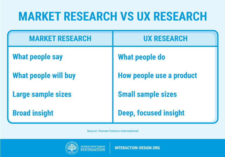
“We’ve done plenty of market research, just tell us what you need to know and we’ll tell you,” comes the offer of many a helpful marketing manager or project manager. In reality, we don’t care about their market research—we need to talk to users to build up a profile in relationship to the use of the product and not how they interact with the company in general. Market research is about broad trends in customers and what they are likely to buy; UX research is about individual behaviours of users when they use a product. These are different things, and without talking to users, we can’t know how they see the product or develop one of those lovely user personas that we need.
2. UX Work Tends to Be Iterative
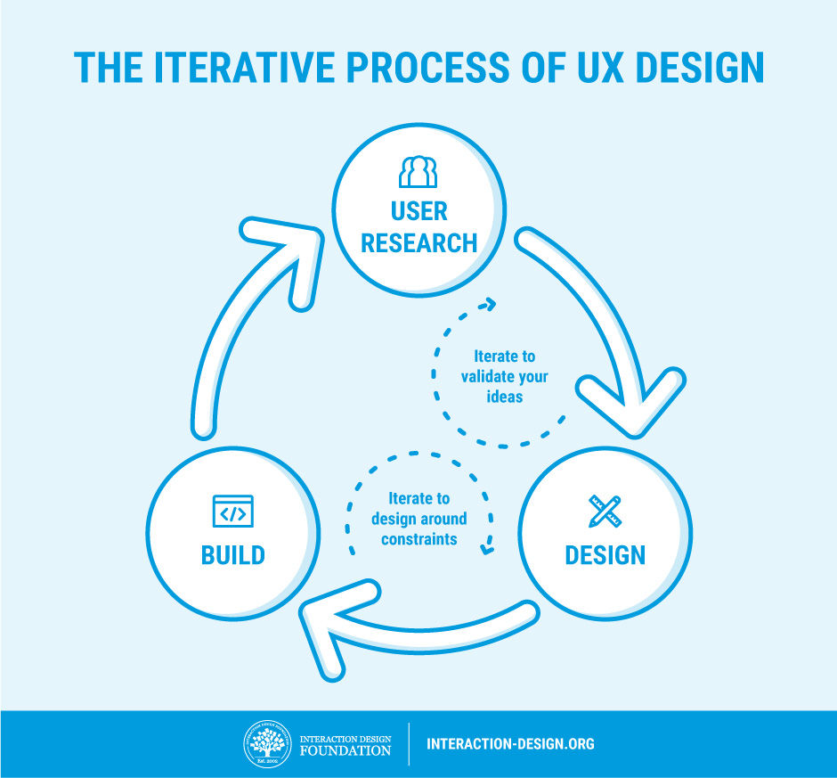
While it doesn’t look like we’ve done all that much since the last time you popped your head round the door, in truth, we’re 5 versions farther along the lines towards a product our customers will like. To make great products, we make lots of changes and test them. Then we bury the changes that don’t make enough of a difference. We keep doing this until we finally have a product that’s substantially better than either our last one or the competitor’s offerings. It takes time, and it’s not exciting to look at from outside our labs, but it’s also very much necessary.
3. We Can’t Show You a “Process”
We warn against treating UX work as a “one size fits all” process. Sadly, this behaviour can alienate some clients, and in some cases, clients might even demand this from the outset.
“Show us your process and we’ll tell you how it fits in with our product,” they might claim.
You need to step back and explain that each process should be somewhat unique, as each product is somewhat unique and as each user base is also somewhat unique. Your clients don’t want a standard process really; they just think they do and you may have to wean them off the idea.
4. Yes, We Have to Test
If you want products that users love, then we have to test them. Sure, we UX folks are experts in our field, but we’re not your users. Our job is to refine ideas to the point that we can hand them over to your users to tell is if we got it right or not. This may be time consuming, but it’s the only assurance you have that we’re really moving in the right direction too.
5. UX is More than Usability
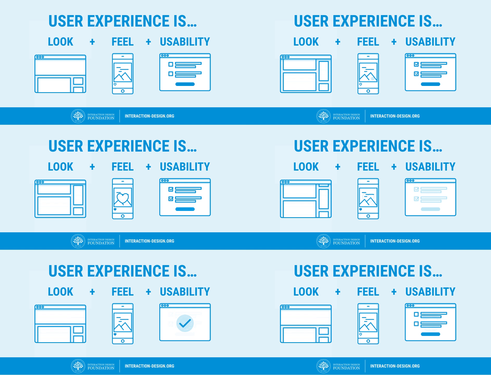
Usability is important, but the user experience is more than usability. We like how Apple has managed to get usability on the strategic radar, but usability alone is not enough. Usability is the bare minimum requirement of a product that is released; UX includes everything else that makes the difference between “it works” and “it wows!”