Visualizzazione post con etichetta good design. Mostra tutti i post

domenica 11 agosto 2019

Why Is Bad User Experience Design Still A Thing?

Why Is Bad User Experience Design Still A Thing?


The other day I decided to set up two relatively common household products: (1) a wireless router and (2) a portable steamer. The instruction manuals and the resulting experiences of each setup couldn’t have been more different. Can you guess which required more energy, brain power and patience?


Ding ding ding ding ding! It was the steamer!

Why did setting up an appliance with mechanical engineering akin to a kitchen kettle feel like preparing a space shuttle launch…while a device manufactured by a cable company took five minutes with zero aggravation or ambiguity? The answer: User Experience design.

Good UX: The Router Setup


Setting up routers used to involve sitting on the phone with the cable company and wishing it was somebody else’s job. Now it’s as simple as flipping open a glossy, single-page pamphlet and following clear, colorful diagrams placed alongside highly legible text.


There was even some witty Easter Egg copy as if a real human being wrote it and not just a systems engineer:


Relax? No problem! In fact, when the blinking lights stopped flashing after just two minutes, I felt like a technical genius.

Bad UX: The Steamer


The steamer was another story. A list of 14 steps with essentially no visual hierarchy made it nearly impossible to skim for the most important information: how to avoid burning yourself. In fact, this nugget is all the way at the bottom of list item 13, below a mountainous, monotonous section of text. “The water in the reservoir can severely burn skin.”
Seriously?!

The visual aid stresses the importance of moving the steamer up and down. This doesn’t seem like the most important and/or complicated piece of information for a user to grasp.


___________ 

Here’s how I would have written this information: 

Before You Begin:
1. DO NOT fill with water past the max line.
2. DO NOT tilt the steamer back and forth or water will drip out.
Use an up-down motion, not too long in the same spot. 
3. When you’re done OR need a refill, unplug.
Wait 5 minutes after unplugging for unit to cool before handling.

STEP 1: Fill steamer with water.
- Twist reservoir cap clockwise to open.
- Add tap water up to the maximum line. Do not overfill.
- Replace reservoir cap and twist counter-clockwise to close.

STEP 2: Turn on device.
- Plug device into power outlet and press ON.
- When on, the switch will light up.
- Wait 2-3 minutes for unit to heat up.

STEP 3: Steam clothing.
- Always keep unit in an upright position.
- Point steam holes at wrinkled fabric. Move steamer in an up-down direction.
- For best results, pull fabric firmly in place while steaming.

STEP 4: Unplug and allow to cool before handling.
- Even after turned off, any water inside the unit will remain boiling hot.
- Wait 5 minutes before handling.
- Once cool, empty excess water and replace cap.
- Store in a cool, dry place.

_____________ 

People who buy portable steamers value convenience. It should be easier to assemble. My revision lists key safety concerns at the top followed by a logical order of steps, told in fewer words.

source: emsok

lunedì 29 luglio 2019

Design Critiques

Design Critiques


 design critiques - Pratt Institute


About IXD@Pratt

IXD@Pratt is a collection of articles about User Experience and its related disciplines. The website is maintained by faculty and students at Pratt Institute’s School of Information and all content is written by students, alumni, and faculty associated with the Master of Science in Information Experience Design and User Experience (UX) Advanced Certificate programs.

Pratt Institute, School of Information
144 West 14th Street, 6th Floor
New York, NY 10011-7301

********************
Examples 2019

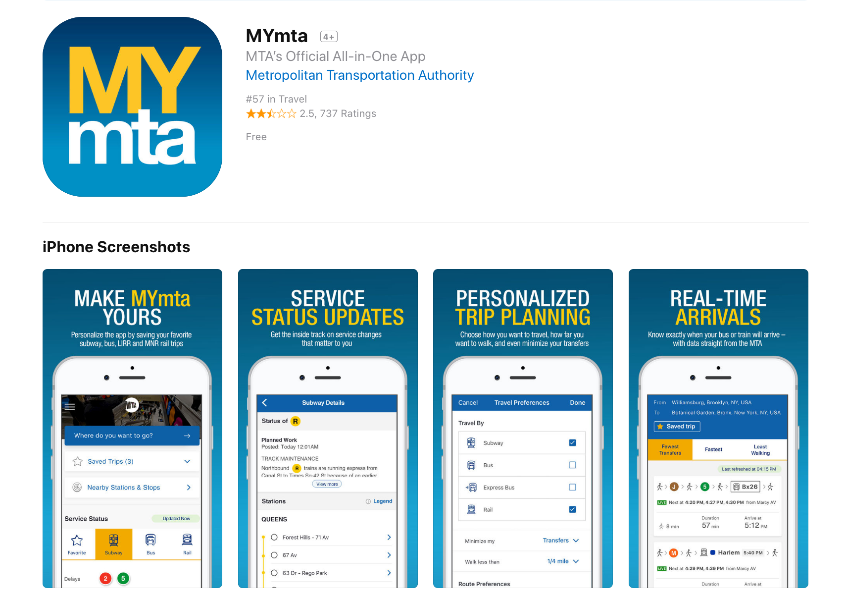
Design Critique: MYmta (iPhone app)

Source: https://itunes.apple.com/us/app/mymta/id1297605670?mt=8

Introduction
The MYmta iPhone app is a travel app designed to provide relevant information related to New York City’s many public transit options: subways, buses, LIRR and Metro-North rail services, and the Access-A-Ride program. The app allows for real-time scheduling and service changes, as well as personalized settings and trip planning, and station accessibility information.


************ 

Design Critique: Netflix (Desktop App)


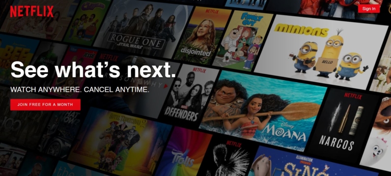
Fig 1.1 – Before signing into Netflix

Netflix is a major streaming service that allows users to watch TV shows, movies, animations and more. It has so much entertainment that you can never say, there is nothing to watch. In order to use Netflix, the new user could start with a one month free trial (which they can cancel anytime) or subscribe by paying monthly. The app itself is free, which is available in mobile, tablet and desktop versions.


**************** 
Design Critique: Notes (iPhone App)


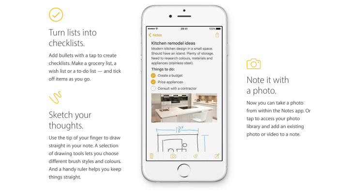
The iOS built-in Notes app empowers users’ note taking capability by providing seamless synchronization feature, supporting multimedia input/insert, and even integrating the sketch feature to simulate the analog note-taking experience. This article would critique the Notes App based on some usability factors mentioned by Don Norman’s book- The Design of Everyday Things.

lunedì 4 dicembre 2017

Bad Icons: How to Identify and Improve Them

Bad Icons: How to Identify and Improve Them

by KARA PERNICE  (Nielsen Norman Group)

Summary: Related links are often chunked as a set, each with an icon. One bad icon hurts user interaction. A set of bad icons is worse because it amplifies confusion, adds clutter, and wastes screen real estate.

Sets of bad icons are very common on intranets. In fact, unhelpful sets of icons appear on most intranets I have seen. As an example, I just looked at this year’s Intranet Design Annual submissions. I excluded the ten winners and opened 20 other homepages at random. In almost every case I saw set of bad icons right away. In three cases there were none on the homepage, but I didn’t have to look far to find one. Only one out of the 20 intranets didn’t have any bad sets of icons. (That site didn’t have any icons at all.)

What Makes an Icon “Bad”

  • The visual already has a different, established meaning. A star icon, for example is for rating and bookmarking, not to view “presentation templates.” The Internet Explorer icon means “launch Internet Explorer,” not “open a list of web links.”
  • The reference is too esoteric and requires too many inferences. An image of a rocket may lead the occasional user to make the leap from “rocket” to “launch” to “app”, as in launch applications. Just as a bull’s eye with an arrow jabbed in its center may conjure “target” then “hit the target” then “financial targets” to finally, savings and retirement. But most users don’t want to solve a puzzle to understand an icon.
  • Blurry. Assumedly because some intranet teams don’t have graphic designers on staff or proper software, some icons are produced with subpar tools, and are thus grainy-looking, fuzzy, and hard to make out.
  • The icon is repeated for every item in a list. Why add a silhouette icon next to every user in a list of names, when the list contains only names and nothing else? Why add a small chain icon by each link in a list of links? Why add a paper icon next to each document in a list of documents?
  • The icons only work as a set. Users should not have to study all icons in a set to determine the meaning of an individual icon.


Examples of intranet icons: without their labels, can you tell what each one is for? The solution is shown further down in this article.

These following types of icon clusters frequently appear on the intranet homepage and other main section pages, probably because these pages act as a portal to more content and applications:


  • Quicklinks (we don’t recommend this name) — links to the areas that are most commonly used, most important to the organization, personalized based on the user’s role, or customized by the user
  • Processes
  • Areas on the intranet


Why There Are So Many Bad Icons on Intranets
Intranets consolidate like commands and links in clusters. Clustering related items helps employees scan and digest pages more quickly. This good design principle, combined with good intentions and a chain of damaging events leads to bad icon design. A common scenario is this: A set of related links are placed together in a list, or as a set of buttons. One or two of the words — such as calendar or comment — in the set create an obvious opportunity to add an icon. The remaining words in the group don’t offer a straightforward iconic representation, but designers are now sold on the idea of using icons, so they conjure poor visuals to accompany or to replace each of the text links.

Another scenario is when a page is text-heavy, and the easiest solution is to break up the text with photos, illustrations, and icons.


Cost of a Bad Icon
If the plan is to always have a label with every icon, then why is a bad icon harmful? After all, the label will be there to disambiguate its meaning, right?

Wrong. Icons are not free, and not every link on your intranet deserves an icon. Each of the following resources used for icons have financial costs, interaction costs, and opportunity costs associated with them:

  • Design and research: Icons don’t just materialize out of thin air. Unlike adding a text link, someone with graphic-design skill needs to create them. They are conjured, drawn, usability tested, and iterated.
  • Development and support: Once created, they still need to be coded, quality-tested (usability-tested again), supported, and sometimes documented. This may be more work than implementing a text link.
  • Screen real estate: Icons take up more space on the screen than text links alone. The space used means another UI component may be forced below the fold, onto another page, or must be omitted altogether.
  • Information processing: Icons may add to visual noise. While good icons can be helpful, poor icons add clutter, and some are hard to understand.


The benefit the icon offers should be greater than the costs of having it.

Examples of intranet icons that are not helpful (from left to right): the ubiquitous wireless symbol used here to represent support, a hard-to decipher image of a person with a magnifying glass over his face to represent personalization, a briefcase standing for job listings, books to represent internal audit, and a chair with a speech bubble to represent departments. (To maintain anonymity of the organization who created these icons, we recreated them in different colors and slightly different styles, but the concepts are the same as the originals.)


Benefits of Good Icons
There are many ways in which icons on intranets can help employees. Some of these include the following:

  • Fast recognition: A familiar or memorable icon may quickly convey meaning — sometimes more so than a text link.
  • Findability:  When people learn what action is associated with a given icon, the icon’s presence can provide an opportunity for some users to locate the command quickly and to become thus more efficient with repetitive tasks. Still, we recommend including a text label on all icons, mainly to ensure that all commands are understandable even if the image isn’t identifiable to every user. With the text label always present, will the icon provide any additional benefit? Answer that question before deciding to include an icon.
  • Brand and style reinforcement: Icons that adhere to brand guidelines reinforce the intranet’s aesthetics style. (Links and buttons without icons can also do so, with color, style, shape, typeface, and color.)

Remember that good icons should be identifiable, quick to locate, and memorable.


Opportunities for Good Icons
Do you think you have a place where you can add some helpful icons? Before proceeding, make sure that:

  • The concept or command that you want to enhance with an icon can be naturally represented by an icon. Don’t forget that some concepts are very complicated, and too difficult to represent with an icon.
  • Your candidate visual for the icon will fit well in the available (usually small) space. Sometimes designers think of a great visual, but it’s impossible to minimize, shrink, crop, or take a portion of to make it work as an icon.
  • The candidate icon is simple and easy to decipher, devoid of a lot of detail. People should not need to lean in or squint to decrypt the icon.
  • The reference is obvious and easy to interpret at a glance, and does not require decoding, studying, or thinking. A web icon is not a painting in a museum ­— users shouldn’t have to stare at it for a long time. One fixation should be enough to understand it. (On an intranet, every second employees waste on poor design is one more second you pay their salary without getting any work done.)


Conclusion
Icons can help users recognize and recall commands. But, a set of links with icons of inconsistent quality will confuse employees and waste their time. Better to either brainstorm, research, and design a set of usable icons; or just use clear text links and no icons at all.

lunedì 31 luglio 2017

Foundations of Human-Computer Interaction

Foundations of Human-Computer Interaction

Goal and Outcomes.

This course introduces students to the field of human-computer interaction.

Introduction

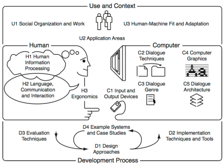
The body of knowledge of Human-Computer Interaction can be perceived as resulting from the following five interrelated aspects, depicted in the diagram bellow:

(N) the nature of human-computer interaction;
(U) the use and context of computers;
(H) human characteristics;
(C) computer system and interface architecture; and

(D) the development process.


This course touches the (N) aspect but mainly targets the (H) aspects illustrated in the diagram above. It comprises seven modules:

Visibility, Affordances, Mapping, Constraints, Conceptual models
Seven stages of action, Types of knowledge
Feedback, Errors, Forcing Functions, Gestalt laws, Responsiveness
The Human Processor Model, Fitts Law
Interface Efficiency, KLM, GOMS
State transition diagrams, Petri nets
History and vision
After successfully attending this course, students will know how user interfaces have developed over the past decades, and what constants of human performance need to be considered when designing user interfaces.

Further details are available including…

  • The pedagogical script;
  • The technical script;
  • The assessment criteria; and
  • The bibliography.


Foundations of Human-Computer Interaction

lunedì 17 luglio 2017

Ikea mug notch


IKEA Trofe Mug: Dishwasherowned
by Travis Hudson

This isn't so much of a gadget, but an extremely handy device that I wish I would have thought of. This TROFE mug from IKEA has a simple notch on the bottom of the mug that prevents water from pooling up around the base during a dishwasher run.

Some comments from the website:

___________

Gizmometer
These are a perfect example of design without testing. The notch is under the handle. Most dishwashers load cups so that the handle points toward the center of the dishwasher and are tilted upward at the handle so that the spray can reach the inside of the cup. Thus, the notch is at the highest point of the cup when it's loaded in a dishwasher, making the notch useless. A few tests in a few dishwashers would have pointed that out. Now people will buy these thinking they're clever, only to find that they don't work as advertised when they get home.

___________ 

John Laur
I agree with the comments about poor design choice. It would have been easier to make the bottom flat or put two or 3 notches in it.

Plus it's not like Ikea invented this. Look at any cheap plasticware in any restaraunt and you will find drain notches. You can also use them to 'hook' one or two cups onto the rim of another and carry four or six drinks at a time without using a tray.
___________ 

jetstar7
I don't own a dishwasher. I am the dish-washer. I put stuff on a wire rack to drip dry. So this cup works. And the image of the cup is seen in IKEA's latest catalogue. No mention of it's intent to optimise dishwasher cleaning in there.

lunedì 26 giugno 2017

Design With A Purpose: 15 Everyday Things You Never Imagined Had A Purpose

Design With A Purpose: 15 Everyday Things You Never Imagined Had A Purpose
by Suchismita Biswas

Technology has science behind it. Every small design has logic. Do you know the purpose of the small hole in your pen cap? I bet many of us don’t know the actual purpose of the feature. Like this, there are many everyday small things we use but don’t know the exact purpose of the features. This article is written to inform you such little things which you use but don’t know the purpose.


design-purpose-15-everyday-things-never-imagined-purpose

lunedì 29 maggio 2017

plug with a convenient hole to hook a finger into

Plug with a convenient hole to hook a finger into
by Katherine Bennett


You can accuse me of living under a rock because I haven't seen one of these before, but this is absolutely brilliant. I just bought a new contact grill and take a look at the plug on the cord set. For all of you designers out there who bemoan the "stupidity" of consumers, how they won't follow directions, bla bla bla, take note of this simple design solution.

The problem is as old as electric products themselves. People grab the cord rather than the plug to unplug an appliance, eventually ruining the cord.

more.... designinvestigations.com

lunedì 17 aprile 2017

The UX Design Success Ladder

The UX Design Success Ladder: Achieving Meaningful Product Design
by Ward Andrews


The UX Design Success Ladder: 5 Steps to Creating Meaningful Products.
To take products from good to great, we have to go beyond functional requirements and deliver usable, comfortable experiences that not only delights users, but also affect their lives on a deeper level.

lunedì 20 marzo 2017

Dieter Rams: ten principles for good design

Dieter Rams: ten principles for good design


Back in the late 1970s, Dieter Rams was becoming increasingly concerned by the state of the world around him – “an impenetrable confusion of forms, colours and noises.” Aware that he was a significant contributor to that world, he asked himself an important question: is my design good design?
As good design cannot be measured in a finite way he set about expressing the ten most important principles for what he considered was good design.

lunedì 13 marzo 2017

How to design doors to be less confusing

How to design doors to be less confusing

You’ve encountered a door like this. One that looks like you should pull on it, but really you’re supposed to push. Those doors you hate have a name: “Norman doors.”

They’re named after Don Norman, a UC San Diego cognitive scientist, who identified this phenomena in his book “The Design of Everyday Things.”

According to Norman, pushing on a door that says “pull” isn’t necessarily your fault. It is just poorly designed.
University of California: How to design doors to be less confusing

lunedì 6 marzo 2017

Bad Design vs. Good Design: 5 Examples We can Learn From

Bad Design vs. Good Design: 5 Examples We can Learn From
by Teo Yu Siang


Looking at examples of bad design alongside counter-examples of good design is not only fun but also draws important lessons for designers. They highlight pitfalls for designers to avoid and let us understand how to translate design theories into solutions that work in the real world. Jared Spool, the American writer, researcher and usability expert, once said: “Good design, when it’s done well, becomes invisible. It’s only when it’s done poorly that we notice it.” So, let’s look at five examples of obviously bad designs, shine the light on how good design makes it work, and distil some lessons so we can all create great and invisible experiences for our users.


lunedì 5 settembre 2016

How do you tell good design from bad design?

How do you tell good design from bad design?

I’d argue that it’s obvious to tell the difference between good and bad design. But if that was the case for everyone, then we’d enjoy a world full of excellent websites. 
I believe there are obvious visual and emotional indicators of good and bad design. Let’s start by comparing and contrasting the visual indicators first.


Solvm

martedì 17 maggio 2016

venerdì 13 maggio 2016

Good Design: Timex alarm clock

Good Design: Timex alarm clock

First of all it has very good visibility. Every button and dial are clearly labeled for its specific purpose. The labels are written in white ink which makes it very visible against the black background. The buttons are raised high enough for there to be a shadow, indicating for one to push down on them. The digital display is bright red with very large and easy to read numbers, as well as a battery symbol that glows red when it is running out. One quick glance at the alarm clock and it is easy to see where each function is.
by Lauren Allshouse February 6, 2014
normandoors.wordpress.com