giovedì 29 dicembre 2016

martedì 20 dicembre 2016

lunedì 5 settembre 2016

How do you tell good design from bad design?

How do you tell good design from bad design?

I’d argue that it’s obvious to tell the difference between good and bad design. But if that was the case for everyone, then we’d enjoy a world full of excellent websites. 
I believe there are obvious visual and emotional indicators of good and bad design. Let’s start by comparing and contrasting the visual indicators first.


Solvm

martedì 23 agosto 2016

venerdì 29 luglio 2016

lunedì 27 giugno 2016

lunedì 20 giugno 2016

lunedì 13 giugno 2016

Top 25 Biggest Product Flops Of All Time

Top 25 Biggest Product Flops Of All Time


Consumer Products That Failed
Here's a look at WalletPop's biggest product failures of all time. Sometimes good companies make very bad decisions. We highlight over two dozen of our favorite examples in our list of the Top 25 Biggest Product Flops of All Time. From New Coke to Ben-Gay aspirin, we take a look at product launches that we bet these companies wish never happened.
www.dailyfinance.com

mercoledì 1 giugno 2016

Apple 30-pin to USB Cable

ipad-30-pin
What is wrong?  the 
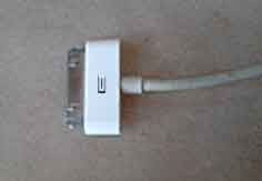
Signifier:
- There isn't effective sign for the right side to plug in an Apple 30-pin to USB Cable
When people try to plug in the USB connector, they frequently turn it the wrong way.
This problem is annoying; you lost time and it could happen to force it in the wrong way.
Ok for a simple design but it shouldn't be a minimalist design: there aren't effective signs for the right side to plug in.
ipad-30-pin
Apple 30-pin to USB Cable


No tactile signs; just a pale symbol hidden by the thumb.

Suggestions
Sensory_Homunculus
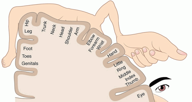
This map shows the parts of the body next to the areas of the brain that process our sense of touch. The eyes and hands have a lot of space devoted to them; other parts, not so much.
Image reference
Sensory homunculus
The Sensory Homunculus
microsoft-mouse-4500
Microsoft mouse 4500 with a bulge on the USB cable. So you can touch the right side to plug in.
retouched-ipad-usb-cableipad-30-pin-bulge
Why don't use a non-visual interaction design? Using a BULGE you can recognize the right side even without look at it, just using the touch sense.

lunedì 23 maggio 2016

30 Most Baffling Design Flaws of Popular Products

30 Most Baffling Design Flaws of Popular Products

Hey now, we're pretty appreciative of the times we're living in -- at least we aren't wiping our asses with pine cones. But, come on, with as advanced as our society is, some nuisances that accompany things we use everyday seem pretty ridiculous. We asked you to show us the worst offenders, and gave a bunch of slightly bent dollar bills that won't be accept by vending machines to the winner


CRACKED Readers ·January 22, 2014
www.cracked.com

martedì 17 maggio 2016

domenica 15 maggio 2016

venerdì 13 maggio 2016

Good Design: Timex alarm clock

Good Design: Timex alarm clock

First of all it has very good visibility. Every button and dial are clearly labeled for its specific purpose. The labels are written in white ink which makes it very visible against the black background. The buttons are raised high enough for there to be a shadow, indicating for one to push down on them. The digital display is bright red with very large and easy to read numbers, as well as a battery symbol that glows red when it is running out. One quick glance at the alarm clock and it is easy to see where each function is.
by Lauren Allshouse February 6, 2014
normandoors.wordpress.com

11 Hilarious Examples of Bad Design

11 Hilarious Examples of Bad Design

Everyone makes mistakes. Often, these can be laughed off and everyone’s the wiser. But some mistakes are more serious than others, especially the ones that lose business or damage a brand.
This post goes over some bad design examples that are more funny than serious, but still highlight some pitfalls to avoid.
The great thing about mistakes is that they can be redeemed when we learn from them. And laugh at them.
by Jarom McDonald May 2, 2016
www.lucidpress.com

mercoledì 11 maggio 2016

Retro style radio set

  radio vintage
What is wrong?  the Conceptual Model:
- Designer put a switch on the left side to turn on the appliance
- Users prefer to turn on by a volume knob.
  In a radio set usually the volume control knob is used to turn on, but on this old style radio the On/Off switch is on the left side.
The On/Off switch is not even on frontal panel but almost hidden on a lateral panel.

This causes 3 problems:
First problem: you have to search for On/Off switch.
Second problem: when you turn on, if someone have left the volume set up on max, the loud music can hurt your ears.
Third problem: to turn off you have to continue press the On/Off switch for 2 seconds
  vintage radio

vintage radio

Suggestions
  vintage radio  
Using a single knob with integrated On/Off and Volume  
vintage radio  
  In this radio receiver, there is a more intuitive Volume Knob and Switch  
rocker switchvolume knob
Rocker switch              Volume knob
 

https://www.sparkfun.com/search/results?term=knob