Game Design Theory
How designers silently tell you what to do? - Affordances and Signifiers
Sometimes, you just look at a thing and know how it works. That's not an accident - it's good design, called affordance, and it can be applied to video games.
source: Extra Credits
______
Signifiers are things we add to objects when an affordance is not 100% clear. These signifiers can be words, symbols or other things, but we put them onto objects to hint at an affordance or to flat out tell a user what to do. We can take advantage of these in a similar way we took advantage of affordances by using them to guide the player with more difficult interactions.
There are many situations in games where we leverage affordance when we play. In this video we cover a number of examples and I explain in depth the definition of these terms we have been discussing. We will cover the classic door design example where we design door handles to fit the way a door opens. We also talk about how affordance isn't just for environment design but is applied all over different disciplines of design including combat design.
source: Game Design by Gigity McD
______
Affordances and Constraints in game design process
by Reid Wang
In his article Affordance, Conventions and Design, Norman emphasizes the difference between perceived affordance and affordance.[1] Thus, affordance can not be understood as feedback made by system when we are using screen-based equipment and instead it should be explained as something that “provide strong clues to the operations of things”, according to DOET written by Norman[2]. In general, affordance serves as the role that leads users and consumers to think, learn, analyze and interact.
As a representative form of interactive media, video games never lack materials for us to research design principles such as affordances, constraints and conventions.[3]
1.HUD design in video games
When we talk about interactive media, it is inevitable to talk about user interface and user experience. As for video games, a player can not judge the quality of gameplay when he first starts adventure, but he can decide whether the art style is to his liking or not once he sees the title. Jesse Schell in his book The Art of Game Design explicitly explain the hierarchical mental structure of players’ cognition. Even though for designers, mechanism, story, aesthetics and technology are equally important, the first two things players notice are usually aesthetics and mechanism maybe because these two are most easily to be symbolized.[4] So the combination of aesthetics and mechanism should provide players with enough affordances.
Games, especially the role-playing game, often leave tons of information for players to learn. Obviously, game designers in modern age will not list everything on screen just as their predecessors did. Instead they just place the most important information, such as hit point, mana point and ammunition, on the screen. Actually, the important information presented on screen is called Head Up Display (HUD), which is originally used in military area, describing the parameters shown in cockpit. To keep the HUD interface as concise as possible, one strategy is integrating the information into game contents.
 |
| The ammunition design of COD: AW |
In Call of Duty: Advanced Warfare, designers cleverly make the ammunition information one part of the guns (the number will move as you move the gun and change view), giving players clear information that it is something related to weapons.
However, this strategy does not make game mechanism clear all the time. Metro 2033 uses the watch to indicate the duration of gas mask. It is really a good idea if players have been familiar with the game mechanism, but the vague and indirect relationship between mask and watch can frustrate new players at first. In contrast, Call of Duty: Black Ops uses the cracks on mask to warn players, which is a more intuitive design.
 |
| The watch design of check gas mask is somewhat confusing |
2.Map and interactive elements design
It is the responsibility of game designers to tell players what they should and should not do during the gaming process. HUD serves as the instructor of player from beginning to end, but it is not enough for players to do well when they are required to make an immediate response. So designers should leave hints to players.
One thing that designers are good at is using both affordance and constraint to give players instructions. In many action games, players have to manipulate their characters to climb cliffs or trees and jump over chasms. Under such circumstances, designers often mark rocks that can be climbed and restrict characters to access those areas that can not interact with players.
 |
| The climbable part in Rise of the Tomb Raider is different from other parts |
In Rise of the Tomb Raider, the ice that can be climbed is evidently lighter than the unclimbable part. What’s more, it is a standard design in the whole game, meaning the pattern of climbable part can be understood instinctively by players.
Another common trick used by game designers is setting margin for map with seemingly accessible perspective. I guess every player of Counter-Strike has the experience of fleeing outside the map. A more intricate way is to destroy the environment intentionally in order to force players to move to the next scene, especially in some linear cinematic games. Naughty Dog is the master of using such a strategy. In Uncharted franchise games, players must keep moving to avoid being buried by collapsed houses and cliffs, which in turn destroy the scene and stop characters from going back. This constraint ensures that players can have compact gaming process and have no problem with finding the destination.
3.Thoughts of future game design
Murray in her book Inventing the medium listed four affordances for digital artifacts: encyclopedic, spatial, procedural, and participatory.[5] Intrinsically a computer program, video game itself of course own the four affordances. For example, RTS(Real-Time Strategy) and MOBA(Multiplayer Online Battle Arena) games produce infinite possibilities for players and professional tournaments with bonus of millions of dollars. Compared to legacy media, video game is totally multisequential and interactive.
However, the complexity and flexibility of video game have brought designers a question – how to know what players really like. In traditional media age, users receive information passively, so designers only have to consider the transmission process from one direction and in digital media age, especially during the process of designing HCL system, designers should select the appropriate conventions that human interactors can understand, according to Murray.[5] Modern video game design is based on the mature media like movies and novels and asks designers to consider the balance between mechanism, story, aesthetics and technology. The problem here is that players have different preferences so designers can only accumulate experience by making mistakes to set good conceptual models for most players. A typical example is the failure of No Man’s Sky, whose developers are seduced by new technologies. [5] They create an universe by automatic random algorithm but neglect the importance of level design, thus making the world vapid, sterile and repetitive.
In general, game design is a formidable process and requires developers to correctly construct conceptual model for most players and make clear affordances, constraints and conventions.
References:
[1]Norman, Donald A. “Affordance, conventions, and design.”interactions 6.3 (1999): 38-43.
[2]Norman, Donald A. The design of everyday things: Revised and expanded edition. Basic books, 2013.
[3]Norman,Donald A, “Affordance, Conventions, and Design.” Interactions 6, no. 3 (May 1999): 38-43.
[4]Schell, Jesse. The Art of Game Design: A Book of Lenses. 2nd edition. Natick: A K Peters/CRC Press, 2014. Print
[5]Murray, Janet H. Inventing the medium: principles of interaction design as a cultural practice. Mit Press, 2011.
[6]Stonehouse, Anthony. “User interface design in video games.” Gamasutra. 27 Feb 2014.
[7]Zhang, Jiajie, and Vimla L. Patel. “Distributed cognition, representation, and affordance.” Pragmatics & Cognition 14.2 (2006): 333-341.
_________________________________
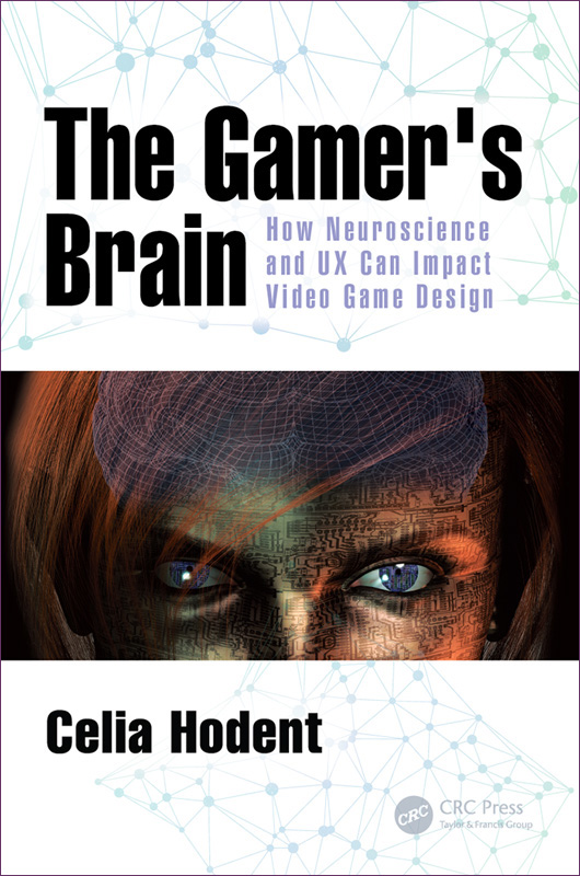
The Gamer’s Brain
by Celia Hodent
 |
| Game Developers Conference - GDC 2016 video presentation |
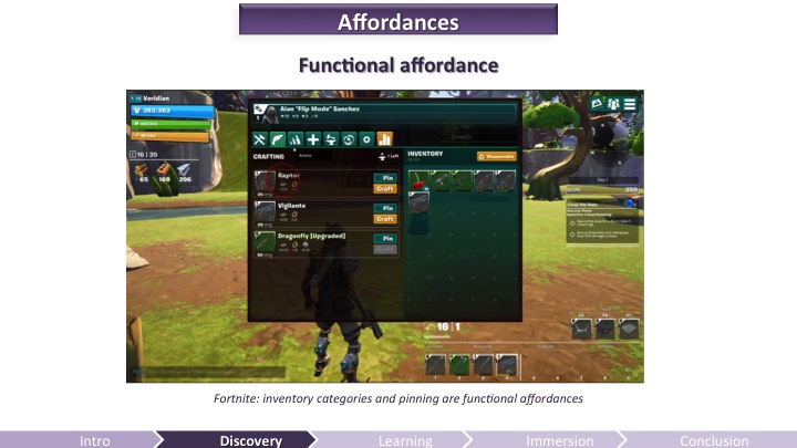
Discovering and mastering a video game is a learning experience for the user. It requires mental efforts. This is why it’s important to understand how the brain learns to craft a compelling onboarding experience – one worth putting effort into, one that will matter to your audience.
Anything the brain processes and learns originates from a perceived input and changes the memory of a subject. The quality of the processing – therefore the quality of the retention – depends highly on the attentional resources applied, which are also dependent on the emotions and motivation felt by the players. In sum, to improve the experience of the players, video game developers must take into account the perception, memory, and attention limitations of the brain, as well as the emotions and motivation felt by the players.
 |
| The Gamer's Brain: How Neuroscience and UX can Impact Video Game Design |


0 commenti :
Posta un commento