sabato 3 marzo 2018

Why don't users read manuals?

Why don't users read manuals?

Why people don't read manuals?

Why don't users read instructions?
Why don’t users read instructions?

User’s Fault
Most people are lazy.
They assume most of it can be figured out by using common sense.
They assume they know how to use things and don’t have time to read complicated instructions.
Some people learn best when given spoken directions rather than reading.
Some people learn best by watching and imitating.


Not The User's Fault
Instructions are often tedious to read and poorly written.
The manual is written in another language.
Often written by the engineers who designed the product and by lawyers for the manufacturer, the manuals are usually not written with the consumer in mind, even when the manuals are easy to understand, they may not be entertaining enough for today's consumer, especially younger ones who have grown up with the fast-paced world.
Learning styles
Learning by doing

The Paradox of Active Users

Usability - Principles of design for users

Principles of design for users:


Affordance
Affordances define what actions are possible between an object/service and a person.

Consistency
Design interfaces to have similar operations and use similar elements for similar tasks.
Enable people to transfer prior knowledge to new contexts and learn new things quickly.

Constraint
A method of limiting the actions with restrictions so that the system can never enter into an invalid state.

Feedback
Clearly and immediate confirmation that an action has been performed successfully.

Mapping
A relationship between controls and their movements or effects. A good mapping between controls and their effects results in greater ease of use.

Signifier
Signifiers are signs, perceptible signals of what can be done. These signs tell you about the possible actions; what to do, and where to do it.

Visibility
The usability of a system is improved when its status and methods of use are clearly visible.

How to write usable manuals


How to write usable manuals
Components of well-designed manuals:    
A separate quick-start booklet.
Table of contents and index required. 
Glossaries for clarifying technical terms. 
Appendices for error messages.
Divide the document into sections.
Match the procedures to tasks. Group similar tasks into the same chapter.
Organize chapters so that frequent tasks come before infrequent tasks.
If you need both task-based instructions and reference material, divide the document into two sections. The first section is a user guide. The second section is a reference manual. 

Pdf document "People don't read manuals"


sabato 24 febbraio 2018

Usable Products

Usable Products


BASIC UX — A Framework for Usable Products


The problem is this…
While information and opinions on ‘good UX’ are increasing in availability, teams, organizations, and individuals still struggling to define, measure, and agree upon principles of UX in a productive manner. That is, a lot of UX discussions end in design arguments. Meanwhile, the developers are waiting for direction, the designers are waiting for a correction, and the end-users are waiting for a satisfying experience.

BASIC UX does not set out to be the ‘end all, be all’ of UX principles. It does set out to help solve or at least reduce the problem stated above — UX design in productive environments is harder than it should be.

A set of common principles that test something’s overall user experience.

First, each letter in the word BASIC stands for a UX principle.

  • Beauty
  • Accessibility
  • Simplicity
  • Intuitiveness
  • Consistency

______________

Beautiful

Is it aesthetically pleasant?

The look and feel of a product are important to its overall user experience. The Aesthetic-Usability Effect shows that a visually appealing design is perceived as easier to use than an ugly one. Developers should refer to style guides and design specs for reference here. A few pixels can make a design look ‘off’ and leave the product feeling ‘broken.’

Questions to ask

Is it aesthetically pleasant?
Does it follows the style guide? (Attractive things work better)
Are high-quality images and graphics used? (balance with size optimization)
Is it properly aligned with the layout?

__________

Accessible

Can ‘everyone’ use it?

A product’s accessibility is measured by how available and usable it is for people, regardless of their ability. Developers must go beyond the ‘average’ user and ensure that those with disabilities are also able to use the product. These disabilities might include: poor or no vision, color blindness, lack of motor skills, lower than average intelligence, etc. In these cases, third-party software such as mouse-dictation and screen readers are often used to navigate and perform actions within the product. Using existing standards such as WCAG, 508 compliant, and W3C will help increase the overall accessibility of the product. Subtle accessibility impacts should also be kept in mind when choosing font size, colors, and animations.

Questions to ask

Does it comply with standards? (WCAG, 508 compliant, W3C)
Is it cross-browser compatible? (IE8–11, CH, FF, SF)
Is it ‘display’ responsive?
Is the language simple enough for most to understand?

__________ 

Simple

Does it make life easier?

Hick’s Law states that the time it takes to make a decision is proportionally related to the number and complexity of choices. Additionally, Ockham’s Razor states that simplicity should be the deciding factor when choosing between two identical designs. Developers must then create user interfaces that distill the options to only what is needed to perform the user’s task.

Visually, this means balancing the use of white space and alignments to create associations, rather than complex graphics and styling. The Principles of Gestalt informs us that the use of distance, alignments and color similarities can help guide a product in a clean, simple and intuitive manner. For language content, this means reducing redundancy, removing passivity and filler words.

Questions to ask

Does it reduce the user’s workload? (automate where possible, reduce user’s workload)
Is it free of clutter and repetitive text? (Cognitive load, DRY text, KISS)
Is its functionality necessary? (YAGNI)

________ 

Intuitive

Is it easy to use?

The Gulfs of Evaluation and Execution (Norman 1986) help us understand the usability gaps that users face in any system. Evaluation happens when the user is trying to understand the state of the system. If the state is not clear, the user might unnecessarily repeat an action, or feel a sense of anxiety that their task wasn’t completed. Execution is needed for a user to achieve their goals. If the path of execution is unclear, then the user won’t know how to achieve their goals in the system. If either one of these “gulfs” are too wide, then users will not have a good experience in the system and will dread using it.

Affordance is another key aspect of an intuitive UX. For example, the color of links or the shape of buttons indicates that there is an action available. It’s import to realize that most people spend most of their time with other products and in other systems. Thus, building upon established design patterns is key.

Questions to ask

Is the functionality clear (Affordance and Gulfs of Evaluation/Execution)
Can the user achieve their goal with little or no initial instructions?
Is the task easily repeated by the user without further instruction?
Can the user predict the outcome/output?

_________ 

Consistent

Does it match the system?

Consistency is the thread that holds BASIC UX together. A beautiful product is consistent. An accessible product is consistent. A simple product is consistent. An intuitive product is consistent. In UX, consistency is the thing that separates frustrating chaos from cohesive harmony. It is important that design colors, spacing, fonts and alignments are uniform throughout the product. This visual and functional uniformity creates a sense of dependability and trust between the user and the system.

Developers should reuse existing and established elements in the system whenever possible. Forms should have consistent alerts, labels, validation, and action behaviors. If consistency is lacking, then the entire UX will be as well. Performance glitches should be minimized so that pages load as a consistent rate and actions produce predictable responses.

Questions to ask

Does it reuse existing Interfaces/Interaction?
Is its language, images, and branding consistent with the system?
Does it appear in the right place at the right time? (workflow, navigation, visual hierarchy and information architecture)
Does it perform consistently every time?

__________ 

Conclusion

User Experience Design is at the forefront of product management in today’s industries. However, in spite of this vast and growing knowledge-share on the topic, UX Design is still a difficult area to gain team consensus around. It is in these situations that frameworks can provide clear direction. BASIC UX is a user experience design framework made up of five key design principles. It strives to help developers and designers guide their products in the right direction while remaining productive in the development process. I encourage you to introduce BASIC UX to your team and use it to enhance the experiences your products deliver.

sabato 17 febbraio 2018

If It Needs a Sign, It’s Probably Bad Design

If It Needs a Sign, It’s Probably Bad Design


bad design

The EpiPen, the potentially life-saving device that delivers a dose of medicine to people having a severe allergic reaction, has been all over the news for its outrageous price spike. Going up 500 percent in just under a decade is upsetting. But even as the company and regulators are dealing with its price, going unaddressed is the product’s significant design flaw.

Despite having pen in its name, the EpiPen isn’t really designed like a pen at all. A pen usually has a cap that covers the pen tip. But the cap of the EpiPen is on the opposite end as the needle tip. Joyce Lee, a pediatrician and University of Michigan professor who also studies patient-centered design, points out that this broken metaphor causes confusion over which end is which – and has led to people accidentally pushing their fingers into the needle. Between 1994 and 2007 there were over 15,000 unintentional injections from EpiPens, including many cases of trained healthcare professionals who accidentally gave themselves a dose of epinephrine in the thumb or finger while trying to deliver the life-saving medicine to someone else.

bad design
Unlike a regular pen, the EpiPen has the cap and needle tip on opposite sides  (Kira Stewart-Watkins, Flickr)

The owner of the EpiPen, Mylan, told ProPublica that “Since acquiring the EpiPen Auto-Injector, Mylan has made significant improvements to the design of the medical device portion of the product” and that the design changes were “aimed at making EpiPen Auto-Injectors easier to safely carry, hold, and administer and reduce the risk to users from the device’s needle, which is extremely important to our patients.” The company “encourage[s] all patients and caregivers to receive training on proper administration.” See Mylan’s full response here.

But while in 2009 Mylan redesigned the device, they didn’t change the orientation of the cap and needle. Instead, they colored one end bright orange and gave it the label “Needle End.” No doubt the design tweak helped a little: according to one study, the new EpiPen has a success rate of 67 percent (the old pen had a success rate of 43 percent). But that same study compared the EpiPen to another epinephrine auto-injector, the Auvi-Q, which was recently taken off the market after being recalled for dosage problems. The Auvi-Q is designed with the cap and needle on the same end – and had a success rate of over 90 percent.

It’s not surprising that a new color and a label didn’t stop accidental injections entirely. The EpiPen is just one more example in a long tradition of designers “solving” design problems by adding instructions, rather than fixing the underlying design itself.

Now, it’s true that sometimes instructions are useful and necessary. But in many cases, if it needs a sign, it’s bad design.
_____________________________________ 

The Role of Metaphor in Design

by Joyce Lee, MD, MPH Physician, Designer, Researcher Promoting a Maker Movement for Health     doctorasdesigner.com

bad design

The left-sided photo shows the needle area of the old EpiPen. The right-sided photo shows the needle area of the currently available EpiPen. On both sides of the current EpiPen, there is text on the front and back with the words NEEDLE END in large capital letters accompanied by a large black arrow. A healthcare stakeholder wouldn’t even blink at this detail, but I must quote the great Don Norman, one of the founders of human-centered design:

“Any time you see signs or labels added to a device, it is an indication of bad design.”


lunedì 5 febbraio 2018

People don't read instructions


Entitled People Don't Like to Follow Instructions   

They see rules as an unfair imposition.

by Jesse Hicks

Entitlement, as they say, is a hell of a drug. A new study examines its effects, finding that people with a greater sense of entitlement are less likely to follow instructions—because they see rules as an unfair imposition. Even when disregarding the rules means receiving punishment, the more-entitled people would rather lose out than submit to a system they perceive as less than fair to them.

The study, which appears in Social Psychological and Personality Science, follows up on earlier work which showing that more entitled people are less concerned about what’s socially acceptable or serves a greater good. They believe themselves deserving of preferences and resources not given to others—that’s nearly the definition of entitlement—but researchers were less clear on why people felt that way.

********************************

Psychological Entitlement Predicts Failure to Follow Instructions 

Abstract
Six studies examined the relationship between psychological entitlement and not following instructions. In Study 1, more entitled individuals were more likely to ignore instructions about how to format their responses. Studies 2–4 investigated possible boundaries on the association between entitlement and ignoring instructions; however, entitled people were more likely to ignore instructions even when following instructions was low cost for the self, instructions were given in a less controlling way, or punishment was highly likely to result from a failure to follow instructions. To explore another possible explanation for the relationship between entitlement and ignoring instructions, Study 5 examined whether entitled people were more sensitive to situations potentially unfair to them; indeed, they were more likely to reject offers in an ultimatum game. Building on this finding, in Study 6, more entitled individuals’ greater likelihood of ignoring instructions was predicted by their viewing instructions as an unfair demand on them.

******************************** 
********************************

Real Users Don't Read Manuals  

by Moritz - Enterprise Project-manager

Good products help users attain their goals
This is the case for machines, electronics and other physical products, but also holds true for software. A great deal of good UX design is creating something that people can easily understand and handle intuitively. People use products not for the sheer pleasure of using it but to reach a certain goal. This means that one of the main criteria of how people rate their experience depends on how effectively and efficiently people can reach those goals.

So, in general, your product should strive to teach its users 3 different things:

  • To know where different functions can be found
  • To understand the purpose of the different functions 
  • To understand how different functions work

Why don’t users read manuals?

There are a few obvious explanations and not so obvious explanations for this. For one, most people are lazy. They’d rather not do something that takes effort, like read complicated instructions. Even if forced to work with a new tool most novice users will skip over the instructions and assume most of it can be figured out by using common sense. Advanced users skip over the instructions. They assume they know how to use things and don’t have time to read complicated instructions. This doesn’t just lead to errors, but also to users who maintain ineffective usage patterns, keeping themselves from learning and limiting their ability to achieve the goals they have set out for themselves with their new tool.

This isn’t always the user’s fault. Instructions are often tedious to read and poorly written. Users who try to read the instructions tend to get confused by the sheer number of words and concepts. Designers often overdo it with their instructions and tend to over-complicate things. This holds especially true for helper texts within a system. In an attempt to cover all bases and make sure the user gets what he has to do, long text scares off the user and creates the opposite effect.


The theory of the Active User Paradox

Back in the 1980’s John M. Carroll and Mary Beth Rosson at IBM discovered that people don’t read manuals but dive right into tasks until they get stuck or manage to finish through trial and error. They formulated the theory of the Active User Paradox.  In this theory they deal with two common problems faced by users:

  • The Product Paradox
  • The Assimilation Paradox 

These behavioural patterns explain how users try to avoid spending more time than necessary with a product. By skipping proper learning they try to save time, but on the long run this usually costs more time than it saves.

The Product Paradox is the focus of the user on the final product. As they use a product for a specific goal they want to achieve this as soon as possible. They take the first best solution they can find,  skipping instructions and focusing only on the task at hand.

Resulting from this the Assimilation Paradox describes the fact that if people don’t know something they compare it to things they know. Even if those comparisons are not appropriate.

In their paper they give some great guidelines on how to deal with these issues:


How to improve learning behaviour for users

Thankfully, with the above in mind, there are things you can do to improve the learning behaviour of users. One important thing is to accept that long-winded written text-based manuals are often not an ideal solution. Diversification of methods, giving users different avenues for learning, will help bring your point across. In addition, even if a point against manuals has been made here, they should always be supported, as users will need it in worst case scenarios it has to be there.

Different onboarding strategies incorporate the principles Carroll and Rosson established in their papers and try to design for or mitigate the impact of the two paradoxes.


Paradox of the Active User - pdf online

*********************************


Onboarding strategies

What is user onboarding?

User onboarding is the practice of making your product or service as easy as possible for new customers to get value from. It’s a way to build retention directly into your business, ensuring that customers understand how the product works and why it’s worth paying for.


*******************************************
*******************************************


Designing for People Who Have Better Things To Do With Their Lives 

by JOEL SPOLSKY

When you design user interfaces, it’s a good idea to keep two principles in mind:


  1. Users don’t have the manual, and if they did, they wouldn’t read it.
  2. In fact, users can’t read anything, and if they could, they wouldn’t want to.

These are not, strictly speaking, facts, but you should act as if they are facts, for it will make your program easier and friendlier. Designing with these ideas in mind is called respecting the user, which means, not having much respect for the user. Confused? Let me explain.

What does it mean to make something easy to use? One way to measure this is to see what percentage of real-world users are able to complete tasks in a given amount of time. For example, suppose the goal of your program is to allow people to convert digital camera photos into a web photo album. If you sit down a group of average users with your program and ask them all to complete this task, then the more usable your program is, the higher the percentage of users that will be able to successfully create a web photo album.

Now, even without going through with this experiment, I can state with some confidence that some of the users will simply fail to complete the task, or will take an extraordinary amount of time doing it. I don’t mean to say that these users are stupid. Quite the contrary, they are probably highly intelligent, or maybe they are accomplished athletes, but vis-à-vis your program, they are just not applying all of their motor skills and brain cells to the usage of your program.

Users Don’t Read the Manual.

First of all, they actually don’t have the manual. There may not be a manual. If there is one, the user might not have it, for all kinds of logical reasons: they’re on the plane; they are using a downloaded demo version from your website; they are at home and the manual is at work; their IS department never gave them the manual. Even if they have the manual, frankly, they are simply not going to read it unless they absolutely have no other choice. With very few exceptions, users will not cuddle up with your manual and read it through before they begin to use your software. In general, your users are trying to get something done, and they see reading the manual as a waste of time, or at the very least, as a distraction that keeps them from getting their task done.

In fact, users don’t read anything. 

This may sound a little harsh, but you’ll see, when you do usability tests, that there are quite a few users who simply do not read words that you put on the screen. If you pop up an error box of any sort, they simply will not read it.

The fact that users do not read the manual leads many software designers to assume that they are going to have to educate users by describing things as they go along. You see this all over the place in programs.

In reality, when you run a usability test on this kind of thing, you’ll find that advanced users skip over the instructions. They assume they know how to use things and don’t have time to read complicated instructions most novice users skip over the instructions. They don’t like reading too much and hope that the defaults will be OK the remaining novice users who do, earnestly, try to read the instructions (some of whom are only reading them because it’s a usability test and they feel obliged) are often confused by the sheer number of words and concepts. So even if they were pretty confident that they would be able to use the dialogue when it first came up, the instructions actually confused them even more.

******************************************** 

Why Users Don’t Read Your Help Manuals

Study says 64% of men don’t even read the manual before calling tech support

The Disappearance Of The Instruction Manual

95 percent of all returned gadgets still work

Why Don’t People Read the Manual? 

5 Reasons Why Users Don’t Read Your Help Manuals

  1. Your help manual is published in the wrong format
  2. Your help manual is absolutely boring
  3. Your manual does not match user's operating system
  4. Product users underestimate the value of your help manual
  5. Differing technical abilities


Further reading
Why don't people read the manual? in Proceedings of the 24th annual ACM international conference on design and communication (pp. 11-18) Novick, D. G., & Ward, K.

Resolving the paradox of the active user: Stable suboptimal performance in interactive tasks. In Cognitive science, 28 (6), 901-935 Fu, W. T., & Gray, W. D.

Principles and heuristics for designing minimalist instruction. Technical Communications, 42(2), 243-261. van der Meij, H. & Carroll, J.M.

Paradox of the active user. Carroll, J. M., & Rosson, M. B.

The Nurnberg Funnel. Carroll, J.M.

lunedì 29 gennaio 2018

Digital Cockpit Drives the Future of Connected Cars

Digital Cockpit Drives the Future of Connected Cars

source: news.samsung.com

Samsung and HARMAN unveiled a new concept in connected car technology at the Consumer Electronics Show (CES) 2018. This first automotive electronics collaboration between the two companies has resulted in the Digital Cockpit platform, which combines 5G technology and an IoT platform to provide an intelligent and seamless connected car experience.


Consumers’ needs have changed greatly when it comes to automotive technology. While both drivers and passengers have always needed ease of use, personalization and safety, more than ever, they need their devices to be able to connect to each other and to offer simpler controls. The Digital Cockpit meets these needs and more by providing infotainment and IoT services across a suite of OLED and QLED screens.

The Digital Cockpit consists of three displays and three knobs that can all be customized according to driver and passenger tastes.


The Cluster Display in front of the driver uses a 12.3-inch OLED and provides driving information such as speed and RPM. Infotainment is handled by a 28-inch QLED Central Information Display (CID) and Passenger Display, using the integrated solutions for multiple displays running on a single chip. Below these displays is the Control Display, a 12.4-inch curved OLED that enables control of other features such as air conditioning.

The Digital Cockpit’s three knobs have a circular display akin to Samsung’s Gear S watch, so users can directly and intuitively use them. The customizable knobs can be set to functions most frequently used by the driver, such as clock, temperature, volume and Bixby.

The Cluster Display (left) for information and the Center Information Display/Passenger Display (right) for infotainment

more:
news.samsung.com


lunedì 22 gennaio 2018

Acura precision cockpit

Acura Precision Cockpit Previews Next-Generation Interior and Technology Direction

source: acuranews

acuranews.com


Touchpad with Absolute Positioning

The Acura Precision Cockpit's touchpad uses absolute position mapping for the first time in the driving environment, combining the flexibility and usability of a touchscreen with the comfort and reduced driver distraction of a remote-based approach. A traditional touchscreen approach is intuitive and direct, but forces a compromised placement of the screen close to the driver and out of the driver's natural line-of-sight. A traditional remote-based interface – common in luxury cars – solves these challenges, but the interaction between the remote and the display is often indirect and clumsy. 

With absolute positioning, the interaction with the touchpad aligns precisely with the actions on the main display. Every spot on the touchpad is mapped to a specific function on the main display, just like a touchscreen. Favorites are positioned along the bottom, and scrolling is positioned along the outer edges. A tap on the top left corner of the touchpad engages the content on the top left corner of the center display. 

"Absolute positioning transforms the touchpad experience, making it personal, intuitive and particularly well-suited for premium, driver-centric, performance machines," said Dave Marek, Acura's executive creative director. "It's also designed to be quickly and easily adopted, as drivers become acclimated and comfortable in minutes."

_______________ 

Bucking trends, Acura reveals vision of tomorrow’s dashboard

source: Chris Davies 

It’s an answer that goes against the grain of what many others in the auto industry are doing. While the modern dashboard is usually a finger-enticing plethora of touchscreens, Acura has eschewed such things with the argument that, though perfect for tablets and smartphones, they’re not especially suited – or safe – for cars. After all, since you need to look where you tap, you have to take your eyes off the road.

The automaker’s new alternative is, ironically, something you might have experimented with on your laptop years ago. The Precision Cockpit concept has a touchpad mounted down low in the center console, positioned just right for your fingertips to dangle atop it when you rest your wrist on the leather pad. It’s topped with a couple of shortcut buttons for Home and Back, with a touch-sensitive scroll strip to its right.

Touchpads aren’t new in cars either – Lexus tried, albeit half-heartedly, to replace its little-loved joystick controller with one – but what makes the difference in Acura’s case is how taps are registered. Dubbed “Absolute Positioning” it’s basically a 1:1 mapping of points on the touchpad to points on the wide 12.3-inch display on top of the dashboard. A tap in the top right corner always refers to what’s in the same spot on the display, for instance.

The idea is that, just as you get familiar with the location of physical buttons on a dashboard over time, so you get used to positions on the touchpad and how they relate to what’s on the screen. According to Acura, it was a matter of minutes before its testers got to grips with the system, in fact.

Both touchpad and center display are positioned for anyone in the front to use. For the driver alone, there’s a second 12.3-inch screen for virtual instrumentation. With a human at the wheel, that shows things like a speedometer and the usual dials you’d expect; when the car is driving itself, under conditions like adaptive cruise control or – in the future – entirely autonomously, it changes considerably.

Similar absolute-mapping on laptops has always been less than ergonomically successful, primarily because the resolution of the display and the content on-screen usually demands smaller movements than are practical on a laptop-scale trackpad. In Acura’s case, the chunky icons are far easier to hit. The display itself is split roughly 60/40 into two panels: a primary display for apps, navigation, and such on the left, and a narrower screen dedicated to music, weather, and notifications on the right.
slashgear.com
Both touchpad and center display are positioned for anyone in the front to use. For the driver alone, there’s a second 12.3-inch screen for virtual instrumentation. With a human at the wheel, that shows things like a speedometer and the usual dials you’d expect; when the car is driving itself, under conditions like adaptive cruise control or – in the future – entirely autonomously, it changes considerably.

slashgear.com

_______________ 


lunedì 15 gennaio 2018

BMW HoloActive Touch

BMW HoloActive Touch

BMW HoloActive Touch looks floating graphic over the console. Touch either of the floating buttons and you control feature functions but also get distinctive touch sensation. It uses three sub-assemblies – projector, a camera and a speaker. The projector sits in a panel on the console and makes the images appear to float in the air.

A camera sensor captures the finger motion (like projected capacitive) and activates the feature / function. The unique feature is haptic feedback.


BMW HoloActive touch sensitive display for showing the driver information about music, navigation and more, which appears to float in air, and which also provides actual felt, tactile feedback in response to interactions. HoloActive Touch incorporates heads-up display features, too, meaning it could span the driver’s field of view and provide a more immersive way to access info about your car and your ride.
excerpt from designhmi.com 
_____ 


This revolutionary technology brings together the BMW Head-Up Display, BMW gesture control, a feature which made its debut in a previous CES and is now available in the new BMW 7 and 5 Series, and direct touchscreen operation into on single interface. So you can simply adjust the audio volume or climate control in the car by waving your hand or snapping your fingers.

This innovative interface between the driver and vehicle acts like a free floating in-car virtual touchscreen which can be operated using finger gestures. BMW HoloActive Touch allows the user to access the wide variety of services provided by BMW Connected.

According to BMW:
"For the first time, the functions can be controlled without any physical contact with materials. But the technology still enables the visible and tangible driver-vehicle interaction familiar from conventional touch screens."

The display is located towards the right of the steering wheel and the driver can simply use finger gestures to operate it. There is a camera to detect the driver’s hand movements. The moves further help to determine if the fingertip makes contact with the visual control surface. A pulse is then emitted and the relevant function is activated. In this way, the driver does not interact with any physical material and can thus focus on driving.

This technology seems to have been sourced from Ultraphatics.


HoloActive Touch is BMW’s latest step towards holography. BMW introduced AirTouch last year, which allows users to control navigation and entertainment features with movement of hand.
excerpt from mobilescout.com  


_____ 


_____ 

Article  Offline  Attachments:


lunedì 8 gennaio 2018

Volvo design: Pushing the right buttons?

Volvo design: Pushing the right buttons?

By Denis Wong

Jonathan Disley, Vice President of Design, Volvo Cars China and Asia Pacific.

It’s always a privilege to be privy to talks by designers expounding on their own creations, as is the case recently when Jonathan Disley (top), Volvo Cars China and Asia Pacific’s Vice President for Design, decided to stop by Kuala Lumpur.

On the evidence of the new XC90 and the soon-to-launch S90/V90, few can deny that Volvo is on to a good thing from a design perspective. If you find the exterior styling of new Volvos invigorating, then the interior makeover has been nothing short of a revolution.


The handful of buttons and a lone rotary knob of the XC90 (top image) against an entire panel of them on a S60.
It was no surprise to learn from Disley that buttons and switches have always been a bane to interior designers; they are a necessity but introduces clutter to the dashboard. Once physical controls are ‘confirmed’ for production, it’s near impossible to alter the aesthetics and functionalities without incurring heavy redevelopment costs. Basically, you’re stuck with them for at least one model cycle that lasts at least five to seven years, if not longer.

Disley revealed that the inspiration behind Volvo’s new Sensus Connect infotainment system came from Apple’s iPad. Not only does touch screen technology solve the age-old issue of clutter, thus freeing the shackles that bound designers from penning a cleaner, more expressive design, but by virtue of being software-based, the system can be updated anytime, just like a tablet.

Are virtual controls ready to replace physical ones entirely? Hmmm…
Some hardware switches have survived the cull of course – ignition, drive mode selection, park brake, demister, hazard, among others, but curiously, Volvo chose to stick with the physical controls for the entertainment system (i.e. volume, play button, etc.) and not the air-conditioning.

Volvo isn’t the first manufacturer to have embraced touch interface in a comprehensive manner and certainly won’t be the last. Make no mistake, to pack that much tech yet have an interface so clean and visually appealing is nothing short of cool. The minimalist approach allows for large swatches of natural materials (wood, aluminium, leather as found in the XC90) to shine through. Personally, I’m sold on the concept, and you’d be too if you ever find yourself sitting in a XC90.

Clean, uncluttered interior architecture allows for materials to shine.
But as Disley proudly quoted Jeremy Clarkson’s verdict on the XC90 cabin as ‘the nicest interior you’ll find anywhere this side of a Rolls-Royce Phantom’, a couple of us local hacks (who aren’t remotely as famous or as wealthy as Mr. Clarkson) can’t help but to query Disley as to why Volvo chose to have physical controls for the audio instead of air-conditioning which we humbly submit as the more critical one to have, particularly when the steering wheel already has dedicated buttons that control the sound system.

Audio controls can be found on the XC90 steering wheel, curiously repeated on the lower dash.
So as more carmakers move to exorcise unsightly buttons and dials from dashboards, I believe the decision as to which physical controls to retain will be harder than ever. Our extremities may have become more dexterous in the age of smartphones and tablets, but adjusting the temperature and fan speed on a touchscreen (such as that of the XC90’s) when driving can be a hit-or-miss exercise. Unless you have fingers shaped like a stylus or have the (mis)fortune of being endowed with dainty digits like Donald Trump, it can even be distracting at times, when it really shouldn’t be. Our reader review of the XC90 also touched upon this point.

Disley justified the inclusion of physical audio controls on the basis of Volvo’s own customer research. I can’t possibly question the Swedish carmaker’s integrity in vehicular safety either; they remain at the forefront and are well on their way to achieving zero fatalities in road accidents involving Volvo vehicles. But it’s interesting to note that other premium manufacturers (case in point being the Germans) have also gone the minimalist route in interior design while retaining hardware controls for key functions such as air conditioning. Maybe that’s why Jeremy Clarkson likes them less than the Volvo.

Often used air-con controls should all be as easy to operate as this one (from a Volkswagen Passat)


lunedì 1 gennaio 2018

5 Things Everyone Should Know About UX Work

5 Things Everyone Should Know About UX Work


The howls of frustration that we hear on many UX projects are often to do with how badly misunderstood the UX role is in business. Here are 5 things that everyone should know about UX work:

1. UX Research is Essential

The first barrier to many a UX project is people in the company who think they already know the customer inside out.

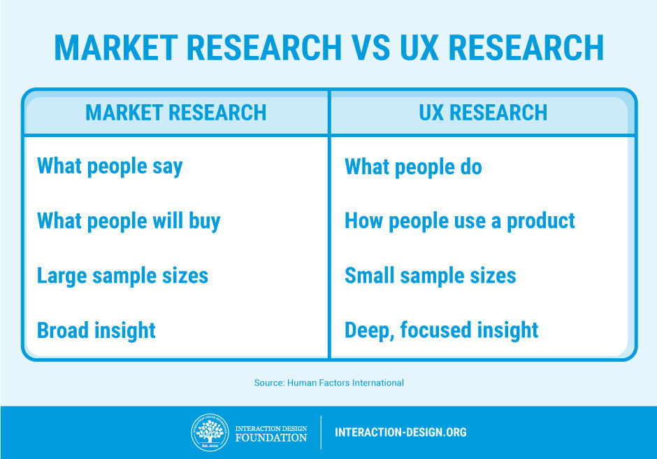
“We’ve done plenty of market research, just tell us what you need to know and we’ll tell you,” comes the offer of many a helpful marketing manager or project manager. In reality, we don’t care about their market research—we need to talk to users to build up a profile in relationship to the use of the product and not how they interact with the company in general. Market research is about broad trends in customers and what they are likely to buy; UX research is about individual behaviours of users when they use a product. These are different things, and without talking to users, we can’t know how they see the product or develop one of those lovely user personas that we need.


2. UX Work Tends to Be Iterative

While it doesn’t look like we’ve done all that much since the last time you popped your head round the door, in truth, we’re 5 versions farther along the lines towards a product our customers will like. To make great products, we make lots of changes and test them. Then we bury the changes that don’t make enough of a difference. We keep doing this until we finally have a product that’s substantially better than either our last one or the competitor’s offerings. It takes time, and it’s not exciting to look at from outside our labs, but it’s also very much necessary.


3. We Can’t Show You a “Process”

We warn against treating UX work as a “one size fits all” process. Sadly, this behaviour can alienate some clients, and in some cases, clients might even demand this from the outset.

“Show us your process and we’ll tell you how it fits in with our product,” they might claim.

You need to step back and explain that each process should be somewhat unique, as each product is somewhat unique and as each user base is also somewhat unique. Your clients don’t want a standard process really; they just think they do and you may have to wean them off the idea.


4. Yes, We Have to Test

If you want products that users love, then we have to test them. Sure, we UX folks are experts in our field, but we’re not your users. Our job is to refine ideas to the point that we can hand them over to your users to tell is if we got it right or not. This may be time consuming, but it’s the only assurance you have that we’re really moving in the right direction too.


5. UX is More than Usability

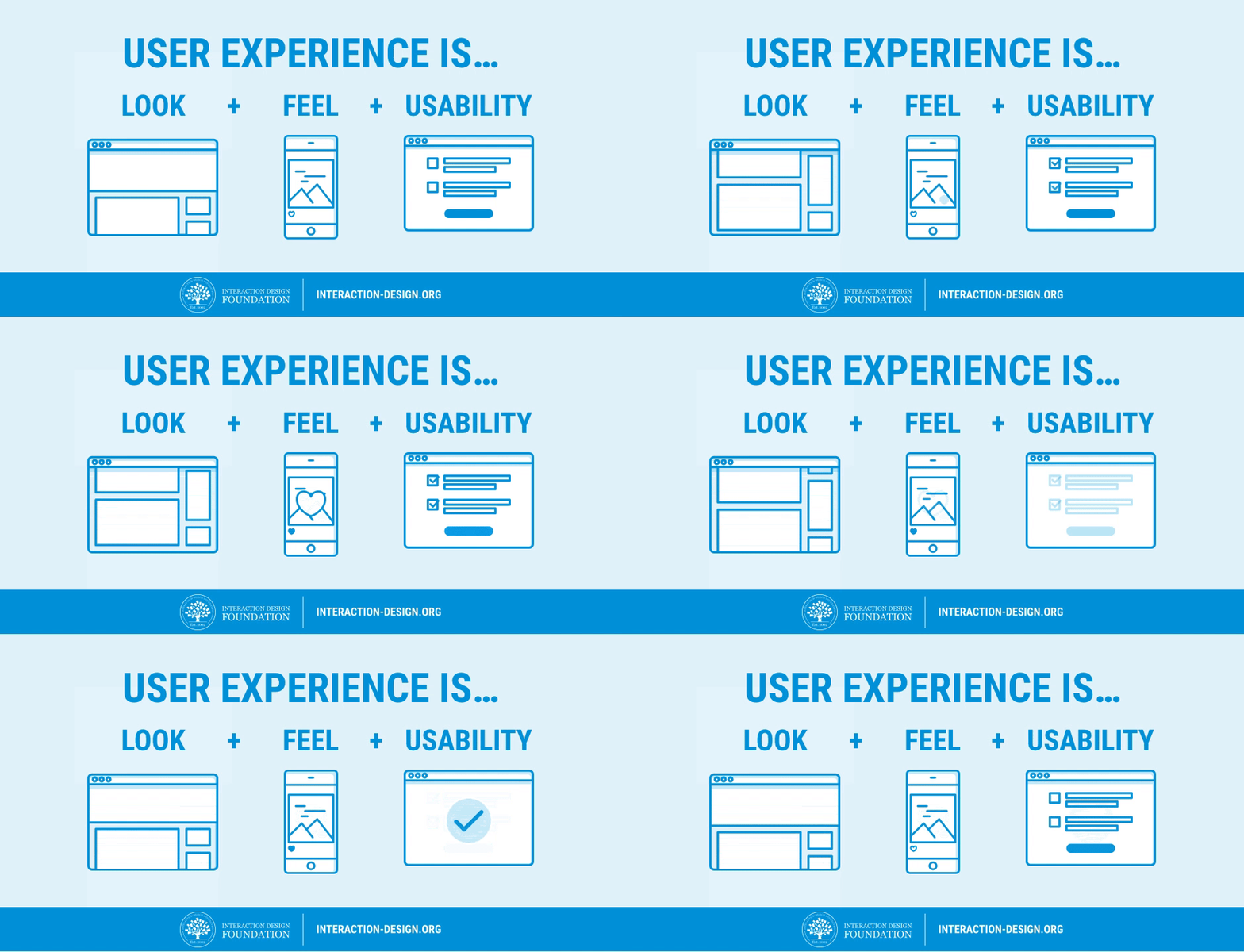
Usability is important, but the user experience is more than usability. We like how Apple has managed to get usability on the strategic radar, but usability alone is not enough. Usability is the bare minimum requirement of a product that is released; UX includes everything else that makes the difference between “it works” and “it wows!”

source: Interaction Design Foundation

lunedì 18 dicembre 2017

What are bad technological flaws no one is addressing?

What are bad technological flaws no one is addressing?


  • Mobility.You cant use your phone while charging.
  • Wastage of electricity as it is less efficient.
  • It's not wireless. Charging Dock is connected to the outlet through a wire.