lunedì 25 settembre 2017

Reach Out And Touch Something … Screen or Knob?

Reach Out And Touch Something … Screen or Knob?
by Doug DeMuro


I recently had the chance to test out the “new” Volkswagen Passat, which is so new that the designers were explaining to a whole group of journalists how the position of the rear reflectors has changed compared to the outgoing model.

Actually, I kind of like the new Passat. It was impressive in a lot of ways, right down to the new touchscreen, which finally sees Volkswagen catching up to some of the technology and features rival models have been using for roughly five years. As I was driving it, I couldn’t help but think to myself: I like a good touchscreen.

What I don’t like is a knob.

It seems that these are our only choices in today’s infotainment world: a touchscreen or a knob. Some cars have touchscreens. Some cars have knobs. And given that basically every new car has an infotainment system, this is an important choice. Do you want to control your screen by touching it, like a smartphone? Or by moving around a controller located on the center console, like a computer?


Automakers appear to be largely split on this issue. Most mainstream car companies, the Fords and Chevys of the world, offer a touchscreen. You touch, it screens. The benefit of this is that you touch exactly where you want, and the system does exactly what you want, unless you are in a Chevy, in which case it does what you want after it thinks for a few seconds/minutes/it’ll do it this weekend.

High-end brands tend to prefer knobs. Lexus has its famous Remote Touch Controller, which is sort of like a computer mouse in the sense that you move around a little arrow and you click on stuff, but not really like a computer mouse in the sense that you’re supposed to do this at 75 mph. BMW’s iDrive and Audi’s MMI both work similarly: you move a dial to control the infotainment system. You could touch the screen, but it wouldn’t do anything, and you’d just end up getting fingerprints on it.

Me, I personally prefer a touchscreen. Let me tell you why: because it’s incredibly easy to use. A button says “MAP.” I press “MAP.” The MAP comes up. This is very different than in, say, a BMW 7 Series, where a button says “MAP,” so you grab the little dial, and you move over to the button, and you’re about to click on it, but then there’s a bump in the road, and you accidentally click somewhere else, such as on a button that says “CLIMATE,” and now you have no idea where you’re going, so you crash into a bus shelter.

Of course, I am not saying that the BMW 7 Series is scary. What I am saying is that the BMW 7 Series is incredibly scary.

But the manufacturers that use knobs don’t see it that way. They say that if they put the knob in the center console, they can move the infotainment screen higher on the dashboard, away from your reach, which means you have to take your eyes off the road less in order to do things. This is true, of course, but I would like to point out that I would take my eyes off the road even less if I could just touch the damn screen wherever I want.

Maybe the best manufacturer is Mazda, who undoubtedly had this argument in some engineering meeting, which likely led to raised voices and harsh words and maybe even some good old-fashioned chair throwin’. So what they did is, they put in a knob and a touchscreen. This allows you to use both hands to control the screen at any one given time.

No, I’m just kidding, what it allows you to do is use the touchscreen when you’re feeling touchscreeny and use the knob when you’re feeling knobby. I think this is Mazda’s greatest decision since 2002, when they decided to start making decent cars.

Unfortunately, it’s not a decision anyone else seems to be making, as other automakers have all staked their claims: some have gone touchscreen. Some have gone knob. But I will continue to hope that in this great war of in-car screen controls, the touchscreen people will slay the knob people and claim victory over the Great Land of Infotainment. Until then, I will do my best to keep from crashing into bus shelters.


lunedì 18 settembre 2017

Five worst new car features reinvent the wheel for no reason

Five worst new car features reinvent the wheel for no reason
by Robert Duffer    -   Contact Reporter  - Copyright © 2017, Chicago Tribune

The shifter of a BMW 740L diesel is seen at the media preview of the 2014 Chicago Auto Show at McCormick Place in Chicago on Feb. 6, 2014. Gear knobs that default to a middle setting make it unclear what gear a vehicle is in. (Terrence Antonio James / Chicago Tribune)


The state of the auto industry is one of opposites. There are sport utility vehicles with more horsepower than sports cars, and pickup trucks equipped like luxury flagships. Americans hold on to their cars for over 11 years yet new car sales broke records in 2015 and again in 2016. Yet we're also paying record high prices of more than $34,000 to load up our vehicles with stuff that aggravates us.

So much stuff. Even though there are few new car duds, consumer complaints are on the rise because of technology ranging from balky voice commands to glitchy touch screens and enough dings, blings and dongs to make you dizzy.

In this cutthroat competitive market, where horsepower and mpg are incrementally maxed out, the next place an automaker can stand out is with in-car technology. At best, it makes us safer and provides convenience. At worst, and too often, it makes us confused.

Complaints on the suite of systems generally known as infotainment accounts for 22 percent — the largest category — of consumer complaints in the first three years of ownership, according to the 2017 J.D. Power vehicle dependability study.

From voice recognition fails to Bluetooth drops, either owners are expecting in-car technology to be as intuitive as smartphones or carmakers are hamstrung about how to safely offer such levels of connectivity.

"Increased complexity equals increased problems," Consumer Reports warned consumers (and automakers) in its 2016 car reliability survey.

Here are the biggest sources of new car frustration.

Touch screens

Looking at it from an evolutionary view, touch screens had to happen to get to the next thing. With the backup camera mandated in all 2018 model year vehicles, it made sense to combine audio, climate, navigation, phone and vehicle info functions into the screen. But too often, especially in Asian makes, the buttons are too small, the interface too layered to safely execute a simple command. It becomes something many drivers would rather not use.

On the other hand, Tesla's massive 17-inch touch screen is intuitive and excellent. Most automakers are dialing down touch screens with the return of climate and audio buttons in sleek, spartan designs that complement the display screen. While we prefer the Germans' and Mazda's use of a control dial to access all that valuable information and all those pricey functions, some makes such as Chevrolet have done well using redundant steering controls to access the info in a condensed screen in the instrument cluster. It's as easy to use as setting the cruise. The roads would be safer, and drivers less frustrated, with the elimination of the touch screen.

Touch-sensitive controls   ... continue on Chicago Tribune

lunedì 11 settembre 2017

In Praise of Knobs

In Praise of Knobs
by Phil Patton (writes about design and cars for the New York Times)

Don't call it a comeback: Knobs could save infotainment.

I like knobs. Steve Jobs liked knobs. John Varvatos, the fashion designer with his own Chrysler 300 edition, likes knobs. In fact, Varvatos has created what might be thought of as a temple dedicated to knobs. In his New York store, occupying the former CBGB’s, the legendary punk bar on the Bowery, he displays a prime collection of 1960s and 1970s audio equipment with large, brushed-metal knobs, solid as the turrets of Admiral Dewey’s battleships, faces gleaming with ever-shifting reflections. Touch the knobs on such equipment and they convey to the fingers a solid feel, light but sure. Turning carefully calibrated knobs can be immensely satisfying. They have the quality we are searching for and find largely missing in the many interfaces in our lives. We want the same happy relationship of finger to surface in a touch screen, say, as we swipe and pinch or drag and zoom. No wonder the knob is making a comeback. Especially in the complex infotainment systems where voice and touch have come up short, knobs are back. Ford executive Joe Hinrichs recently said he would fix the much maligned MyFord Touch with more knobs. Steve Jobs, who of course put a knob on the original iPod (Apple called it a “scroll wheel”), was also a big fan of the stereo equipment on display at Varvatos—those huge units from Pioneer, Marantz, and McIntosh, with big two- or three-inch knobs that could be tuned precisely. Jobs loved stereo equipment, and legend holds that McIntosh, along with the apple, was one of the inspirations for the Macintosh name. However, the ultimate knob experts may be Audi’s knob gnomes, researchers who are part of the company’s haptics team, which focuses on sensory—especially touch—experiences, in Ingolstadt, Germany.
The knob gnomes are proof that car knobs have become more than simple utilitarian controls; they are now elements of brand differentiation. Jaguar’s shift knob rises dramatically from the console on startup, and Audi is proud of what it calls the “Audi click.” The lab guys can show you on a machine the exact resistance that makes for the Audi click (it’s really a double click). Getting a knob’s feel right would seem easy, but after visiting Audi, other vehicle knobs suddenly felt sticky or mushy. A good knob can be as satisfying as precise steering or well-balanced brakes, while a bad one ruins the experience.

Knob design is part of the haptics discipline. The sense of touch depends on ­several different kinds of nerves. Each is named for a scientist; Ruffini endings and Merkel mechanoreceptors convey pressure and texture, for example, and Meissner’s corpuscles offer information from a lighter touch while Pacinian corpuscles, located deeper beneath the surface, require more pressure. But measuring the responses of these nerves is difficult. “Haptics are difficult to express in numbers. Haptic evaluation is very subjective,” explains Audi’s Johann Schneider, director of the company’s lab. The goal is for the driver to immediately feel comfortable and have a sense of precision. The knob team tries to define such elements as ease of motion, well-defined end stops, uniform actuation sound, and clear feedback. “You won’t be able to please every customer,” says Schneider’s colleague, Manfred ­Mittermeier. “Actuation haptics and operating acoustics are usually perceived subconsciously. If we achieve 80 percent, that means we have a very good concept.”

People often speak of good controls as intuitive, but that usually means they follow familiar patterns. Although a knob’s operation generally needs no explaining, it is not an especially apt control tool for every job. In his classic 1959 text, The ­Measure of Man and Woman: Human Factors in Design, designer Henry Dreyfuss states that the input device needs to fit the nature of the input. He advocated one- or two-inch knobs for selecting amounts of things or quantities. Push buttons are ­better for choosing among discrete entities, such as park and reverse.


Even so, knobs in cars are taking over new functions. Ram is very proud of its dashboard shifter knob and highlights it in television ads. Car knobs are indirect evolutions of stereo knobs, and are, in part, based on the turn-and-push knobs devised by the late legendary designer David Lewis for Bang & Olufsen electronics. He told me once that he first devised these knobs for a 1960s audio project, inspired by the big knobs already on stereo equipment, but placed flush with the surface and equipped with a “dimple” for fingertip control. “That tactile feedback of turning and clicking is reassuring,” Lewis said. “The idea was to concentrate many functions in one button.”

The best interfaces, he said, are those based on years of familiarity. “We were building on established conventions that were known and understood, going back to the early telephone.” Considering that today’s handheld phones are often nothing but a screen, tomorrow’s knobs will have to be good if they are to survive.

Phil Patton

lunedì 4 settembre 2017

Why Does Every Car Infotainment System Look So Crappy?

Why Does Every Car Infotainment System Look So Crappy?
by Thorin Klosowski


button, car, touchscreen, UX, 悪いデザイン  良いデザイン,
from Cadillac's CUE


User interface design is hard, but we've been getting better at it over the years to the point where even a thermostat is easy to use. Automakers, however, seem to have their heads in the sand, taking their design inspiration for their infotainment consoles from old Winamp skins instead of any type of modern interface.

I've been car shopping recently, which means I've sat in a variety of models new and old with a salesperson attempting to justify why their shitty infotainment system — the little dashboard that usually controls at least the radio and phone options — is better than the competition. Pair that up with a number of rentals over the years and I've seen about every car infotainment system around. With a couple very rare exceptions, they're universally horrible and feel like they're designed by someone who hasn't used a computer since 2000.

Most automakers have their own brand of infotainment systems and their bad design is more than skin deep. For example, Audi has MMI, an insane system that uses dials for menu navigation instead of a touchscreen unless you pay to upgrade it. Audi isn't the only one to eschew modern innovation either, BMW's iDrive and Mercedes's Comand both rely on dials for input as well. For years, Lexus has relied on what was basically a mouse for navigation which is as insanely stupid and challenging to use in real life as it sounds.

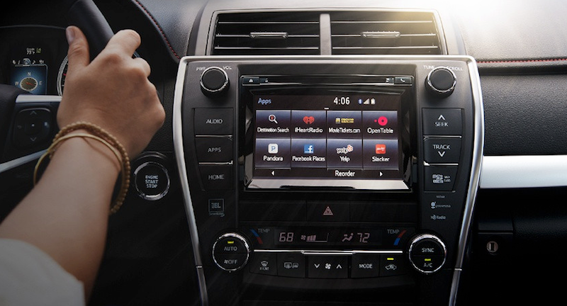
Most carmakers at least use touch screens, though their interfaces are cluttered and ugly. Ford has SYNC, Nissan has Connect, Toyota has Entune, Kia has UVO, Subaru has STARLINK, and so on and so on. As an example, here's Entune one of the worst options, which looks more at home on a laptop running Windows ME than it does in a brand new car:

On most of these infotainment systems, the menus seem devoid of logic, settings you need to access frequently are often buried beneath several submenus, and when there is a touch screen, they seem sluggish and clunky. There is a 100% you will need to look in the manual to change a very basic setting. Even something simple, like icon design, is the worst. The icons on Chevy's MyLink look like they were pulled from a cheap clipart collection:

On most of infotainment systems you'll find horrible icons that are probably included free with MS Word, weird fonts that don't suit the screen's size, and app integration for services that I'm pretty sure nobody actually uses. Like, who goes to movietickets.com and why would I use whatever Aha radio is? After sitting in a bunch of cars, I was actually longing for classic Winamp. Heck, cram this into a Toyota's center console and I'll buy it today:

I'm not going to even touch on how bad the navigation systems included with these things are, but rest assured, they're as horrible as you remember. For whatever reason, classic car GPS systems have been behind smartphone options for a long time, and even if it didn't take 35 minutes to type an address into one of those things, there's a very good chance that all you'll see on the screen is a pixelated blown-up mess of a map that's near impossible to read.

It's not all bad news, of course. Tesla at least seems to be on the right track, though the 17-inch touchscreen includes in their cars is so comically large that I imagine it's a huge distraction. Not that I'd know, since I can't even afford to sit in a Tesla let alone drive one. Volvo also seems on the right track with Sensus, which for some oddball reason is a vertical screen instead of horizontal, but is otherwise the minimally designed interface that you'd want in a four ton moving vehicle. It's easy to use, you can customise it to a small extent, and it's generally inoffensive. It's also brand spanking new though, and the previous Volvo systems weren't much to look at.

Then there's Apple CarPlay and Android Auto, which feel like what happens when the carmakers give up on their own systems and just let someone else make it. Both options leverage the power of the phone you already use for music and navigation to power the car's infotainment options as well.

This comes with its own set of pros and cons. Android Auto and CarPlay are pretty much universally improvements to automaker's awful first-party infotainment options, but they still have some issues. Namely, apps have to actually support the two services, which means that you can't always access every app. For example, with CarPlay, you're locked into mostly first-party Apple apps, like Apple Maps. For iOS users, this is a huge downside, because even though Apple Maps has improved over the years, it's still not as good as Google Maps or Waze. Thankfully, you're not locked into Apple Music or Apple Podcasts at least, as Spotify, Pandora, Pocket Casts, Overcast, and others support CarPlay. Android Auto is a little better, but still pretty limited in the third-party options you have. With either option, there's a good chance at least one of the apps you use for audio won't work with it.

One minor quibble with both is that you'll still need to actually use your car's shitty infotainment system occasionally, as neither CarPlay nor Android Auto can handle any car-wide settings changes. Still, both are an improvement, and if nothing else is at least a sign that automakers have given up entirely on trying to force their awfully designed systems down our throats.

But still, not everyone has an iPhone or Android device, and not everyone wants to link up their phone to their car stereo in the first place. No matter what, these car infotainment systems and their stupid names will be a part of lives for years to come, so it'd be nice if they could at least look like they were designed in the last decade.

We don't need much here! Just don't nest menus deep inside other submenus, hand over your icon design to an actual designer instead of snagging some icon from Shutterstock, use large buttons that are easy to tap while driving, and spend a few extra bucks to give the whole thing a modern sheen so it doesn't look straight out of 1998.

Look, I know this is hard and expensive to do. I know that cars often only have ancient hardware in them that can't run much more than a text interface. I know this is near the bottom of the list of priorities in cars, but maybe it's time to move it up a bit.

Heck, you could even cut off access to any setting that could get me killed if I adjusted it wrong, then open up the entertainment portion Linux-style so I can install whatever I want on there. If nothing else, it'd be nice to at least have OS upgrade option so that I could at least have hope of change.


lifehacker.com.au

lunedì 28 agosto 2017

The 2017 Hyundai Elantra Sport: when physical buttons make more sense than a touchscreen

The 2017 Hyundai Elantra Sport: when physical buttons make more sense than a touchscreen
by Ashley Carman  @ashleyrcarman

Photography by Amelia Holowaty Krales / The Verge


Cars have become expensive, rolling gadgets that are full of screens, speakers, and sensors — but are they actually good gadgets? In our new series, ScreenDrive, we'll review cars just like any other device, starting with the basics of what they’re like to use.

I pulled up to my friend Colin’s apartment in Queens, New York two weeks ago in a silver 2017 Hyundai Elantra Sport. “Damn girl,” I think were his words. The shiny metallic exterior, the leather seats, the two displays: this car is sharp. And considering we usually meet at a corner on our block and walk to the subway together, he really couldn’t complain.

The affordable Elantra Sport has a $21,650 base price and can be upgraded with additional tech and gadgets. My Sport included two displays: an eight-inch, high-resolution, full color touchscreen and a 3.5-inch TFT (thin film transistor) monochromatic display on the dash. Throughout my weekend with Colin and the Elantra, the screens proved helpful for getting around and controlling music, but ultimately, the car’s physical buttons became my go-to. Sometimes, even when you have the option to tech, the old way of interaction just makes more sense.

My core problem with the Elantra isn’t its hardware. The displays look fine, and actually, I grew to love the smaller, middle dash display, which became my default reference point when looking for directions. It clearly laid out my next step and other essential stats, like trip mileage and tire pressure. No, the Elantra’s biggest issue is Hyundai’s confusing software. The Elantra runs Android Auto, Apple CarPlay, or Hyundai’s proprietary software. I spent my driving time with Hyundai’s software, and found that the company’s user interface truly makes no sense.

The space to enter an address, for instance, sits in the right-hand corner of the display and blends into the map. Even after entering multiple addresses, I struggled to remember where that bar was and how to access it. Other poor UI decisions include listing directions from the bottom up, so my next direction populated the bottom of a list as opposed to the top, which again, makes no sense. Maybe I have an odd way of comprehending directions?

More than anything else, I continuously struggled to return to the main menu to access different apps. Hence, the physical buttons. When I was already in an app and wanted to get back to music, for instance, I didn’t always remember how to get there. This shouldn’t ever be a question. While yes, a virtual back button exists, it didn’t stick out as the proper way to navigate. I instead ended up resorting to the physical buttons that clearly stated “media” and “map.” These never failed me, made sense to use, and didn’t require scrolling through a page of apps while operating a vehicle. However, other than the strange UI decisions, the software itself functioned. It got me where I needed to go and generally worked well. I wish I could have natively loaded Google Maps on the car’s main display, but I have an iPhone and can’t use it through CarPlay. That’s not Hyundai’s fault.

Hyundai knew how to get me where I wanted to go but its maps lagged a bit if I strayed from the chosen route. During one drive, the navigation redirected me when I crossed through a parking lot but still took the initial street it suggested. Errors are bound to happen but a slow refresh time is a killer. I missed exits and opportunities to get back on track while the car was thinking. But hey, at least I still got to my destination.

The Elantra also struggled a bit with voice commands, like when I tried to navigate to Mister HotPot in Flushing, New York at 33-42 39th Avenue. The Hyundai couldn’t handle that hyphen. Good luck using voice control in cities plagued by hyphenated addresses. Siri wasn’t any help, either. Every voice-controlled gadget struggles with complicated phrases. Addresses are long, so I don’t fault Hyundai necessarily, but it’s just one more pain point. I’ve learned to be patient after spending hours playing around with different devices, but for drivers like my friend Colin, who don’t play with new tech every day, it’s infuriating to deal with glitchy voice control.

Now, with that all in mind, the driving experience itself was fabulous. It was smooth, and I kind of felt like I was floating. This makes it easy to speed, so I had to set my cruise control for small towns where the limit drops to 30 mph. I guess my tip would be maybe don’t take your Sport through small towns, or rather, don’t do what I did.


Generally, I enjoyed driving the Elantra and was sad to give it back. Its microphone worked well during phone calls, its navigation got me where I wanted to go, and it was an easy ride. I only wish Hyundai would work on its UI and more thoroughly consider how people interact with its displays. If you’re looking into a package for the Sport, I don’t think you’ll need the premium one for $2,400 to make the car worthwhile. However, for the SE, I would suggest the tech package for $1,300, solely because that 3.5-inch dash display was a godsend. Ultimately, as long you have those physical buttons installed, you’re going to be just fine controlling the Elantra.

The Verge

lunedì 21 agosto 2017

Ford admits touchscreen defeat, puts the buttons and knobs back into Ford Sync

Ford admits touchscreen defeat, puts the buttons and knobs back into Ford Sync
by Bill Howard


Ford Sync is getting a new look. Again. This time Ford is adding more knobs and buttons to Ford Sync. At the same time, Ford says voice control will do more with fewer, shorter commands. More Sync-linked applications will be offered for your smartphone. Look for the changes on Ford’s major-redesign 2015 models, including the Ford Mustang sports car and the Ford F-150 pickup truck.

Lincoln, Ford’s upscale sibling, is moving away from the capacitive touch volume and fan sliders. It will also offer a built-in telematics modem, much like GM’s OnStar. Previously Ford and Lincoln handled telematics through the driver’s connected smartphone.

The All-New Ford Mustang GT

Sync continues to evolve (so it doesn’t die?)
The All-New Ford Mustang GTFord Sync has been out since 2008 and today covers virtually all the Ford and Lincoln line. Sync is a phone-and-music, Bluetooth-and-USB link to the car, co-designed with Microsoft. Ford Sync has been though two major iterations of the screen interface and five or so Sync software versions. The second-generation interface, currently in use, is MyFord Touch. It’s based around a touchscreen, 8 inches diagonal except on small Fords such as the Ford Fiesta, and a screen segmented into quarters.

The touchscreen home screen has four quadrants with phone commands upper left, navigation upper right, entertainment lower left, and climate control lower right. That’s pretty much how MyFord Touch has looked since 2011. Software revisions increased the font size in between and some text was dropped to clean up the screen.

But note all the physical buttons and knobs on the new Mustang: seven for audio, 15 for climate control, with plenty of overlap with the touchscreen, such as the seat heaters and seat coolers. Some physical controls on older Fords have been changed to knobs.

Ford’s Amy Marentec, a Ford group marketing manager, said the changes were based on customer feedback. More accurately, Ford has gotten hammered on J.D. Power Initial Quality Survey and downgraded by Consumer Reports. They are near the bottom on both surveys.

“Ford is making the change due to negative feedback they’ve received regarding several aspects of MyFord Touch,” says Chris Schreiner, director of Strategy Analytics‘ user experience practice. “The system can be sluggish to the touch, while knobs and buttons obviously have a much quicker response. The four-quadrant system is also very text and information heavy, making it overwhelming and confusing for some to do even simple tasks.”

Big buttons on the Ford F-150

The 2015 Ford F-150 carries the same MyFord Touch interface and almost 30 infotainment and climate control buttons below the touchscreen on this vehicle. It is virtually the same center stack as on the 2014 F-150 because buttons never quite went away on pickups. Ford says, “Designers have optimized the physical interface for MyFord Touch to accommodate truck users who may be wearing work gloves.” As for MyFord Touch, the screen “interfaces for climate control, entertainment, navigation and hands-free touch are identical” to Ford cars, meaning it would get the simpler voice structure. The new F-150 is expected to ship late summer or fall.

ExtremeTech

lunedì 14 agosto 2017

Designing A Sexy, Safe Touch Screen For Cars Is Harder Than It Looks

Designing A Sexy, Safe Touch Screen For Cars Is Harder Than It Looks
There are reasons why the latest concept dashboard UI hasn’t been made a reality.
by John Pavlus   


A few weeks ago, a gorgeous concept video of “a new car UI” made the rounds of the Internet, gathering praise as it went. With good reason: The video, created by product designer Matthaeus Krenn, shows a working prototype of a simple, sleek touch-screen interface that relies on glance-free gestures instead of cluttering the screen with tiny skeuomorphic buttons. The idea is simple: The less you have to look at the touchscreen in your car to effectively manipulate it, the better.

Then Apple’s CarPlay system came out. What was the result of Cupertino’s vaunted think-outside-the-box interface design process? A screen filled with tiny buttons. Sure, there’s a lot of voice control on offer via Siri, but if you want to use that touch screen, you still have to take your eyes off the road and use them to aim your finger at haptically invisible digital controls. What’s stopping designs like Krenn’s from becoming a reality?


David Young, an interactive designer and former creative director at BMW Designworks USA, expressed misgivings about Krenn’s concept on Twitter, so we asked him for some constructive criticism. (Krenn did not respond to interview requests.)

Young praised Krenn’s design as a “beautiful, innovative, and unexpected” alternative to “the current hierarchical menu-driven interfaces, and all-buttons-at-once touch-screen interfaces we’re currently seeing.” However, Krenn’s focus on re-creating the gestural simplicity of physical controls comes at the expense of flexibility. “Vehicles are increasingly complex systems, with lots of information to display and a wide range of customization and configuration options. Krenn’s interface, however, only supports adjusting eight settings,” Young says. “It’s not nearly expandable enough for the complex demands of a modern vehicle.” Instead of truly solving the problem of “too much information and buttons on a car’s touch screen,” Young suspects that Krenn’s design merely avoids it.

There’s also the problem that all gestural interfaces still have: They’re unfamiliar and all have different rules that must be learned.
There’s also the problem that all gestural interfaces still have: They’re unfamiliar and all have different rules that must be learned. Krenn’s UI is admirably “logical,” and “everything works fluidly,” Young says, but “at a glance, it’s not immediately obvious how things work.” That might amount to a minor quibble on a smartphone app. “But for drivers unfamiliar with the interface–new drivers, infrequent drivers, car renters–it will be as perplexing as the icons on your clothes that give washing instructions,” Young says. By re-creating an iPhone-like, icon-driven interface for CarPlay, Apple may not have wowed any futurists. But in the year 2014, pretty much anyone who gets behind the wheel of a car also knows how to operate an iPhone. That said, CarPlay is designed to augment the iPhone’s display, not function independently like Krenn’s. But Young’s point–that in the context of safely operating a motor vehicle, usability and familiarity are nearly synonymous–is well-taken.

Smartphone screens vibrate–by now, a familiar kind of haptic feedback–so why can’t dashboard touch screens do the same?
Finally, Krenn’s UI has no haptic feedback. “So when changing a setting that doesn’t give immediate feedback, such as changing a climate option, the driver is required to look at the display to see if their gesture is complete,” Young says. This is less a criticism than an acknowledgement of hardware limitations–the iPad that Krenn used to mock up his concept has no vibration feature, after all. But there’s nothing stopping car manufacturers from including this kind of haptic feedback into their designs. Physical knobs and dials often have catches or “detents” in their movement, which let you know that the knob has been turned sufficiently to register a change without having to look. Smartphone screens vibrate–by now, a familiar kind of haptic feedback–so why can’t dashboard touch screens do the same?

This isn’t to tear down Krenn’s creation. Like any concept design, it exists primarily to drive constructive dialogue, and we’re glad that David Young has added to the back-and-forth. Carmakers can do better–and the more voices we have telling them how to do so, the safer our dashboards will become.


[Matthaeus Krenn’s touch-screen concept]

lunedì 7 agosto 2017

The Sad Death Of The Knob, Switch And Button

The Sad Death Of The Knob, Switch And Button
by Jason Torchinsky        jason@jalopnik.com     @JasonTorchinsky


The Sad Death Of The Knob, Switch And Button

I want to start by coming out and saying I'm not one of those car luddites who think everything should hover in some magical past; while I'm very fond of old-school cars, there's an amazing amount of amazing new tech in cars, and LCD dashboards in so many new cars here at the Detroit Auto Show are a genuinely great advance. Except for one big issue: Knobs, switches and buttons? They're now officially doomed.

Knobs are still around, albeit in reduced numbers, but it's very clear they're considered vestigial holdouts and it's just a matter of time before they're done away with completely. Looking at forward-thinking cars like the Tesla Model S demonstrates this, as its dash is basically just two big iPads, one in landscape orientation and the other in portrait.

A booth from Denso, a major supplier of auto parts and electronics, shows a prototype cockpit of the future — and it's all touch screens. Touch screens are great on our phones and tablets; so why wouldn't they be great in a car, right?

The problem has to do more with the "screen" part than the "touch" part, though both are factors. On your phone, you're looking at the screen, interacting with it very directly; the visual feedback is essential for operating the interface.

When you're driving, ideally you're looking mostly out of the big window in front of you, and you operate most of the ancillary controls with no more than a quick glance. Touch screens don't work like that; little buttons on smooth glass surfaces have to be targeted with a pair of eyes.

All you need to do to prove the point is to look up.

Have you ever peeked in the cockpit of an airplane and seen the levers in between the seats? Those levers have funny-shaped knobs: Spool-shaped, crown-shaped, star-shaped — it's the marshmallows from a Lucky Charms box. There is, of course, a great reason why they're like that: so pilots can know what lever is what just by touch.

That's exactly what is being given up when controls move to the touch screen. Tactile feedback and the ability to feel what a control is has long been part of driving.

Traditionally, we can feel and know what's a radio knob, what a climate control lever feels like, how the notches feel as we move them from one setting to another, and it's worked great. Even without any interior lights or dash lights I bet most of us could find and use the essential controls on our cars.

Touch screens are awesome for many, many things. They look great, they can show an incredible amount of information, but they should never be the only components on a dash.

Oh, but that's not the only problem. Some cars, like the Chevy Volt, the Cadillac ATS and everything from Lincoln are replacing standard buttons with sleek capacitive touch plates with big clusters of identically-shaped buttons. Capacitive technology refers to using electrodes to sense the conductive properties of objects, such as a finger. So, basically, rather than physically depressing a button you've fumbled for while your eyes remained on the road, you'll turn on and off four different things before finally looking down to find what function you want to change. Then you crash and die.

So those suck in about the same way touch screens do, and they look like they came off a VCR. So knock that off, too.

Automakers, I'm pleading with you, spare the life of just a few knobs, just some essential ones, even if they have redundant touch-screen controls. Leave me some knobs in the cars of the future. Nice, chunky, clicky knobs, and maybe a lever, switch and button or two.

I'll even let you make them look cool and LED-lit or whatever you want.

http://jalopnik.com

See also:
Any Carmaker Still Not Using A Touchscreen For Their Infotainment System Is An Id...
by Jason Torchinsky

... I like physical controls for things like, say, radio volume and tuning, too. This is not a screed against physical controls. It’s a screed against terrible physical controls used to control an on-screen interface that is clearly, obviously, much more suited to touch controls.

lunedì 31 luglio 2017

The best UX and design conferences in 2017

The best UX and design conferences in 2017
A complete guide for designers who are looking for events and conferences to attend this year, or who are simply planning their next trip around the world.
by Fabricio Teixeira


Photo credit: Knak

A great way of learning more about User Experience and getting in touch with professionals who share the same passion as you is to attend UX Conferences and UX Events happening every year around the globe.

The events listed are the ones our team at uxdesign.cc have been to or would like to attend in the near future. Make sure you charge your smartphone, bring some business cards in your pocket and consider including one of these design events before or after your next trip.

  • Events about creativity and technology

  • Get together with local UX groups

  • Follow events in your area


uxdesign.cc

Foundations of Human-Computer Interaction

Foundations of Human-Computer Interaction

Goal and Outcomes.

This course introduces students to the field of human-computer interaction.

Introduction

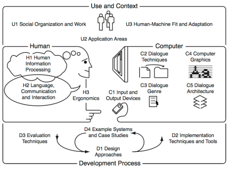
The body of knowledge of Human-Computer Interaction can be perceived as resulting from the following five interrelated aspects, depicted in the diagram bellow:

(N) the nature of human-computer interaction;
(U) the use and context of computers;
(H) human characteristics;
(C) computer system and interface architecture; and

(D) the development process.


This course touches the (N) aspect but mainly targets the (H) aspects illustrated in the diagram above. It comprises seven modules:

Visibility, Affordances, Mapping, Constraints, Conceptual models
Seven stages of action, Types of knowledge
Feedback, Errors, Forcing Functions, Gestalt laws, Responsiveness
The Human Processor Model, Fitts Law
Interface Efficiency, KLM, GOMS
State transition diagrams, Petri nets
History and vision
After successfully attending this course, students will know how user interfaces have developed over the past decades, and what constants of human performance need to be considered when designing user interfaces.

Further details are available including…

  • The pedagogical script;
  • The technical script;
  • The assessment criteria; and
  • The bibliography.


Foundations of Human-Computer Interaction