lunedì 21 agosto 2017

Ford admits touchscreen defeat, puts the buttons and knobs back into Ford Sync

Ford admits touchscreen defeat, puts the buttons and knobs back into Ford Sync
by Bill Howard


Ford Sync is getting a new look. Again. This time Ford is adding more knobs and buttons to Ford Sync. At the same time, Ford says voice control will do more with fewer, shorter commands. More Sync-linked applications will be offered for your smartphone. Look for the changes on Ford’s major-redesign 2015 models, including the Ford Mustang sports car and the Ford F-150 pickup truck.

Lincoln, Ford’s upscale sibling, is moving away from the capacitive touch volume and fan sliders. It will also offer a built-in telematics modem, much like GM’s OnStar. Previously Ford and Lincoln handled telematics through the driver’s connected smartphone.

The All-New Ford Mustang GT

Sync continues to evolve (so it doesn’t die?)
The All-New Ford Mustang GTFord Sync has been out since 2008 and today covers virtually all the Ford and Lincoln line. Sync is a phone-and-music, Bluetooth-and-USB link to the car, co-designed with Microsoft. Ford Sync has been though two major iterations of the screen interface and five or so Sync software versions. The second-generation interface, currently in use, is MyFord Touch. It’s based around a touchscreen, 8 inches diagonal except on small Fords such as the Ford Fiesta, and a screen segmented into quarters.

The touchscreen home screen has four quadrants with phone commands upper left, navigation upper right, entertainment lower left, and climate control lower right. That’s pretty much how MyFord Touch has looked since 2011. Software revisions increased the font size in between and some text was dropped to clean up the screen.

But note all the physical buttons and knobs on the new Mustang: seven for audio, 15 for climate control, with plenty of overlap with the touchscreen, such as the seat heaters and seat coolers. Some physical controls on older Fords have been changed to knobs.

Ford’s Amy Marentec, a Ford group marketing manager, said the changes were based on customer feedback. More accurately, Ford has gotten hammered on J.D. Power Initial Quality Survey and downgraded by Consumer Reports. They are near the bottom on both surveys.

“Ford is making the change due to negative feedback they’ve received regarding several aspects of MyFord Touch,” says Chris Schreiner, director of Strategy Analytics‘ user experience practice. “The system can be sluggish to the touch, while knobs and buttons obviously have a much quicker response. The four-quadrant system is also very text and information heavy, making it overwhelming and confusing for some to do even simple tasks.”

Big buttons on the Ford F-150

The 2015 Ford F-150 carries the same MyFord Touch interface and almost 30 infotainment and climate control buttons below the touchscreen on this vehicle. It is virtually the same center stack as on the 2014 F-150 because buttons never quite went away on pickups. Ford says, “Designers have optimized the physical interface for MyFord Touch to accommodate truck users who may be wearing work gloves.” As for MyFord Touch, the screen “interfaces for climate control, entertainment, navigation and hands-free touch are identical” to Ford cars, meaning it would get the simpler voice structure. The new F-150 is expected to ship late summer or fall.

ExtremeTech

lunedì 14 agosto 2017

Designing A Sexy, Safe Touch Screen For Cars Is Harder Than It Looks

Designing A Sexy, Safe Touch Screen For Cars Is Harder Than It Looks
There are reasons why the latest concept dashboard UI hasn’t been made a reality.
by John Pavlus   


A few weeks ago, a gorgeous concept video of “a new car UI” made the rounds of the Internet, gathering praise as it went. With good reason: The video, created by product designer Matthaeus Krenn, shows a working prototype of a simple, sleek touch-screen interface that relies on glance-free gestures instead of cluttering the screen with tiny skeuomorphic buttons. The idea is simple: The less you have to look at the touchscreen in your car to effectively manipulate it, the better.

Then Apple’s CarPlay system came out. What was the result of Cupertino’s vaunted think-outside-the-box interface design process? A screen filled with tiny buttons. Sure, there’s a lot of voice control on offer via Siri, but if you want to use that touch screen, you still have to take your eyes off the road and use them to aim your finger at haptically invisible digital controls. What’s stopping designs like Krenn’s from becoming a reality?


David Young, an interactive designer and former creative director at BMW Designworks USA, expressed misgivings about Krenn’s concept on Twitter, so we asked him for some constructive criticism. (Krenn did not respond to interview requests.)

Young praised Krenn’s design as a “beautiful, innovative, and unexpected” alternative to “the current hierarchical menu-driven interfaces, and all-buttons-at-once touch-screen interfaces we’re currently seeing.” However, Krenn’s focus on re-creating the gestural simplicity of physical controls comes at the expense of flexibility. “Vehicles are increasingly complex systems, with lots of information to display and a wide range of customization and configuration options. Krenn’s interface, however, only supports adjusting eight settings,” Young says. “It’s not nearly expandable enough for the complex demands of a modern vehicle.” Instead of truly solving the problem of “too much information and buttons on a car’s touch screen,” Young suspects that Krenn’s design merely avoids it.

There’s also the problem that all gestural interfaces still have: They’re unfamiliar and all have different rules that must be learned.
There’s also the problem that all gestural interfaces still have: They’re unfamiliar and all have different rules that must be learned. Krenn’s UI is admirably “logical,” and “everything works fluidly,” Young says, but “at a glance, it’s not immediately obvious how things work.” That might amount to a minor quibble on a smartphone app. “But for drivers unfamiliar with the interface–new drivers, infrequent drivers, car renters–it will be as perplexing as the icons on your clothes that give washing instructions,” Young says. By re-creating an iPhone-like, icon-driven interface for CarPlay, Apple may not have wowed any futurists. But in the year 2014, pretty much anyone who gets behind the wheel of a car also knows how to operate an iPhone. That said, CarPlay is designed to augment the iPhone’s display, not function independently like Krenn’s. But Young’s point–that in the context of safely operating a motor vehicle, usability and familiarity are nearly synonymous–is well-taken.

Smartphone screens vibrate–by now, a familiar kind of haptic feedback–so why can’t dashboard touch screens do the same?
Finally, Krenn’s UI has no haptic feedback. “So when changing a setting that doesn’t give immediate feedback, such as changing a climate option, the driver is required to look at the display to see if their gesture is complete,” Young says. This is less a criticism than an acknowledgement of hardware limitations–the iPad that Krenn used to mock up his concept has no vibration feature, after all. But there’s nothing stopping car manufacturers from including this kind of haptic feedback into their designs. Physical knobs and dials often have catches or “detents” in their movement, which let you know that the knob has been turned sufficiently to register a change without having to look. Smartphone screens vibrate–by now, a familiar kind of haptic feedback–so why can’t dashboard touch screens do the same?

This isn’t to tear down Krenn’s creation. Like any concept design, it exists primarily to drive constructive dialogue, and we’re glad that David Young has added to the back-and-forth. Carmakers can do better–and the more voices we have telling them how to do so, the safer our dashboards will become.


[Matthaeus Krenn’s touch-screen concept]

lunedì 7 agosto 2017

The Sad Death Of The Knob, Switch And Button

The Sad Death Of The Knob, Switch And Button
by Jason Torchinsky        jason@jalopnik.com     @JasonTorchinsky


The Sad Death Of The Knob, Switch And Button

I want to start by coming out and saying I'm not one of those car luddites who think everything should hover in some magical past; while I'm very fond of old-school cars, there's an amazing amount of amazing new tech in cars, and LCD dashboards in so many new cars here at the Detroit Auto Show are a genuinely great advance. Except for one big issue: Knobs, switches and buttons? They're now officially doomed.

Knobs are still around, albeit in reduced numbers, but it's very clear they're considered vestigial holdouts and it's just a matter of time before they're done away with completely. Looking at forward-thinking cars like the Tesla Model S demonstrates this, as its dash is basically just two big iPads, one in landscape orientation and the other in portrait.

A booth from Denso, a major supplier of auto parts and electronics, shows a prototype cockpit of the future — and it's all touch screens. Touch screens are great on our phones and tablets; so why wouldn't they be great in a car, right?

The problem has to do more with the "screen" part than the "touch" part, though both are factors. On your phone, you're looking at the screen, interacting with it very directly; the visual feedback is essential for operating the interface.

When you're driving, ideally you're looking mostly out of the big window in front of you, and you operate most of the ancillary controls with no more than a quick glance. Touch screens don't work like that; little buttons on smooth glass surfaces have to be targeted with a pair of eyes.

All you need to do to prove the point is to look up.

Have you ever peeked in the cockpit of an airplane and seen the levers in between the seats? Those levers have funny-shaped knobs: Spool-shaped, crown-shaped, star-shaped — it's the marshmallows from a Lucky Charms box. There is, of course, a great reason why they're like that: so pilots can know what lever is what just by touch.

That's exactly what is being given up when controls move to the touch screen. Tactile feedback and the ability to feel what a control is has long been part of driving.

Traditionally, we can feel and know what's a radio knob, what a climate control lever feels like, how the notches feel as we move them from one setting to another, and it's worked great. Even without any interior lights or dash lights I bet most of us could find and use the essential controls on our cars.

Touch screens are awesome for many, many things. They look great, they can show an incredible amount of information, but they should never be the only components on a dash.

Oh, but that's not the only problem. Some cars, like the Chevy Volt, the Cadillac ATS and everything from Lincoln are replacing standard buttons with sleek capacitive touch plates with big clusters of identically-shaped buttons. Capacitive technology refers to using electrodes to sense the conductive properties of objects, such as a finger. So, basically, rather than physically depressing a button you've fumbled for while your eyes remained on the road, you'll turn on and off four different things before finally looking down to find what function you want to change. Then you crash and die.

So those suck in about the same way touch screens do, and they look like they came off a VCR. So knock that off, too.

Automakers, I'm pleading with you, spare the life of just a few knobs, just some essential ones, even if they have redundant touch-screen controls. Leave me some knobs in the cars of the future. Nice, chunky, clicky knobs, and maybe a lever, switch and button or two.

I'll even let you make them look cool and LED-lit or whatever you want.

http://jalopnik.com

See also:
Any Carmaker Still Not Using A Touchscreen For Their Infotainment System Is An Id...
by Jason Torchinsky

... I like physical controls for things like, say, radio volume and tuning, too. This is not a screed against physical controls. It’s a screed against terrible physical controls used to control an on-screen interface that is clearly, obviously, much more suited to touch controls.

lunedì 31 luglio 2017

The best UX and design conferences in 2017

The best UX and design conferences in 2017
A complete guide for designers who are looking for events and conferences to attend this year, or who are simply planning their next trip around the world.
by Fabricio Teixeira


Photo credit: Knak

A great way of learning more about User Experience and getting in touch with professionals who share the same passion as you is to attend UX Conferences and UX Events happening every year around the globe.

The events listed are the ones our team at uxdesign.cc have been to or would like to attend in the near future. Make sure you charge your smartphone, bring some business cards in your pocket and consider including one of these design events before or after your next trip.

  • Events about creativity and technology

  • Get together with local UX groups

  • Follow events in your area


uxdesign.cc

Foundations of Human-Computer Interaction

Foundations of Human-Computer Interaction

Goal and Outcomes.

This course introduces students to the field of human-computer interaction.

Introduction

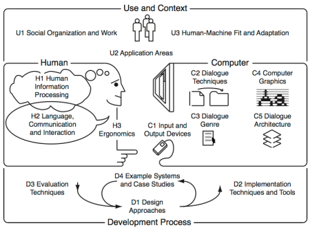
The body of knowledge of Human-Computer Interaction can be perceived as resulting from the following five interrelated aspects, depicted in the diagram bellow:

(N) the nature of human-computer interaction;
(U) the use and context of computers;
(H) human characteristics;
(C) computer system and interface architecture; and

(D) the development process.


This course touches the (N) aspect but mainly targets the (H) aspects illustrated in the diagram above. It comprises seven modules:

Visibility, Affordances, Mapping, Constraints, Conceptual models
Seven stages of action, Types of knowledge
Feedback, Errors, Forcing Functions, Gestalt laws, Responsiveness
The Human Processor Model, Fitts Law
Interface Efficiency, KLM, GOMS
State transition diagrams, Petri nets
History and vision
After successfully attending this course, students will know how user interfaces have developed over the past decades, and what constants of human performance need to be considered when designing user interfaces.

Further details are available including…

  • The pedagogical script;
  • The technical script;
  • The assessment criteria; and
  • The bibliography.


Foundations of Human-Computer Interaction

lunedì 24 luglio 2017

Wichita State University’s Engineering 101 courses

Wichita State University’s Engineering 101 courses


Human Factors Ph.D. Program


Welcome to the class blog for Wichita State University’s Engineering 101 courses.

Engineering 101 is a three-hour course specifically designed for College of Engineering freshmen and transfer students in their first year at Wichita State University. This course provides application to being both engineering students and practicing engineers.

...
In human factors, of course, we are specifically concerned with human interfaces. Typically, research in this field is geared towards improving productivity and reducing errors and injuries, and you can usually separate this into two categories: the application of human psychology and the implications of human anatomy.

Good psychological human factors design would include systems which are intuitive – someone new to the interface can operate it with little or no instruction. Can you think of any examples?

Good anatomical human factors design includes systems which are physically natural – using the system requires little strength or effort, or it could be used many times or over a long period without stress or injury. Can you think of any examples of this? ...

********************* 

Human Factors submissions

An example:

Human Factors – TuTh0930 – Spencer Shield


The problem:
The problem with spray bottles is that it is hard to read whether or not it is open at first glance. Most spray bottles have a labeling system of just being embossed on the nozzle with the words “on” or “off”. This way makes it hard for people with bad eye sight to understand whether or not it is open.

This is on.


This is off.


The solution:
The solution for this problem is to have the nozzle be color coded like stop lights. This makes it so people can tell if the nozzle is locked or not without having to strain their eyes. This solution is very practical and can be implemented easily in the production line. I think the original designers didn’t do this because of the cost of adding this step to the  production line.

The implementation:
The design would look like the fallowing. The red stands for when the nozzle is locked. The green stands for when the nozzle is unlocked.


lunedì 17 luglio 2017

Ikea mug notch


IKEA Trofe Mug: Dishwasherowned
by Travis Hudson

This isn't so much of a gadget, but an extremely handy device that I wish I would have thought of. This TROFE mug from IKEA has a simple notch on the bottom of the mug that prevents water from pooling up around the base during a dishwasher run.

Some comments from the website:

___________

Gizmometer
These are a perfect example of design without testing. The notch is under the handle. Most dishwashers load cups so that the handle points toward the center of the dishwasher and are tilted upward at the handle so that the spray can reach the inside of the cup. Thus, the notch is at the highest point of the cup when it's loaded in a dishwasher, making the notch useless. A few tests in a few dishwashers would have pointed that out. Now people will buy these thinking they're clever, only to find that they don't work as advertised when they get home.

___________ 

John Laur
I agree with the comments about poor design choice. It would have been easier to make the bottom flat or put two or 3 notches in it.

Plus it's not like Ikea invented this. Look at any cheap plasticware in any restaraunt and you will find drain notches. You can also use them to 'hook' one or two cups onto the rim of another and carry four or six drinks at a time without using a tray.
___________ 

jetstar7
I don't own a dishwasher. I am the dish-washer. I put stuff on a wire rack to drip dry. So this cup works. And the image of the cup is seen in IKEA's latest catalogue. No mention of it's intent to optimise dishwasher cleaning in there.

lunedì 10 luglio 2017

How to Create a UX Design Portfolio: Tips from a UX Recruiter

How to Create a UX Design Portfolio: Tips from a UX Recruiter
by Tom Cotterill


How to Create a UX Design Portfolio: Tips from a UX Recruiter
As a UX recruiter, my role involves not just identifying and developing tech talent, but also following the industry closely; going to events, workshops, and conferences to make sure I’m in a strong position to connect the dots and successfully match companies with perfect-fit employees.

Through the conversations I have day-to-day, I’ve managed to put together a clear picture of the industry as it stands in 2017 and what the expectations are for all levels of UX designer, from absolute beginners to senior UXers and UX directors.

One big aspect of my role is making sure that the candidates I work with are amazing at showcasing their skills, experience, and past achievements. One thing I get asked over and over again is, “Where should I begin with creating my portfolio? What’s the standard? How can I make it better?”

So, I’m going to share the advice that I frequently give out to candidates I work with, be it a beginner, mid-level or senior UX designer. I’ll be explaining why your portfolio is so important, what to include, where to host it, how much to include, and answering lots of other common questions.

lunedì 3 luglio 2017

The Encyclopedia of Human-Computer Interaction, 2nd Ed.

The Encyclopedia of Human-Computer Interaction, 2nd Ed.
by Interaction Design Foundation


Textbooks written by 100+ leading designers, bestselling authors, and Ivy League professors. The textbooks are assembled in a gigantic 4000+ page encyclopedia covering the design of interactive products and services such as websites, household objects, smartphones, computer software, aircraft cockpits, you name it.

lunedì 26 giugno 2017

Design With A Purpose: 15 Everyday Things You Never Imagined Had A Purpose

Design With A Purpose: 15 Everyday Things You Never Imagined Had A Purpose
by Suchismita Biswas

Technology has science behind it. Every small design has logic. Do you know the purpose of the small hole in your pen cap? I bet many of us don’t know the actual purpose of the feature. Like this, there are many everyday small things we use but don’t know the exact purpose of the features. This article is written to inform you such little things which you use but don’t know the purpose.


design-purpose-15-everyday-things-never-imagined-purpose