lunedì 30 maggio 2016
lunedì 23 maggio 2016
30 Most Baffling Design Flaws of Popular Products
30 Most Baffling Design Flaws of Popular Products
Hey now, we're pretty appreciative of the times we're living in -- at least we aren't wiping our asses with pine cones. But, come on, with as advanced as our society is, some nuisances that accompany things we use everyday seem pretty ridiculous. We asked you to show us the worst offenders, and gave a bunch of slightly bent dollar bills that won't be accept by vending machines to the winner
CRACKED Readers ·January 22, 2014
www.cracked.com
martedì 17 maggio 2016
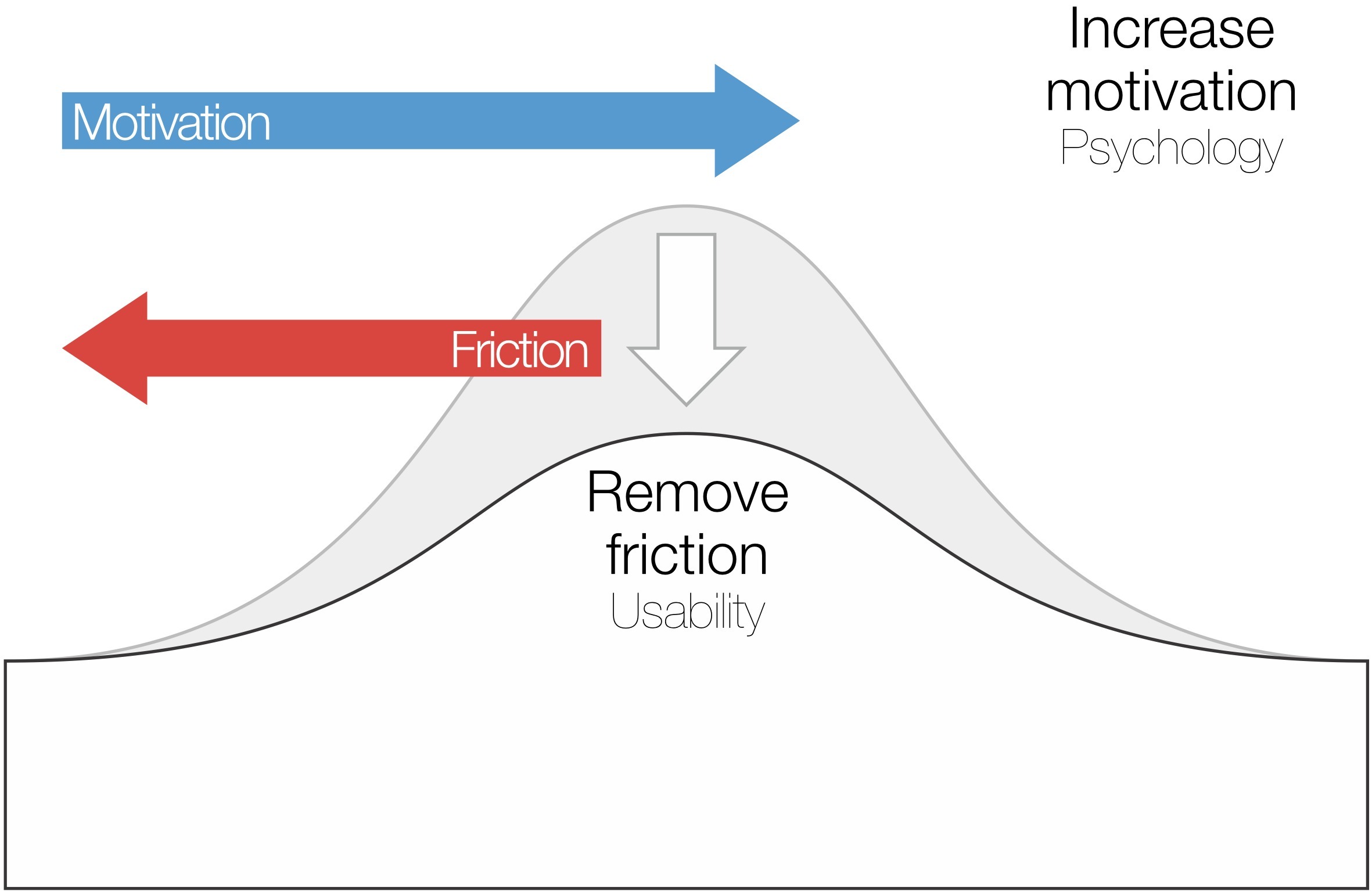
How to reduce friction with good design
how-to-reduce-friction-with-good-design

Friction refers to anything that prevents a user from accomplishing a goal.
by JERRY CAO 2015
thenextweb.com

Friction refers to anything that prevents a user from accomplishing a goal.
by JERRY CAO 2015
thenextweb.com
lunedì 16 maggio 2016
domenica 15 maggio 2016
It's not you. Bad doors are everywhere.
Don’t Know Whether to Push or Pull? Blame Design.
February 26, 2016
This video is about doors. Joe Posner investigates, with some help from 99% invisible, a wonderful podcast. Check them out here:
http://99percentinvisible.org/article/norman-doors-dont-know-whether-push-pull-blame-design/
venerdì 13 maggio 2016
Good Design: Timex alarm clock
Good Design: Timex alarm clock

First of all it has very good visibility. Every button and dial are clearly labeled for its specific purpose. The labels are written in white ink which makes it very visible against the black background. The buttons are raised high enough for there to be a shadow, indicating for one to push down on them. The digital display is bright red with very large and easy to read numbers, as well as a battery symbol that glows red when it is running out. One quick glance at the alarm clock and it is easy to see where each function is.
by Lauren Allshouse February 6, 2014
normandoors.wordpress.com
11 Hilarious Examples of Bad Design
11 Hilarious Examples of Bad Design

Everyone makes mistakes. Often, these can be laughed off and everyone’s the wiser. But some mistakes are more serious than others, especially the ones that lose business or damage a brand.
This post goes over some bad design examples that are more funny than serious, but still highlight some pitfalls to avoid.
The great thing about mistakes is that they can be redeemed when we learn from them. And laugh at them.
by Jarom McDonald May 2, 2016
www.lucidpress.com
mercoledì 11 maggio 2016
Retro style radio set
 |
||
 |
What is wrong? the
Conceptual Model: - Designer put a switch on the left side to turn on the appliance - Users prefer to turn on by a volume knob. |
|
| In a radio set usually the volume
control knob is used to turn on, but on this old style radio the On/Off
switch is on the left side. The On/Off switch is not even on frontal panel but almost hidden on a lateral panel. This causes 3 problems: First problem: you have to search for On/Off switch. Second problem: when you turn on, if someone have left the volume set up on max, the loud music can hurt your ears. Third problem: to turn off you have to continue press the On/Off switch for 2 seconds |
||
  |
||
|
|
||
 |
Suggestions | |
 |
||
| Using a single knob with integrated On/Off and Volume | ||
 |
||
| In this radio receiver, there is a more intuitive Volume Knob and Switch | ||
  Rocker switch Volume knob |
||
|
|
||
| https://www.sparkfun.com/search/results?term=knob | ||
Iscriviti a:
Commenti
(
Atom
)

