Why is Online Checkout So Difficult?!
by Dmitry KovalenkoSummary: nowadays online checkout processes are too complex and cannot be compared with the real-life cash checkout. But they definitely can be better.

In this article we are going to overview the checkout process on 4 services to understand and “feel” the problem itself. Also, it is the 1st chapter of four that are linked together by one story and goal where I described what I have learned and used to design the completely new checkout process for our SaaS project Fluix.
2nd chapter. You will find out 18 must-do principles of how to design a better experience for your checkout form (or any other form) and dramatically increase the success rate, and decrease the completion time.
Chapters 3 and 4. The complexity behind the new checkout form for Fluix. You’ll learn the relationships and dependencies between fields, their input & visual constraints, and a lot of insights about the way I’ve designed the new checkout form for our SaaS project called Fluix.
Just imagine. Friday night. You’re at one of the coziest restaurants in the city with a panoramic ocean view. Eating your best ever ribeye-steak (or whatever you like the most) mixed with a glass of gorgeous red wine. You feel full, relaxed and peaceful. You ask the waiter for the bill (no, the point is not in the money). And instead of a simple piece of paper with a total price, you get a form with 27 fields that must be filled.

“WHAT?!!” — you will probably ask yourself. And will repeat the same question to the waiter, and then to the manager…
SUCKS! Right?
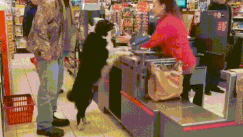
Let’s rewind, how do we bought everything before all these plastic cards and digital transactions? You just take what you want, give the cash to the seller and… that’s it! Done. Minimum time spent. Minimum actions made.
In an online world, it’s not so easy. At all. Tons of fields, questions, buttons, checkboxes, redirections between the bunch of pages, of services, emails with confirmations, passwords, suggestions of other related (most the time they are not) products, tons of additional options, and God knows what else.

0 commenti :
Posta un commento