venerdì 4 ottobre 2019

The refrigerator top freezer handle

The refrigerator top freezer handle


I was recently cooking food with my girlfriend, and she goes into the fridge to pull out something.  Next thing I knew, BAM and “AAHHH” were the sounds ringing in my ears.  She had stood up and smashed her head on the freezer handle of the refrigerator.  After a string of unmentionable words from her, I told her I’d blog about this.

How many of us have felt this same, unbearable pain?  Why, does this keep happening?  WHAT IS THE PROBLEM?  Well, the issue here is two things (besides the worst head pain ever):  memory and placement.  The handle is placed at a point where our short-term memory will completely forget about it.

When we kneel down to reach for something, we have the inclination to look around us to see if we are in a “safe zone”.  Once we have identified the area as “safe” we proceed into doing what we initially set out to do.

At this point, our minds are focused on what our goal is now and have pushed out that short term memory that initial “safe zone”.  The resulting factor is a head-splitting headache and a string of bad words.

This design does not understand how users think.  We as designers need to fully understand the process of which users take use of our products.  This includes their thought process.  The design of this refrigerator does not take into account how users’ minds function, and it sometimes results in a very frustrated user.

Again, we can avoid this by understanding our users’ needs and goals.


_____ 

How do you open the refrigerator?


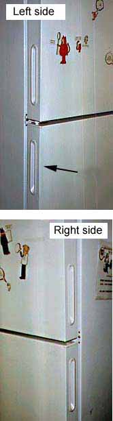
At my new job there is a refrigerator where employees put their lunches. The first time I tried to open the refrigerator I didn't see a handle on the front, but I found one on the left side of the door. (See arrow.) I pulled on the handle, but the door would not open. I thought maybe the refrigerator door had a really strong seal, so I pulled harder. I pulled so hard the whole refrigerator started moving! Someone standing nearby told me, "It opens from the other side. I had the same problem when I first tried to open it."
I looked on the right side of the refrigerator and sure enough, there was a handle there too! When I pulled on that handle, the refrigerator door opened easily.

Apparently, the refrigerator door was designed so it could be hinged on either the left or the right side. Thus, handles were put on both sides. However, people only expect to see one handle on a refrigerator door. When the handle doesn't work, they assume the door is stuck or locked.

Design suggestion

It would be best to put a handle on the front of a refrigerator door so that it can be easily seen. On a reversible door with handles on both sides of the door, there should be a way of removing or concealing the handle on the hinged side. There should not be visible handles on both sides!

domenica 11 agosto 2019

Why Is Bad User Experience Design Still A Thing?

Why Is Bad User Experience Design Still A Thing?


The other day I decided to set up two relatively common household products: (1) a wireless router and (2) a portable steamer. The instruction manuals and the resulting experiences of each setup couldn’t have been more different. Can you guess which required more energy, brain power and patience?


Ding ding ding ding ding! It was the steamer!

Why did setting up an appliance with mechanical engineering akin to a kitchen kettle feel like preparing a space shuttle launch…while a device manufactured by a cable company took five minutes with zero aggravation or ambiguity? The answer: User Experience design.

Good UX: The Router Setup


Setting up routers used to involve sitting on the phone with the cable company and wishing it was somebody else’s job. Now it’s as simple as flipping open a glossy, single-page pamphlet and following clear, colorful diagrams placed alongside highly legible text.


There was even some witty Easter Egg copy as if a real human being wrote it and not just a systems engineer:


Relax? No problem! In fact, when the blinking lights stopped flashing after just two minutes, I felt like a technical genius.

Bad UX: The Steamer


The steamer was another story. A list of 14 steps with essentially no visual hierarchy made it nearly impossible to skim for the most important information: how to avoid burning yourself. In fact, this nugget is all the way at the bottom of list item 13, below a mountainous, monotonous section of text. “The water in the reservoir can severely burn skin.”
Seriously?!

The visual aid stresses the importance of moving the steamer up and down. This doesn’t seem like the most important and/or complicated piece of information for a user to grasp.


___________ 

Here’s how I would have written this information: 

Before You Begin:
1. DO NOT fill with water past the max line.
2. DO NOT tilt the steamer back and forth or water will drip out.
Use an up-down motion, not too long in the same spot. 
3. When you’re done OR need a refill, unplug.
Wait 5 minutes after unplugging for unit to cool before handling.

STEP 1: Fill steamer with water.
- Twist reservoir cap clockwise to open.
- Add tap water up to the maximum line. Do not overfill.
- Replace reservoir cap and twist counter-clockwise to close.

STEP 2: Turn on device.
- Plug device into power outlet and press ON.
- When on, the switch will light up.
- Wait 2-3 minutes for unit to heat up.

STEP 3: Steam clothing.
- Always keep unit in an upright position.
- Point steam holes at wrinkled fabric. Move steamer in an up-down direction.
- For best results, pull fabric firmly in place while steaming.

STEP 4: Unplug and allow to cool before handling.
- Even after turned off, any water inside the unit will remain boiling hot.
- Wait 5 minutes before handling.
- Once cool, empty excess water and replace cap.
- Store in a cool, dry place.

_____________ 

People who buy portable steamers value convenience. It should be easier to assemble. My revision lists key safety concerns at the top followed by a logical order of steps, told in fewer words.

source: emsok

lunedì 29 luglio 2019

Design Critiques

Design Critiques


 design critiques - Pratt Institute


About IXD@Pratt

IXD@Pratt is a collection of articles about User Experience and its related disciplines. The website is maintained by faculty and students at Pratt Institute’s School of Information and all content is written by students, alumni, and faculty associated with the Master of Science in Information Experience Design and User Experience (UX) Advanced Certificate programs.

Pratt Institute, School of Information
144 West 14th Street, 6th Floor
New York, NY 10011-7301

********************
Examples 2019

Design Critique: MYmta (iPhone app)

Source: https://itunes.apple.com/us/app/mymta/id1297605670?mt=8

Introduction
The MYmta iPhone app is a travel app designed to provide relevant information related to New York City’s many public transit options: subways, buses, LIRR and Metro-North rail services, and the Access-A-Ride program. The app allows for real-time scheduling and service changes, as well as personalized settings and trip planning, and station accessibility information.


************ 

Design Critique: Netflix (Desktop App)


Fig 1.1 – Before signing into Netflix

Netflix is a major streaming service that allows users to watch TV shows, movies, animations and more. It has so much entertainment that you can never say, there is nothing to watch. In order to use Netflix, the new user could start with a one month free trial (which they can cancel anytime) or subscribe by paying monthly. The app itself is free, which is available in mobile, tablet and desktop versions.


**************** 
Design Critique: Notes (iPhone App)


The iOS built-in Notes app empowers users’ note taking capability by providing seamless synchronization feature, supporting multimedia input/insert, and even integrating the sketch feature to simulate the analog note-taking experience. This article would critique the Notes App based on some usability factors mentioned by Don Norman’s book- The Design of Everyday Things.

sabato 8 giugno 2019

25+ Epic Design Fails

25+ Epic Design Fails That Are So Bad We Can’t Believe They Actually Happened


I Don’t Even Have Words For This
bad design


This Gray-Scale Pie Chart
worst design products


I Felt Quite Lost In China, But Fortunately, I Found This Sign
bad user experience


Human Traffic Jams

and many more examples

photofunonline.com

domenica 2 giugno 2019

Epic Design Fails That Are So Bad, We Can’t Believe They Actually Happened

Epic Design Fails That Are So Bad, We Can’t Believe They Actually Happened 


 Nothing Like The Smell Of Coffee And A Good Eye-Stab In The Morning


worst design products


I Was Looking For A Soap Dispenser Labeled “Ketchup” With A Picture Of Grapes

epic fails


That’s Gonna Be An Easy Ride

bad design

and many more examples

photofunonline.com

lunedì 27 maggio 2019

Best Conferences for UX Researchers 2019

Best Conferences for UX Researchers 2019

by Ania Mastalerz

Conferences for UX Researchers 2019

Upcoming UX, Usability, and UI Conferences in 2019

Looking to update your knowledge and connect with other professionals at UX Conferences in 2019? Here’s the list so far for UX Conferences including user experience, design, usability and UI topics announced around the world with many more that we’re tracking waiting to announce their 2019 dates. Find the right conference that meets your needs: focus topics, timing, location or cost.